
Your landing page’s weakest score is Trust.
How Univerbal ranks
Trust
52FairProof that the product is real, competent, and safe to try.
| Trust read | |
|---|---|
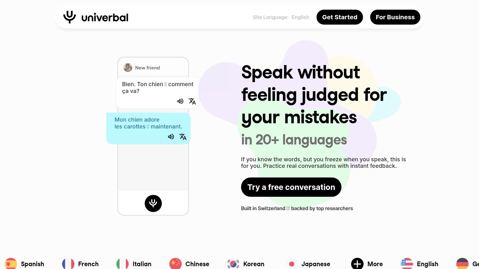
| Univerbal | Embedded chat demo showing a real French conversation with audio and translate controls |
| "See how a session works" video teaser on the mobile fold | |
| "130+ LANGUAGES" badge above "WHICH LANGUAGE DO YOU WANT TO LEARN?" | |
| "Discover why 30,000+ learners choose Langua for building real-world fluency" headline at the fold edge | |
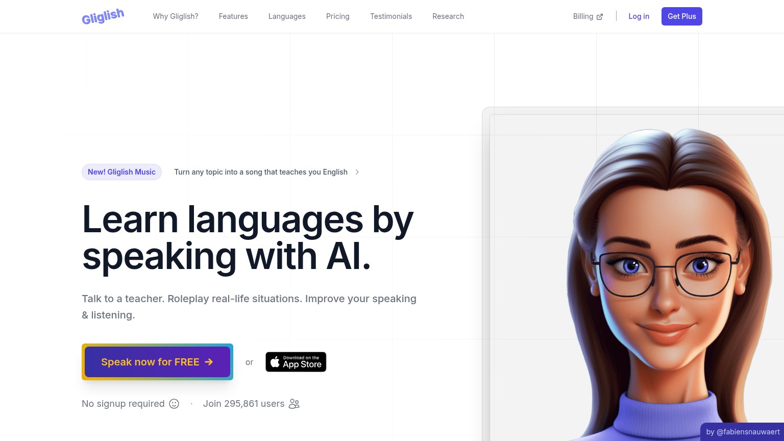
| "Join 295,861 users" counter beneath the primary CTA | |
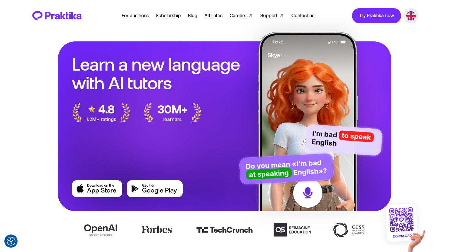
| 4.8 star rating from 1.2M+ ratings alongside 30M+ learners in the hero |
Mobile web
68FairThe phone experience as a first-class citizen.
 123
- Oversized hero headline — Desktop-scale type wraps into four huge lines, pushing the primary CTA to the fold's bottom edge.
- For Business button — Styled identically to the primary CTA directly below it, splitting the tap decision three ways with the header's Get Started.
- Broken flag emoji — "Built in Switzerland with love" renders tofu boxes instead of the flag, an unpolished note right under the CTA.
Information hierarchy
78FairDoes the design help or inhibit what the page is trying to say?
What works
What to improve
Value props
78FairTitle, subtitle, hero — do they sell the product's true value?
Univerbal’s headline
Speak without feeling judged for your mistakes in 20+ languages
If you know the words, but you freeze when you speak, this is for you. Practice real conversations with instant feedback.
Working
Could improve
CTA
82StrongCopy, size, verb, cost-feel — does the primary CTA earn the click?
How Univerbal compares
Recommended rewrites