
Your landing page’s weakest score is Mobile web.
How Praktika ranks
Mobile web
56FairThe phone experience as a first-class citizen.
 12
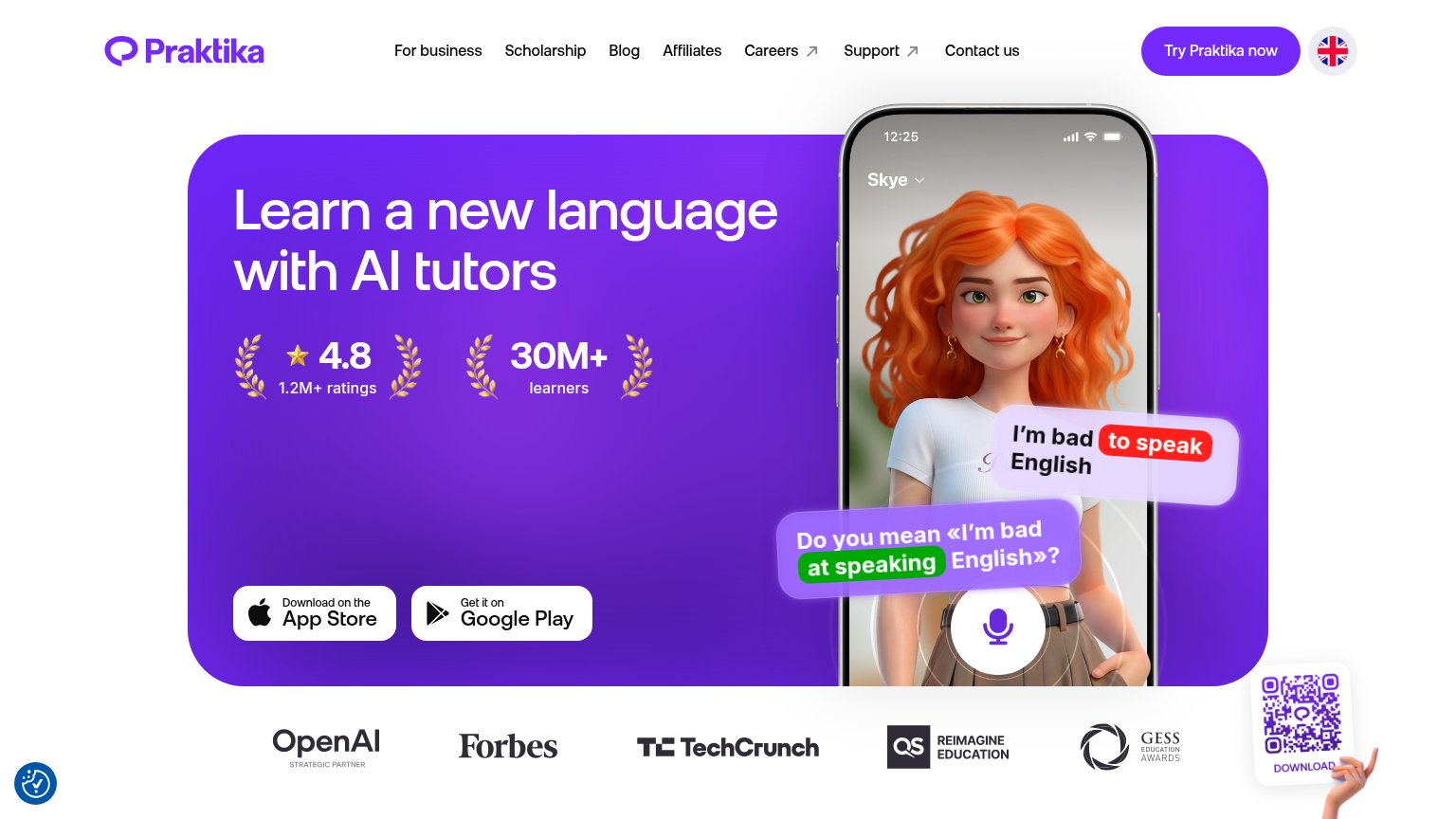
- Oversized phone mockup — The phone illustration consumes most of the first viewport, pushing any download action and all supporting content well below the fold.
- Clipped partner logos — The Forbes logo is cut off at the right edge, signaling an unchecked horizontal carousel or overflow on mobile.
CTA
64FairCopy, size, verb, cost-feel — does the primary CTA earn the click?
Problems
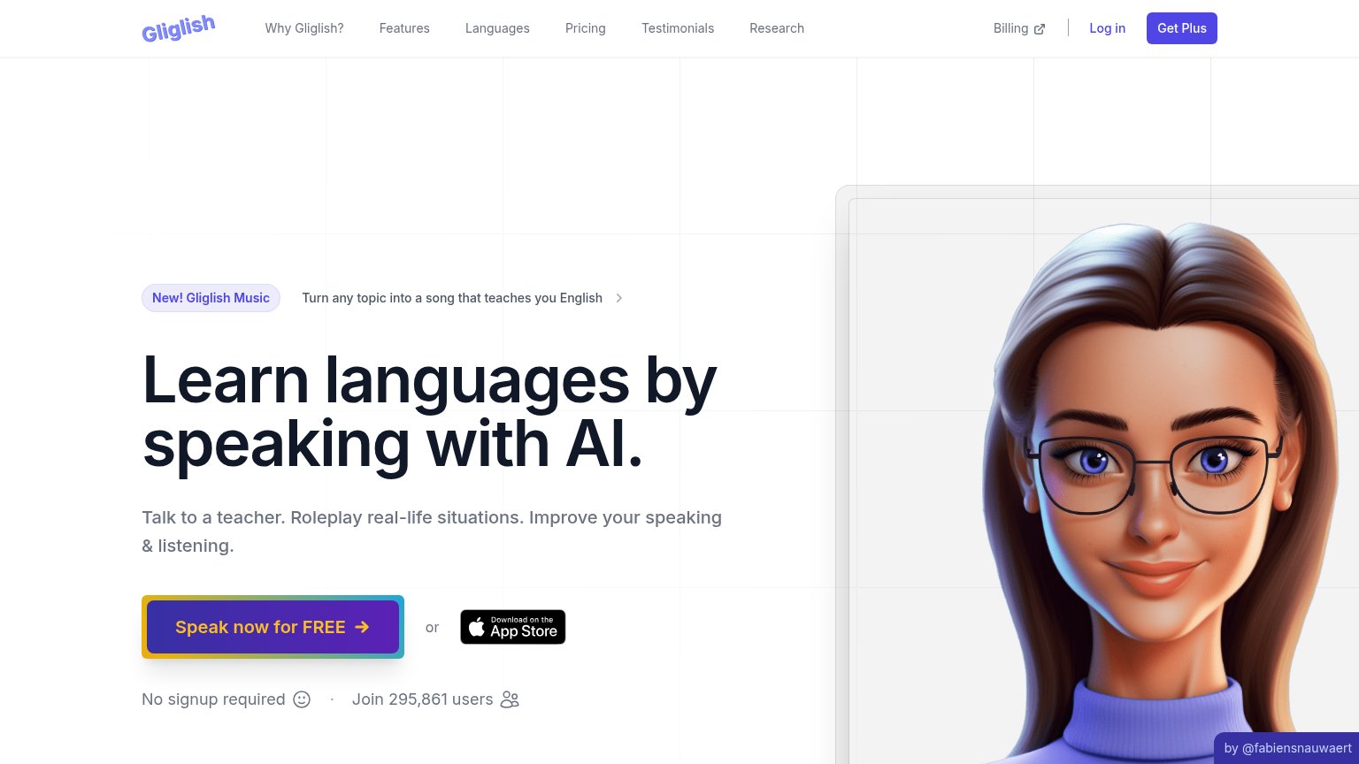
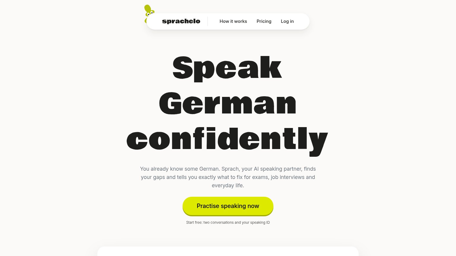
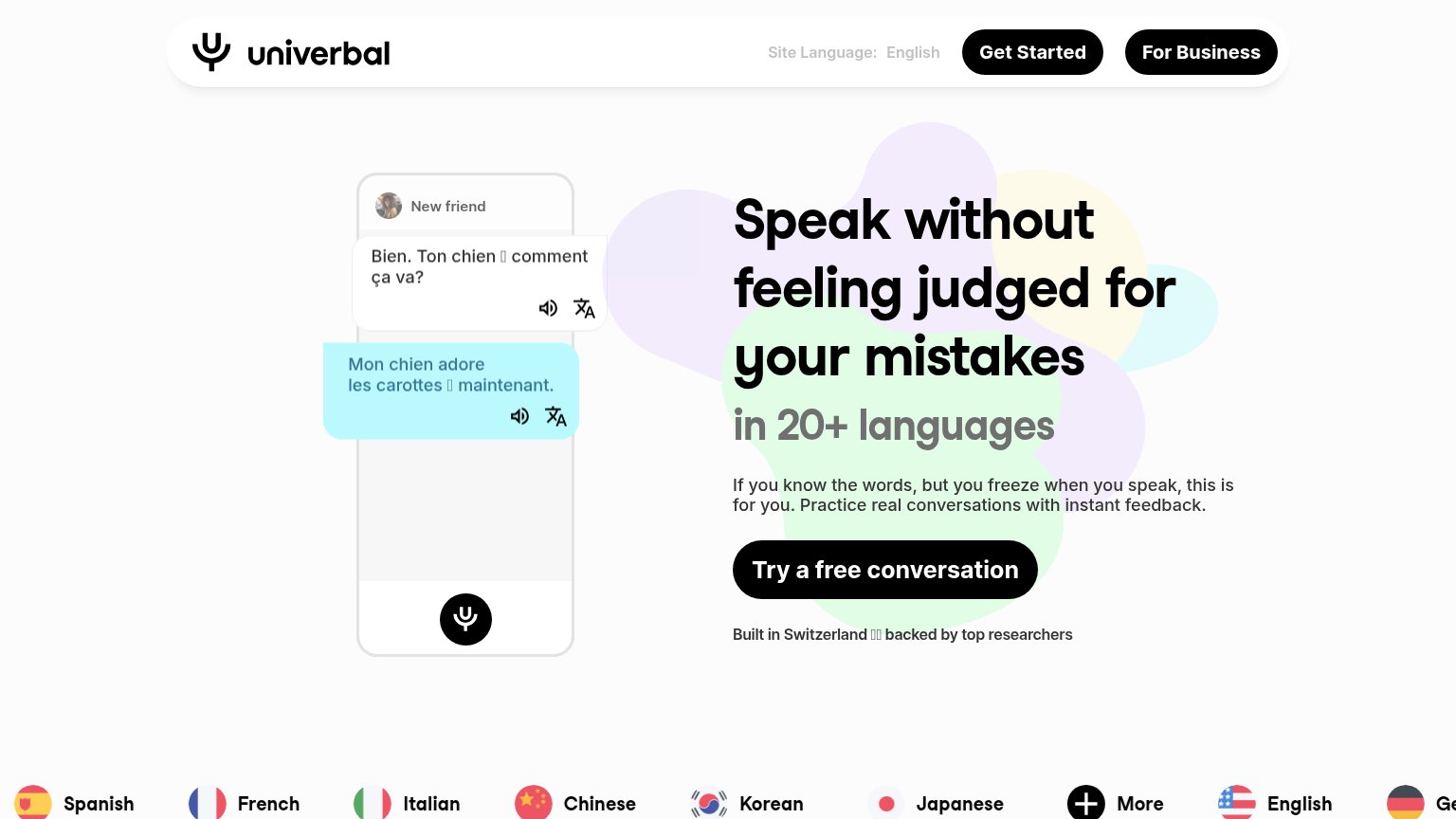
- CTA absent from mobile fold
- nav-sized, not hero-dominant
- hero pushes app-store badges instead
- competes with QR download widget
Information hierarchy
72FairDoes the design help or inhibit what the page is trying to say?
What works
What to improve
Value props
76FairTitle, subtitle, hero — do they sell the product's true value?
Praktika’s headline
Learn a new language with AI tutors
Working
Could improve
Trust
84StrongProof that the product is real, competent, and safe to try.
How Praktika compares
Trust read