
Your landing page’s weakest score is Trust.
How Gliglish ranks
75Growth scoreupdated
category scores
category scoresShowHide
Trust
62FairProof that the product is real, competent, and safe to try.
| Trust read | |
|---|---|
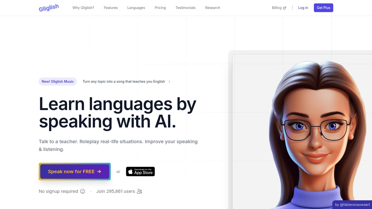
| Gliglish | "Join 295,861 users" counter beneath the primary CTA |
| "See how a session works" video teaser on the mobile fold | |
| "130+ LANGUAGES" badge above "WHICH LANGUAGE DO YOU WANT TO LEARN?" | |
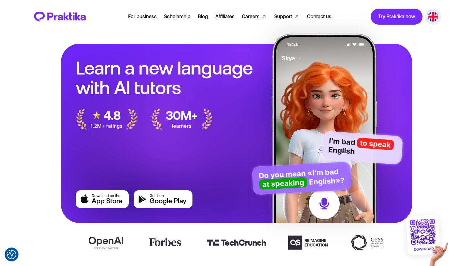
| "Discover why 30,000+ learners choose Langua for building real-world fluency" headline at the fold edge | |
| Embedded chat demo showing a real French conversation with audio and translate controls | |
| 4.8 star rating from 1.2M+ ratings alongside 30M+ learners in the hero |
Information hierarchy
71FairDoes the design help or inhibit what the page is trying to say?
1234- Header exit links — Seven nav links plus Billing, Log in, and Get Plus create eleven exit paths before the hero CTA.
- Get Plus button — Solid indigo fill gives this paid CTA equal weight with the hero action, splitting the conversion path.
- Gliglish Music banner — The announcement pill with arrow link sits directly above the headline and intercepts the scan path with a third destination.
- App Store badge — Styled at nearly equal weight beside the primary button, the 'or' choice forks the one action the fold wants.
Mobile web
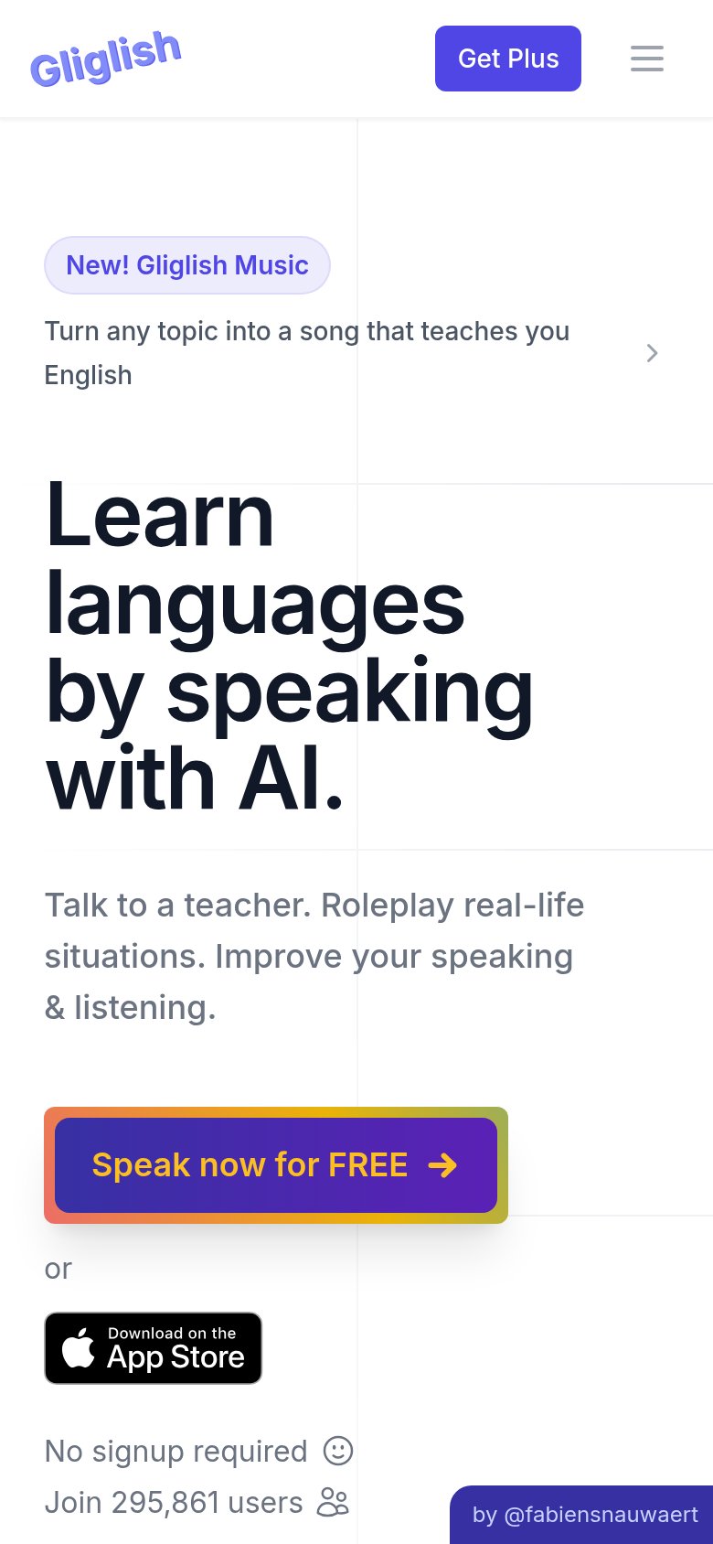
72FairThe phone experience as a first-class citizen.
What works
What to improve
Value props
82StrongTitle, subtitle, hero — do they sell the product's true value?
Gliglish’s headline
Learn languages by speaking with AI.
Talk to a teacher. Roleplay real-life situations. Improve your speaking & listening.
Working
Could improve
CTA
86StrongCopy, size, verb, cost-feel — does the primary CTA earn the click?
How Gliglish compares
Recommended rewrites