
Your landing page’s weakest score is Value props.
How Unifize ranks
68Growth scoreupdated
category scores
category scoresShowHide
Value props
52FairTitle, subtitle, hero — do they sell the product's true value?
Unifize’s headline vague
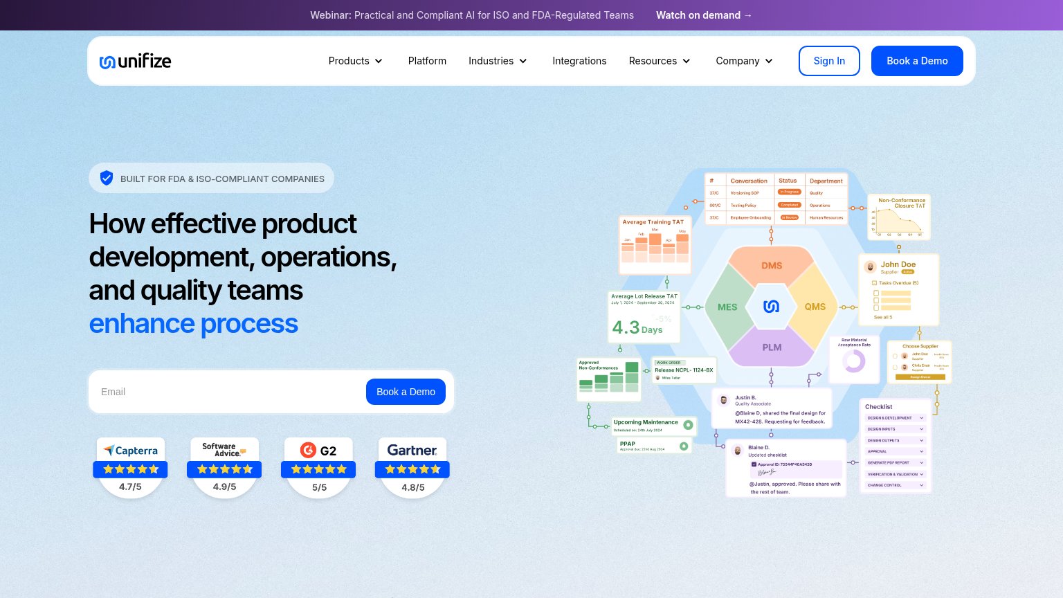
How effective product development, operations, and quality teams enhance process
Working
- Eyebrow targets FDA/ISO-compliant buyers
- Hero art shows real QMS/PLM workflows
- Four review badges add credible proof
Could improve
- Headline never says what Unifize is or does
- "Enhance process" is a generic abstraction
- No subhead to add outcomes or specifics
Information hierarchy
66FairDoes the design help or inhibit what the page is trying to say?
 1234
- Rotating headline verb — The animated blue phrase changes between captures ('enhance process' vs 'improve collaboration'), so the core promise is never stable long enough to land.
- Webinar banner — 'Watch on demand →' sits at the very top of the scan path and routes attention away before the visitor reads the headline.
- Duplicate Book a Demo — Nav 'Book a Demo' competes at equal blue weight with the hero form's button, splitting the primary action into two targets.
- Product diagram annotations — A dozen tiny callout cards (TAT charts, checklists, chat bubbles) shout at once and none is legible, adding density without a readable message.
CTA
68FairCopy, size, verb, cost-feel — does the primary CTA earn the click?
How Unifize compares
Recommended rewrites
Trust
76FairProof that the product is real, competent, and safe to try.
How Unifize compares
Trust read
Mobile web
76FairThe phone experience as a first-class citizen.
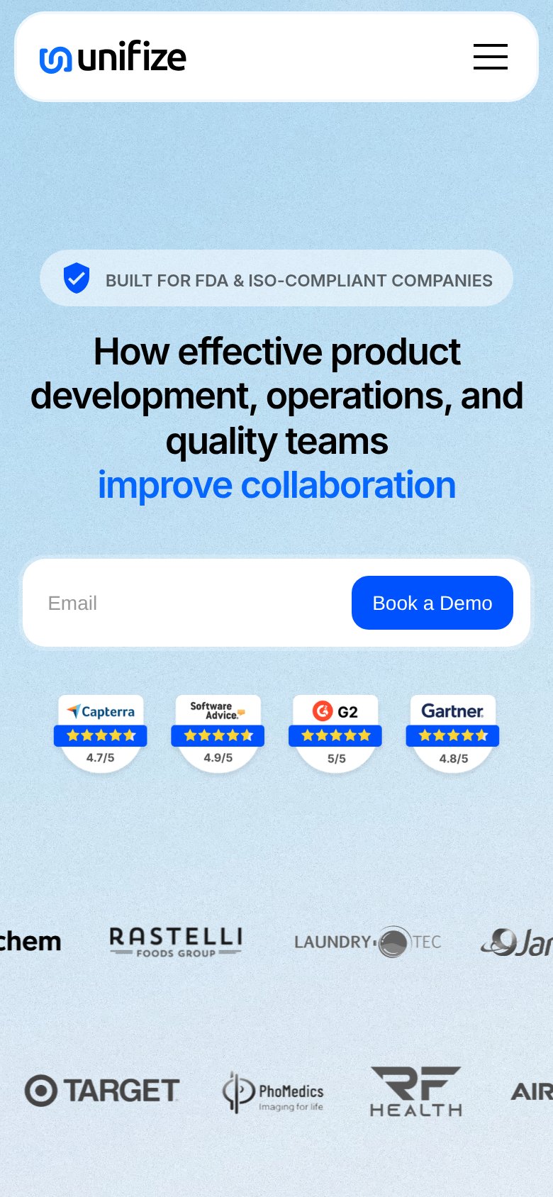
What works
What to improve