
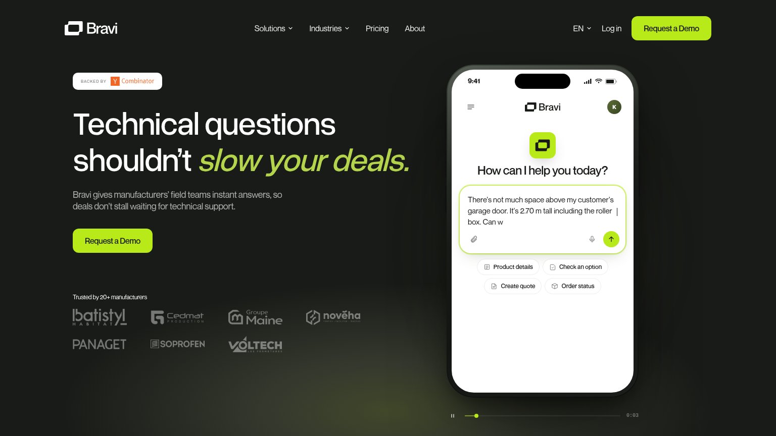
Your landing page’s weakest score is CTA.
How Bravi ranks
78Growth scoreupdated
category scores
category scoresShowHide
CTA
72FairCopy, size, verb, cost-feel — does the primary CTA earn the click?
Problems
- 'Request' feels like a sales gate
- no self-serve or trial path
- demo delays value to a call
Information hierarchy
78FairDoes the design help or inhibit what the page is trying to say?
123- Header nav links — Solutions, Industries, Pricing, About, EN, Log in — six exits at the same eye level as the header CTA, siphoning first-scan attention.
- Duplicate demo buttons — Hero 'Request a Demo' repeats the header button at identical lime weight, splitting the single-action signal across two spots.
- Faded logo strip — Trusted-by logos are so low-contrast against the dark ground that the 20+ manufacturers proof barely registers on scan.
Value props
78FairTitle, subtitle, hero — do they sell the product's true value?
Bravi’s headline
Technical questions shouldn't slow your deals.
Bravi gives manufacturers' field teams instant answers, so deals don't stall waiting for technical support.
Working
Could improve
Trust
78FairProof that the product is real, competent, and safe to try.
How Bravi compares
Trust read
Mobile web
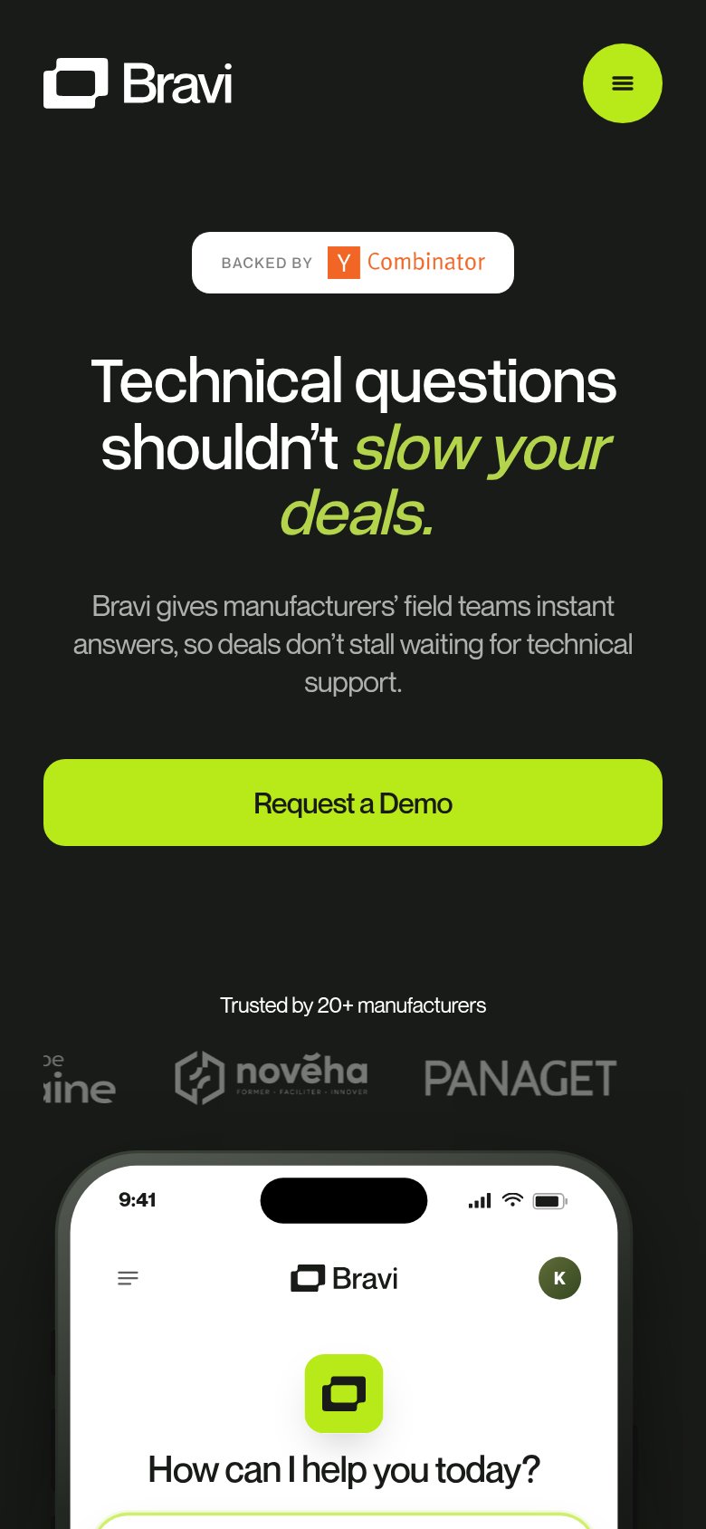
86StrongThe phone experience as a first-class citizen.
What works
What to improve