
Your landing page’s weakest score is Information hierarchy.
How Aquant ranks
72Growth scoreupdated
category scores
category scoresShowHide
Information hierarchy
68FairDoes the design help or inhibit what the page is trying to say?
 123
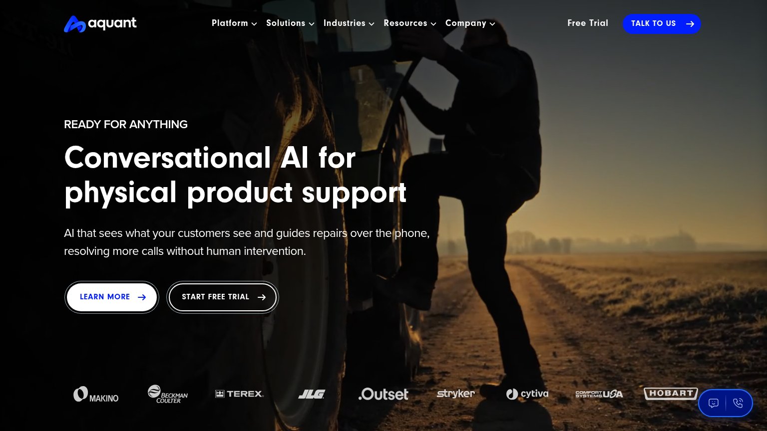
- Three equal-weight CTAs — LEARN MORE, START FREE TRIAL, and TALK TO US share visual weight, so no single primary action wins the one-second scan.
- Outlined hero buttons — Both hero CTAs are thin outlined pills on a dark photo — neither has the filled contrast a primary action needs.
- Five dropdown nav menus — Platform through Company dropdowns plus Free Trial create heavy exit density before the visitor reaches the hero pitch.
Trust
68FairProof that the product is real, competent, and safe to try.
| Trust read | |
|---|---|
| Aquant | Customer logo strip: Makino, Beckman Coulter, Terex, JLG, Outset, Stryker, Cytiva, Comfort Systems USA, Hobart |
| "Backed by Y Combinator" banner | |
| No visible trust signal identified. | |
| "TRUSTED BY THE WORLD'S LEADING DIGITAL INNOVATORS" logo band header | |
| No visible trust signal identified. |
CTA
72FairCopy, size, verb, cost-feel — does the primary CTA earn the click?
How Aquant compares
Recommended rewrites
Value props
76FairTitle, subtitle, hero — do they sell the product's true value?
Aquant’s headline
Conversational AI for physical product support
AI that sees what your customers see and guides repairs over the phone, resolving more calls without human intervention.
Working
Could improve
Mobile web
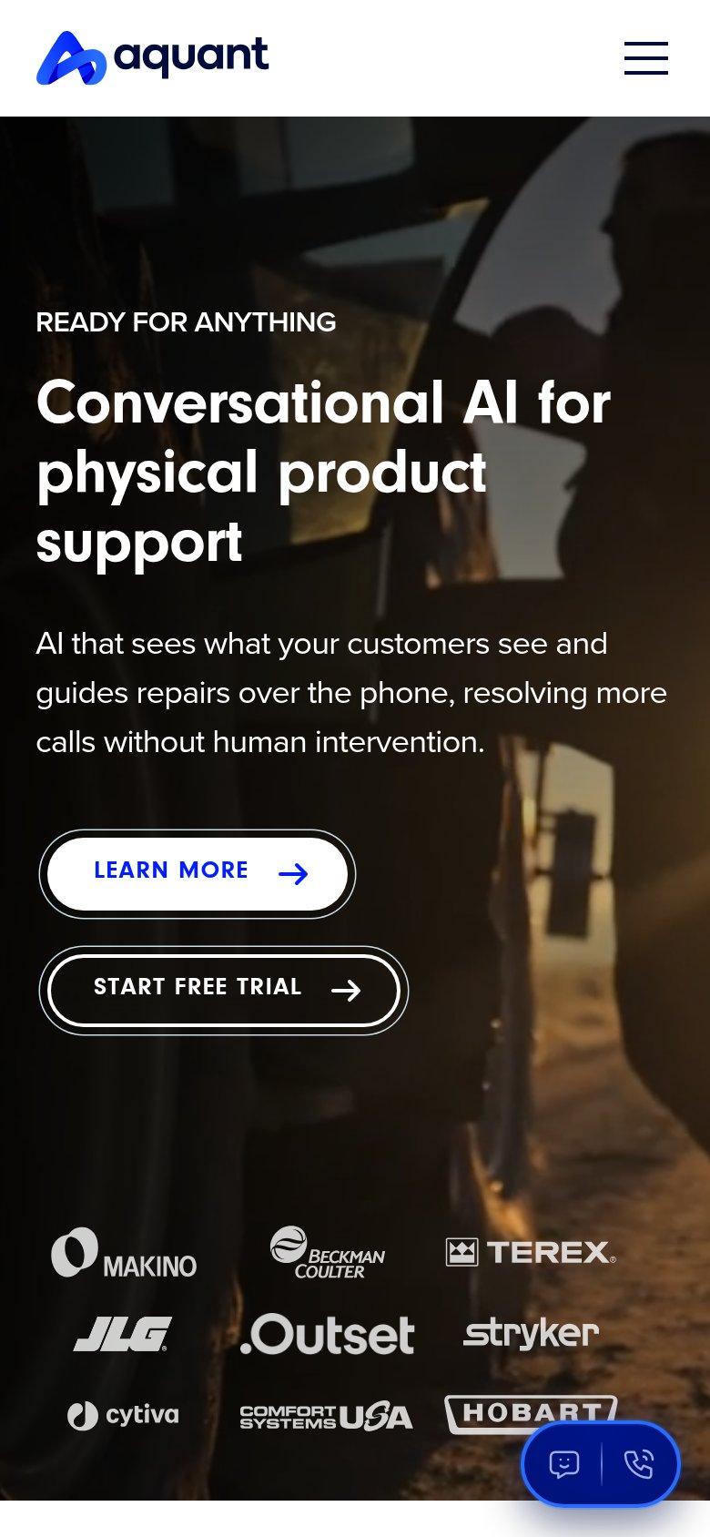
78FairThe phone experience as a first-class citizen.
What works
What to improve