
Your landing page’s weakest score is CTA.
How Tweeks.io ranks
80Growth scoreupdated
category scores
category scoresShowHide
CTA
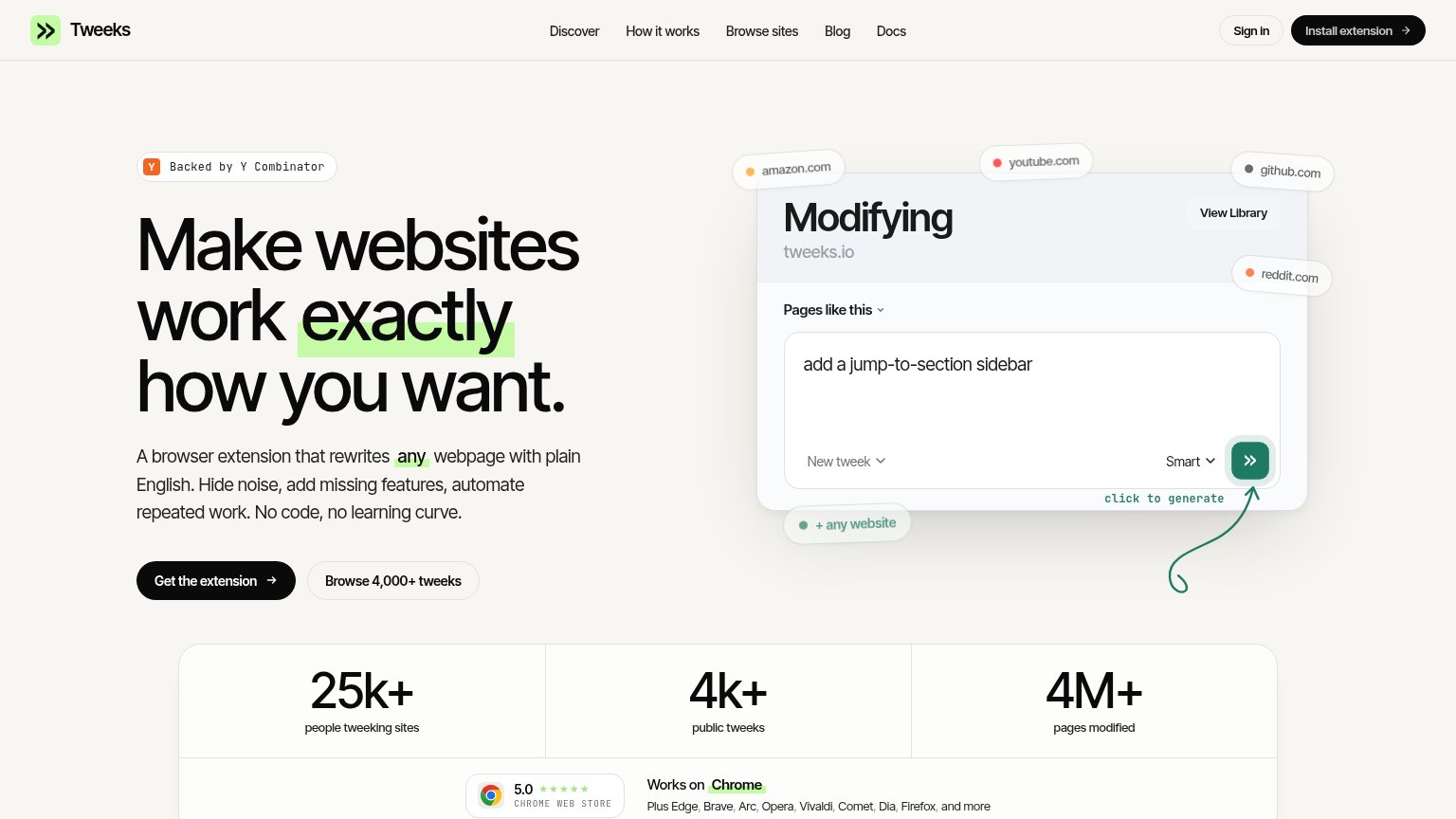
76FairCopy, size, verb, cost-feel — does the primary CTA earn the click?
Problems
- label differs from nav 'Install extension'
- no 'free' or price signal visible
- hero prompt box is a mock, not usable
Information hierarchy
78FairDoes the design help or inhibit what the page is trying to say?
1234- Five-link nav row — Discover, How it works, Browse sites, Blog, Docs give attention five exits before the visitor reaches the headline.
- Header Install extension button — Duplicates the hero CTA at equal visual weight, splitting the single-action focus of the fold.
- Browse 4,000+ tweeks button — Outlined secondary CTA sits shoulder-to-shoulder with the primary and routes visitors away from installing.
- Stats row creeping in — The 25k+/4k+/4M+ band is cropped mid-fold, adding a fourth competing beat before the CTA decision is made.
Trust
78FairProof that the product is real, competent, and safe to try.
How Tweeks.io compares
Trust read
Mobile web
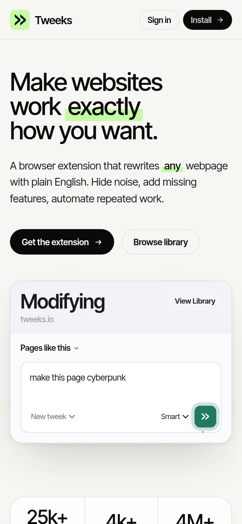
82StrongThe phone experience as a first-class citizen.
What works
What to improve
Value props
84StrongTitle, subtitle, hero — do they sell the product's true value?
Tweeks.io’s headline
Make websites work exactly how you want.
A browser extension that rewrites any webpage with plain English. Hide noise, add missing features, automate repeated work. No code, no learning curve.
Working
Could improve