
Your landing page’s weakest score is Trust.
How Trident ranks
75Growth scoreupdated
category scores
category scoresShowHide
Trust
48PoorProof that the product is real, competent, and safe to try.


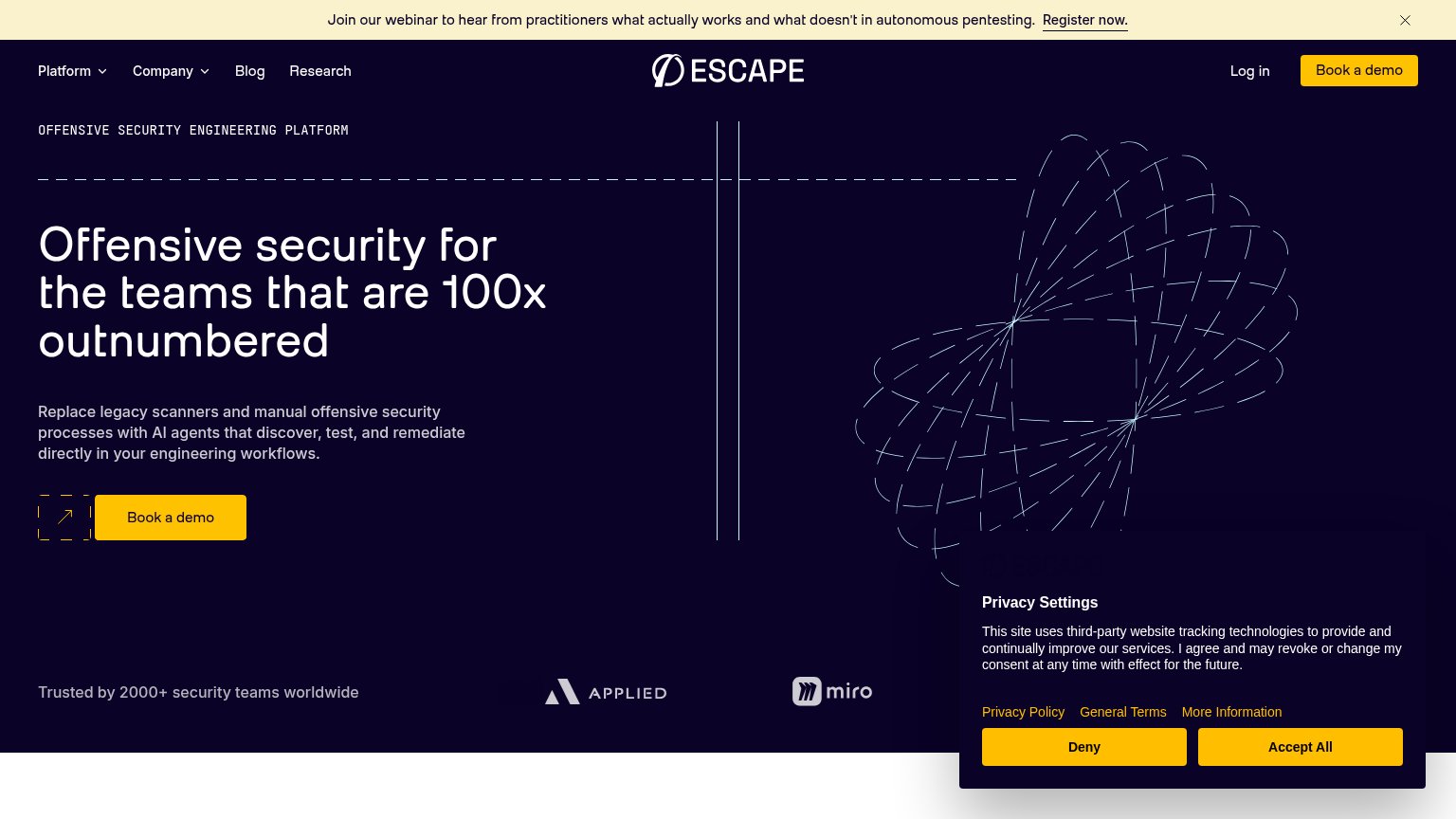

| Trust read | |
|---|---|
| Trident | "Backed by Y" (Y Combinator) badge above the headline |
| "150+ security teams trust XBOW to find and prove the flaws attackers would actually exploit" | |
| Product dashboard UI showing "Signals Received 148" and "5 Critical Findings" | |
| "Trusted by 2000+ security teams worldwide" with Applied and Miro logos | |
| G2 "4.8 out of 5" and Gartner "4.7 out of 5" star-rating badges above the headline |
Information hierarchy
78FairDoes the design help or inhibit what the page is trying to say?
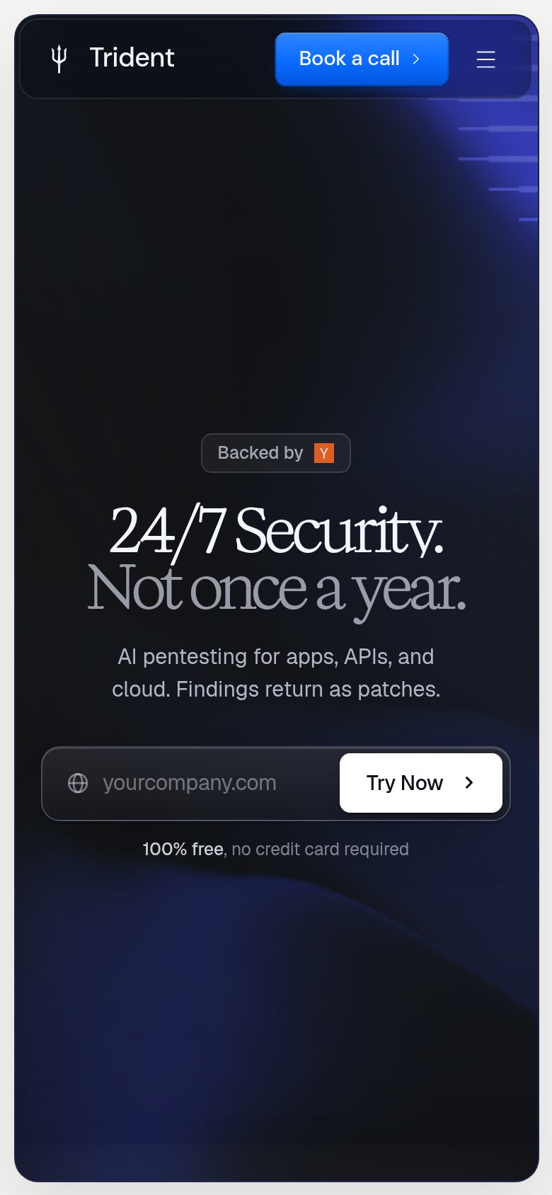
123- Book a call button — Blue nav button outweighs the fold's actual primary CTA, splitting the conversion path in two.
- Try Now button — White-on-dark input button reads secondary next to the brighter blue 'Book a call'; the primary action loses the one-second scan test.
- Floating code graphic — Faint UI-lines motif above the badge communicates nothing about pentesting and pulls the eye above the headline.
CTA
82StrongCopy, size, verb, cost-feel — does the primary CTA earn the click?
How Trident compares
Recommended rewrites
Value props
82StrongTitle, subtitle, hero — do they sell the product's true value?
Trident’s headline
24/7 Security. Not once a year.
AI pentesting for apps, APIs, and cloud. Findings return as patches.
Working
Could improve
Mobile web
86StrongThe phone experience as a first-class citizen.
What works
What to improve