
Your landing page’s weakest score is Trust.
How Escape ranks
Trust
58FairProof that the product is real, competent, and safe to try.

| Trust read | |
|---|---|
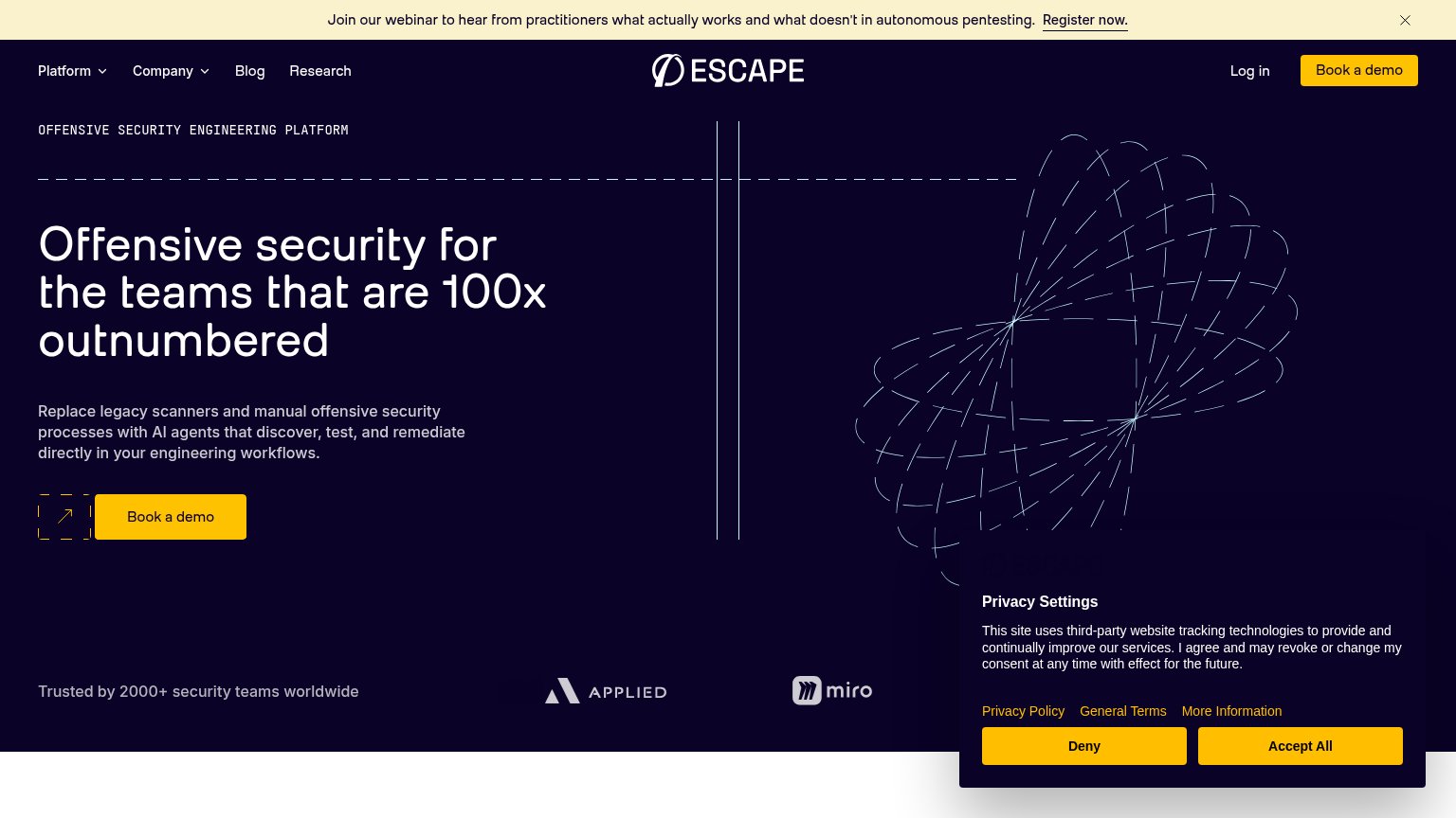
| Escape | "Trusted by 2000+ security teams worldwide" with Applied and Miro logos |
| "Backed by Y Combinator" badge above the hero headline | |
| "150+ security teams trust XBOW to find and prove the flaws attackers would actually exploit" | |
| Video player branded "HORIZON3 — AI-NATIVE PROACTIVE SECURITY" below the hero (visible in the mobile capture) | |
| Gartner Peer Insights Customers' Choice 2026 badge (mobile capture) | |
| Product dashboard UI showing "Signals Received 148" and "5 Critical Findings" |
Mobile web
58FairThe phone experience as a first-class citizen.
 123
- Privacy Settings panel — Consent wall covers the bottom third with yellow Deny/Accept buttons that mimic and outshout the primary CTA.
- Clipped webinar banner — Text is truncated mid-word and the Register now link is cut off-screen — the banner is broken at phone width.
- Half-width demo button — "Book a demo" floats at desktop proportions beside a decorative arrow box instead of a full-bleed thumb target.
CTA
66FairCopy, size, verb, cost-feel — does the primary CTA earn the click?
How Escape compares
Recommended rewrites
Information hierarchy
68FairDoes the design help or inhibit what the page is trying to say?
What works
What to improve
Value props
72FairTitle, subtitle, hero — do they sell the product's true value?
Escape’s headline
Offensive security for the teams that are 100x outnumbered
Replace legacy scanners and manual offensive security processes with AI agents that discover, test, and remediate directly in your engineering workflows.
Working
Could improve