
Your landing page’s weakest score is Mobile web.
How ToolJet ranks
68Growth scoreupdated
category scores
category scoresShowHide
Mobile web
54FairThe phone experience as a first-class citizen.
 12
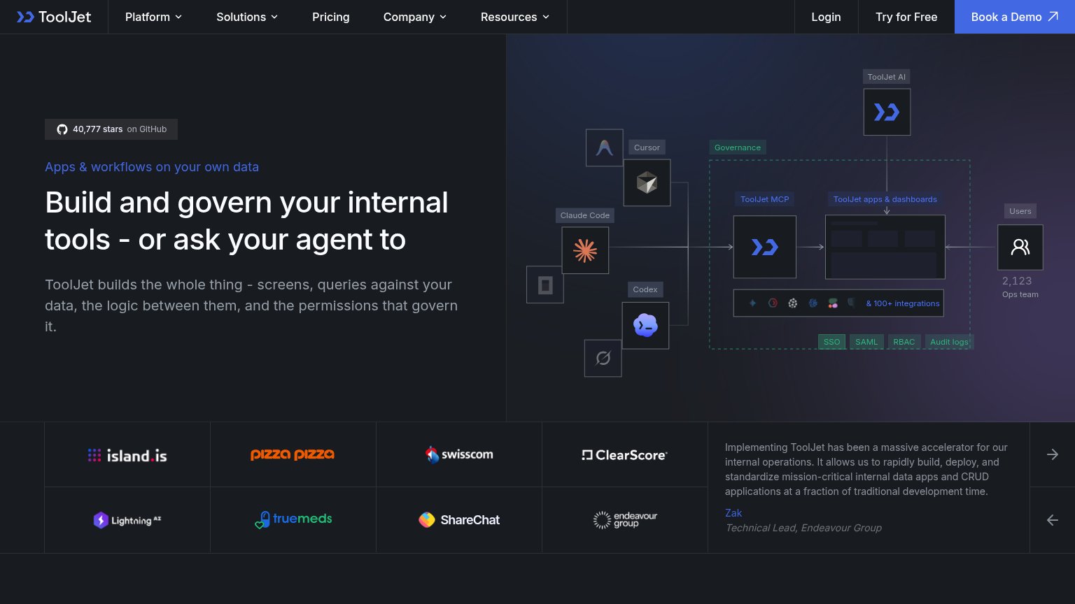
- Hamburger-only header — "Try for Free" and "Book a Demo" are buried behind the menu instead of exposed as a header button.
- Architecture diagram labels — Desktop-density tags like "SSO", "SAML", "RBAC" shrink to unreadable sizes on a phone screen.
Information hierarchy
62FairDoes the design help or inhibit what the page is trying to say?
 1234
- Three header CTAs — "Login", "Try for Free", and "Book a Demo" sit side by side at similar weight, splitting the primary action three ways.
- Logo carousel arrows — Carousel controls and a scrolling logo wall pull the eye into rotating content instead of toward a conversion action.
- Hero copy no CTA — The headline and subtext end with no button beneath them, forcing the scan path back up to the nav to act.
- Architecture diagram labels — Nine-plus small labeled nodes (Cursor, Codex, Governance, SSO, SAML, RBAC) compete at equal weight and read as a feature index.
CTA
62FairCopy, size, verb, cost-feel — does the primary CTA earn the click?
How ToolJet compares
Recommended rewrites
Value props
78FairTitle, subtitle, hero — do they sell the product's true value?
ToolJet’s headline
Build and govern your internal tools - or ask your agent to
ToolJet builds the whole thing - screens, queries against your data, the logic between them, and the permissions that govern it.
Working
Could improve
Trust
82StrongProof that the product is real, competent, and safe to try.
How ToolJet compares
Trust read