
Your landing page’s weakest score is Trust.
How Appsmith ranks
74Growth scoreupdated
category scores
category scoresShowHide
Trust
64FairProof that the product is real, competent, and safe to try.
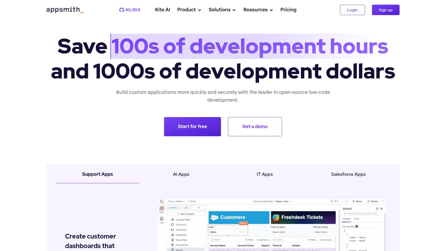
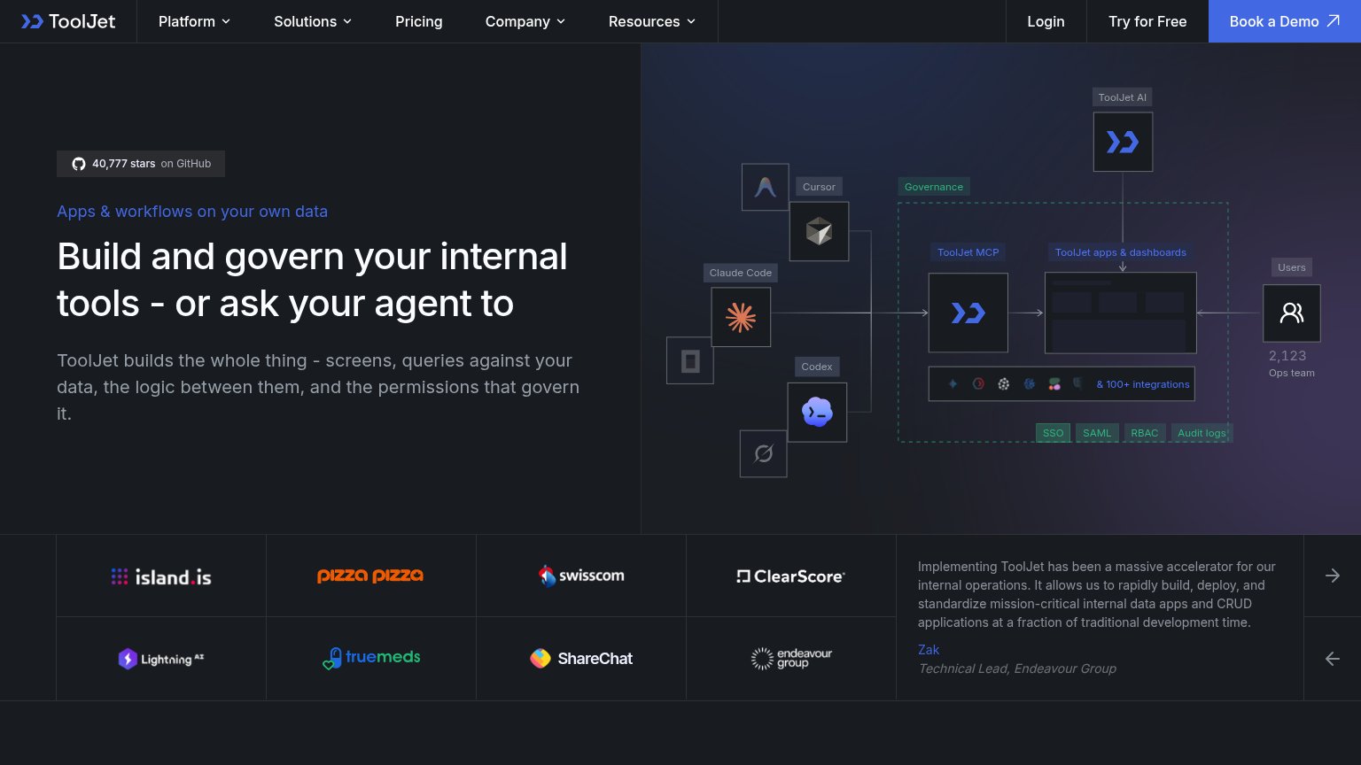
| Trust read | |
|---|---|
| Appsmith | GitHub star count "40,904" displayed in the header navigation |
| "Backed by Y Combinator" badge above the headline | |
| Customer logo wall on mobile: DoorDash, OpenAI, Pernod Ricard, Pfizer, Stripe, Unity, Philips | |
| GitHub "27.5K" star count in the navigation | |
| "40,777 stars on GitHub" badge above the hero headline |
Information hierarchy
72FairDoes the design help or inhibit what the page is trying to say?
1234- Get a demo button — Same size and adjacent placement as 'Start for free' splits the click decision at equal visual weight.
- Highlighted headline phrase — The purple highlight box on '100s of development hours' fragments the headline into two competing visual blocks.
- Header nav row — Nine interactive targets (three dropdowns, GitHub counter, Login, Sign up) leak attention before the hero CTA.
- App category tabs — Four equal-weight tabs enter the fold and start a second decision before the hero CTA is resolved.
Mobile web
72FairThe phone experience as a first-class citizen.
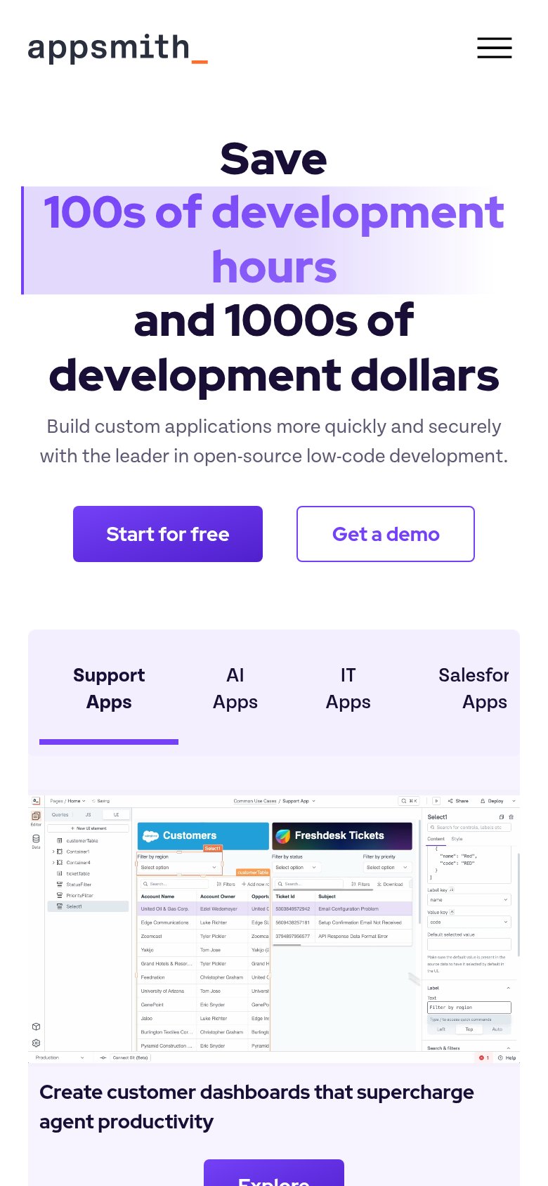
What works
What to improve
Value props
76FairTitle, subtitle, hero — do they sell the product's true value?
Appsmith’s headline
Save 100s of development hours and 1000s of development dollars
Build custom applications more quickly and securely with the leader in open-source low-code development.
Working
Could improve
CTA
86StrongCopy, size, verb, cost-feel — does the primary CTA earn the click?
How Appsmith compares
Recommended rewrites