
Your landing page’s weakest score is Trust.
How Budibase ranks
Trust
62FairProof that the product is real, competent, and safe to try.

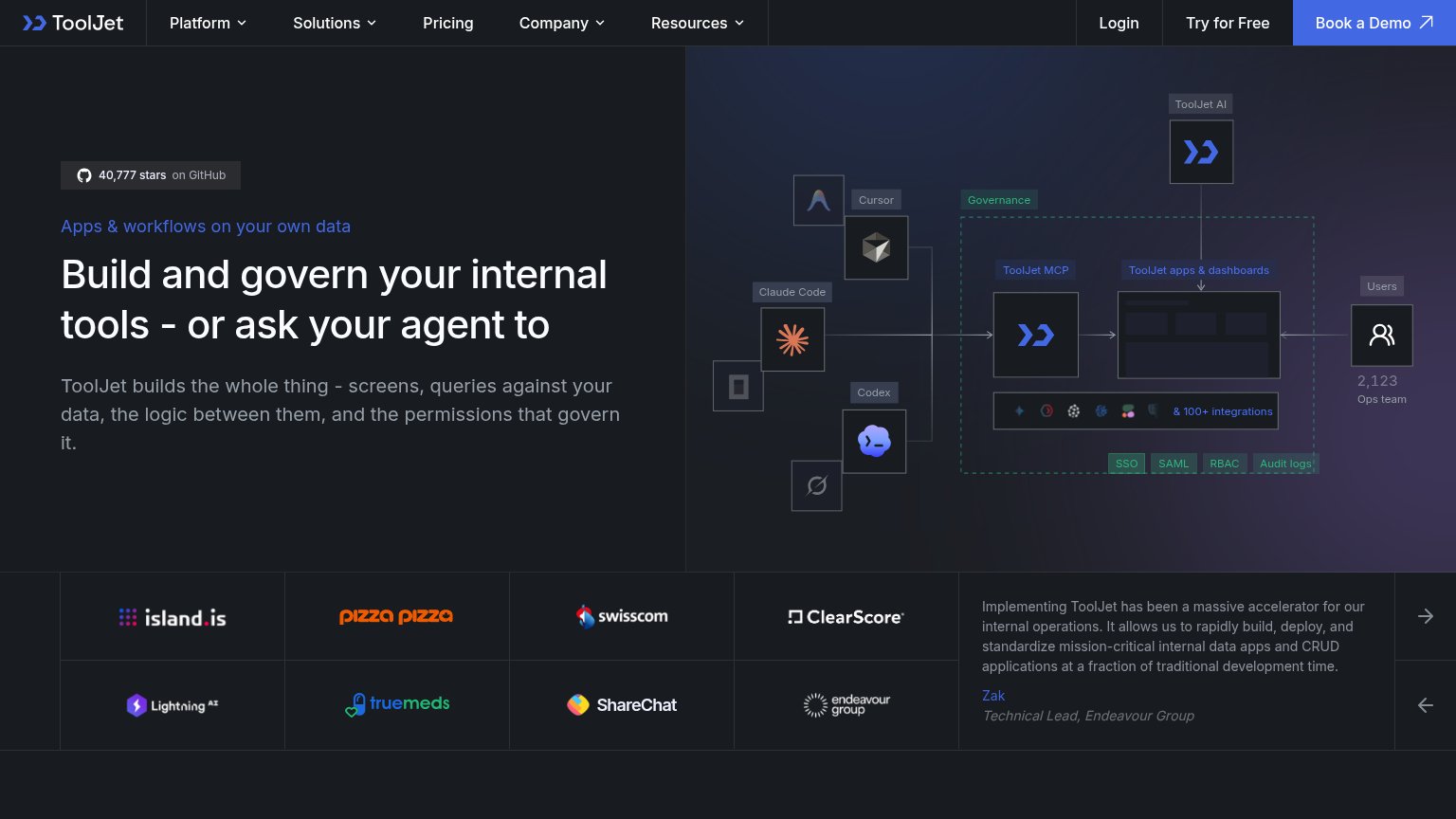

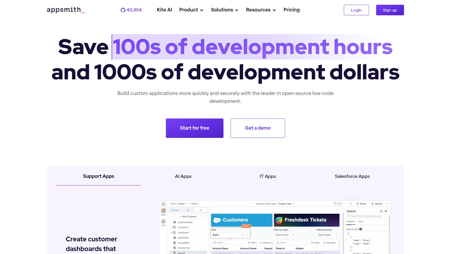
| Trust read | |
|---|---|
| Budibase | GitHub "27.5K" star count in the navigation |
| "Backed by Y Combinator" badge above the headline | |
| Customer logo wall on mobile: DoorDash, OpenAI, Pernod Ricard, Pfizer, Stripe, Unity, Philips | |
| GitHub star count "40,904" displayed in the header navigation | |
| "40,777 stars on GitHub" badge above the hero headline |
Mobile web
62FairThe phone experience as a first-class citizen.
 123
- Cookie consent dialog — Dead blocker dims the page and covers ~45% of the fold with three stacked consent buttons before any action is possible.
- Five-line serif headline — Desktop-scale display type wraps into five cramped lines, pushing the CTA pair to the bottom edge of the fold.
- Try it free button — Desktop-proportioned pill shares a row with Contact sales instead of being a full-width thumb target.
Information hierarchy
72FairDoes the design help or inhibit what the page is trying to say?
What works
What to improve
Value props
78FairTitle, subtitle, hero — do they sell the product's true value?
Budibase’s headline
Save weeks building agents, apps, and automations
Automate workflows, handle requests, build internal tools, and connect your business systems - with your own data, LLMs, and APIs.
Working
Could improve
CTA
86StrongCopy, size, verb, cost-feel — does the primary CTA earn the click?
How Budibase compares
Recommended rewrites