
Your landing page’s weakest score is Trust.
How Tolmo ranks
68Growth scoreupdated
category scores
category scoresShowHide
Trust
58FairProof that the product is real, competent, and safe to try.
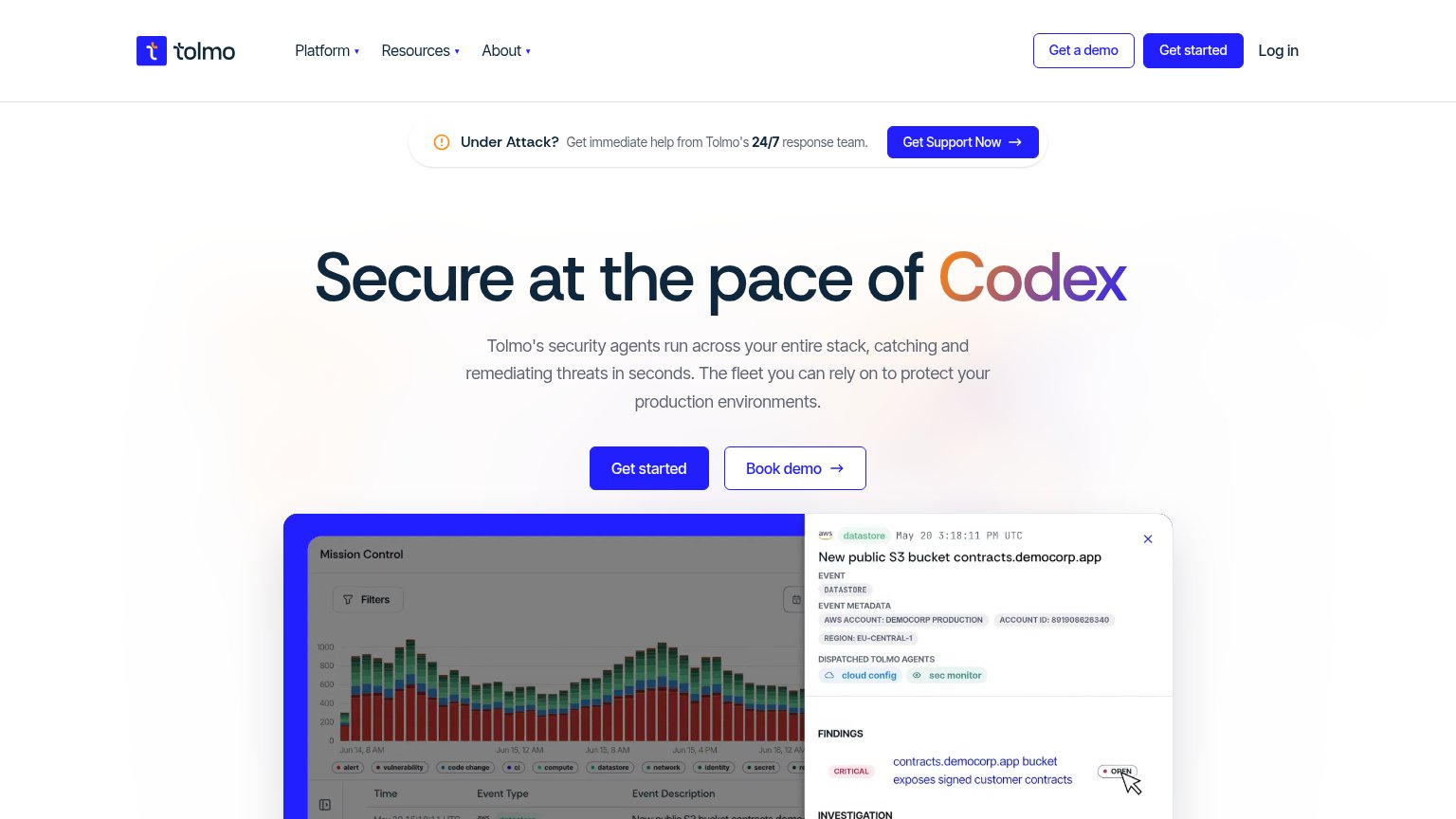
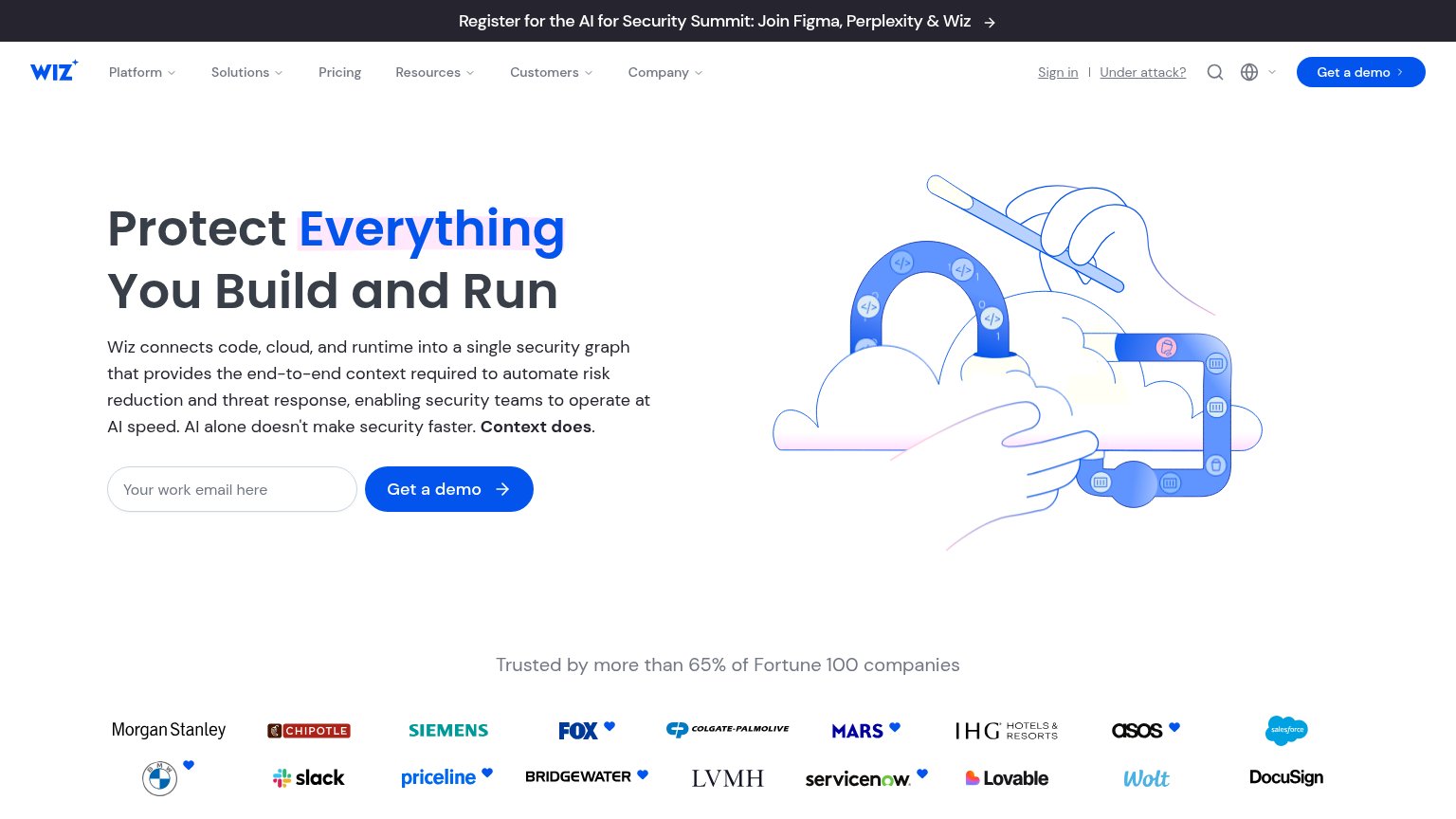
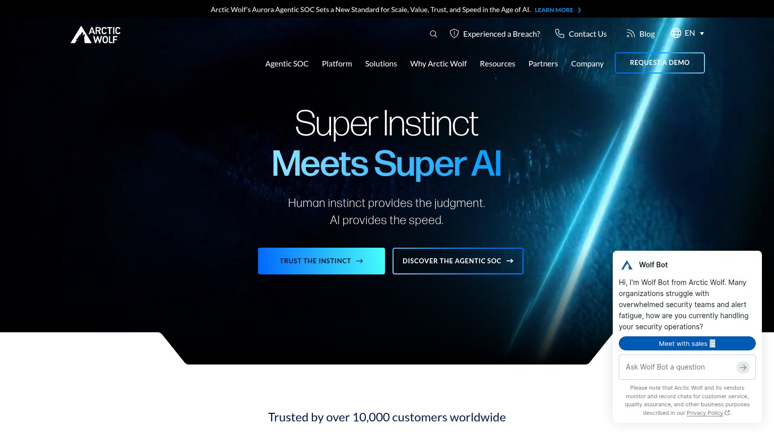
| Trust read | |
|---|---|
| Tolmo | Detailed Mission Control product UI showing a real alert: "New public S3 bucket contracts.democorp.app" with AWS event m |
| "Trusted by more than 65% of Fortune 100 companies" above a logo wall including Morgan Stanley, Siemens, Salesforce, Ser | |
| implicit context Orca Security may benefit from pre-existing familiarity among its target audience. | |
| Interactive "Estimate Your Real Cloud Risk" widget with "Takes 30 seconds. Your score, no email needed." | |
| "LATEST ANALYST RECOGNITION" button implying third-party analyst validation | |
| "Trusted by over 10,000 customers worldwide" |
Information hierarchy
68FairDoes the design help or inhibit what the page is trying to say?
1234- Under Attack banner — Emergency banner with 'Get Support Now' button outranks the hero and is the first CTA visitors scan.
- Duplicate header CTAs — 'Get a demo' and 'Get started' sit side by side at near-equal weight, duplicating both hero buttons and splitting the click.
- Headline 'Codex' reference — The gradient word 'Codex' gets the strongest visual emphasis on the page but names another product, not Tolmo's value.
- Book demo button — Outlined 'Book demo' sits at nearly the same size as 'Get started', diluting the single primary action.
Mobile web
68FairThe phone experience as a first-class citizen.
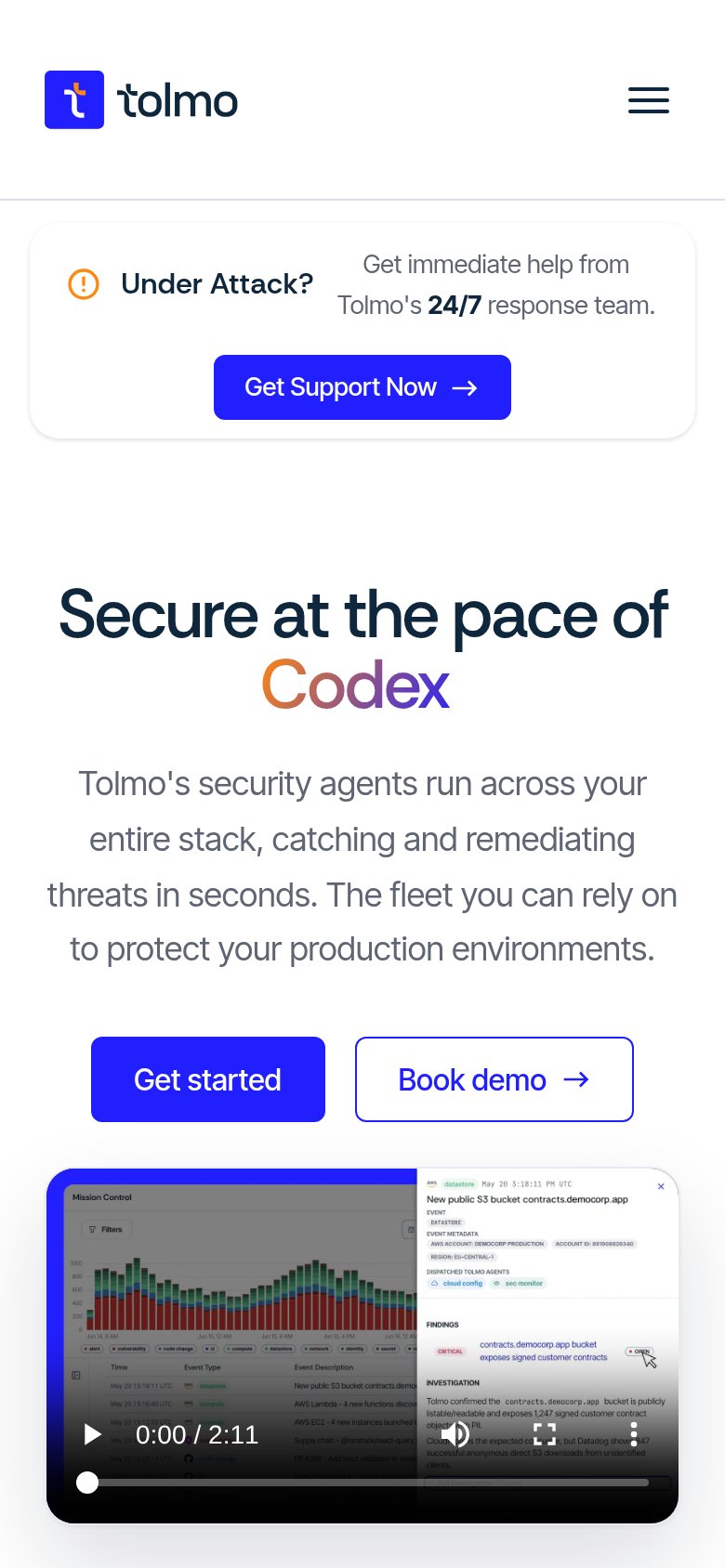
What works
What to improve
CTA
72FairCopy, size, verb, cost-feel — does the primary CTA earn the click?
How Tolmo compares
Recommended rewrites
Value props
72FairTitle, subtitle, hero — do they sell the product's true value?
Tolmo’s headline
Secure at the pace of Codex
Tolmo's security agents run across your entire stack, catching and remediating threats in seconds. The fleet you can rely on to protect your production environments.
Working
Could improve