
Your landing page’s weakest score is Mobile web.
How Togal.AI ranks
Mobile web
58FairThe phone experience as a first-class citizen.
 1234
- Book a Demo button — Primary CTA sits ~1050px down, pushed out of the first viewport by the oversized headline and paragraph.
- Hero headline — Desktop-scale headline wraps into three tall lines and consumes nearly a third of the mobile viewport.
- Announcement banner — Two-line promo bar stacks under the header and eats hero space before any value statement appears.
- Chat bubble overlay — Large chat widget overlaps the product video thumbnail, adding a dead blocker near tappable content.
Trust
62FairProof that the product is real, competent, and safe to try.
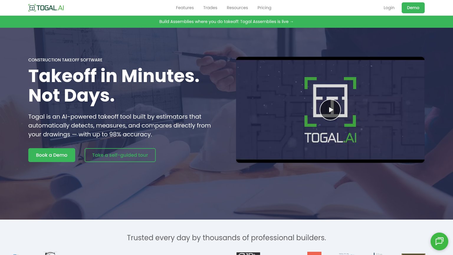
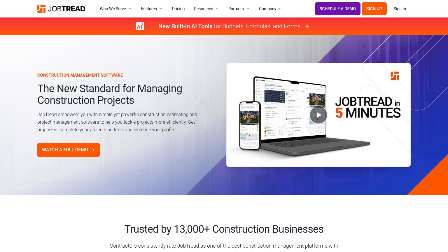
| Trust read | |
|---|---|
| Togal.AI | "Trusted every day by thousands of professional builders." strip above the customer logo row |
| Customer logo strip (Energize Builders, Kash, MDRN Construction, NA Design Builders, Pacific Crest, Danbuilt) at the bot | |
| implicit context Houzz Pro may benefit from pre-existing familiarity among its target audience. | |
| Trusted by 13,000+ Construction Businesses | |
| "A Buildertrend Company" logo lockup in the header | |
| Product UI screenshot of estimate "Bathroom Remodel - Full Gut" showing "63 items from 3 catalogs" with itemized line it |
CTA
72FairCopy, size, verb, cost-feel — does the primary CTA earn the click?
How Togal.AI compares
Recommended rewrites
Information hierarchy
78FairDoes the design help or inhibit what the page is trying to say?
What works
What to improve
Value props
86StrongTitle, subtitle, hero — do they sell the product's true value?
Togal.AI’s headline
Takeoff in Minutes. Not Days.
Togal is an AI-powered takeoff tool built by estimators that automatically detects, measures, and compares directly from your drawings — with up to 98% accuracy.
Working
Could improve