
Your landing page’s weakest score is Trust.
How Handoff ranks
76Growth scoreupdated
category scores
category scoresShowHide
Trust
55FairProof that the product is real, competent, and safe to try.
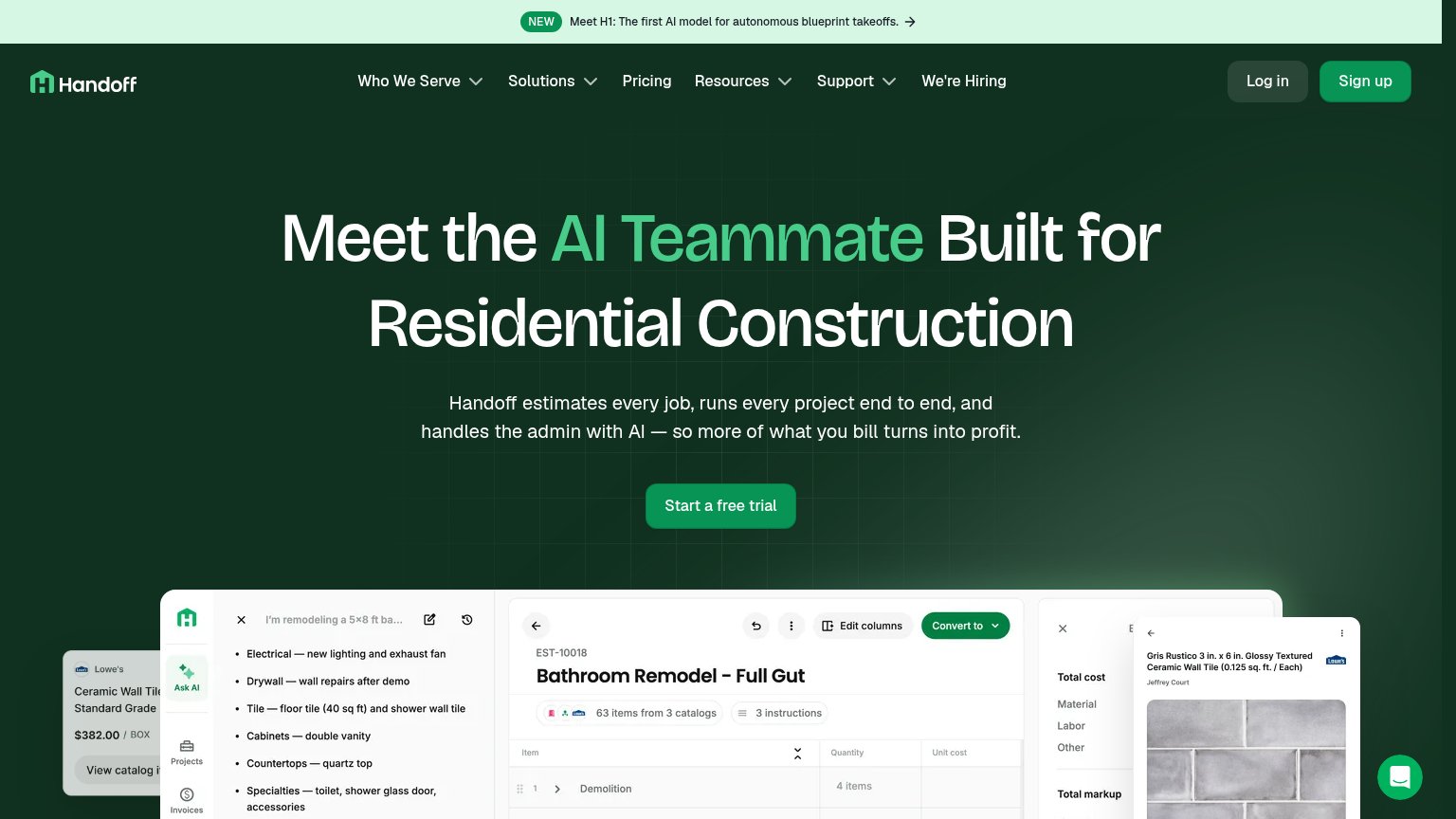
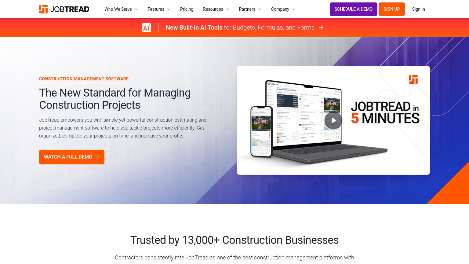
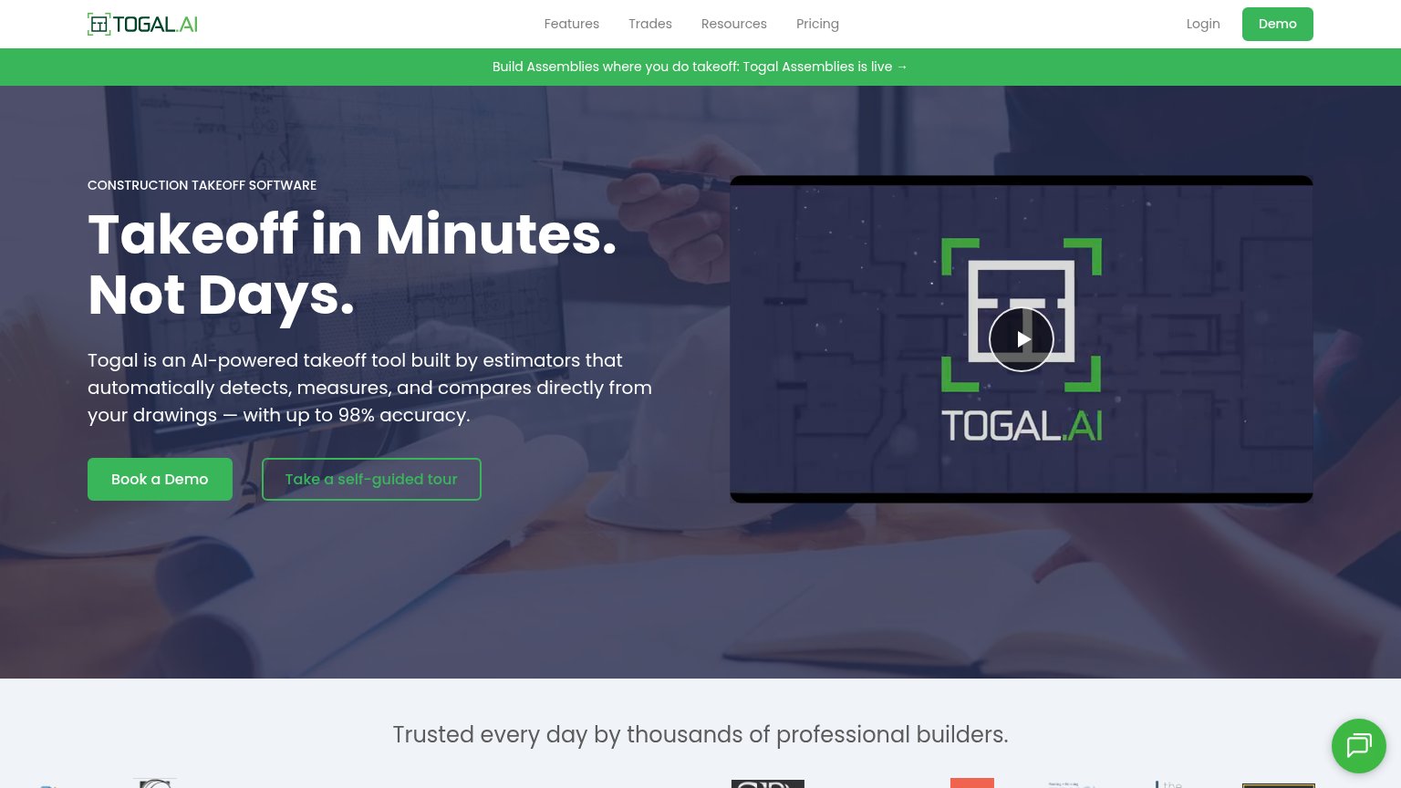

| Trust read | |
|---|---|
| Handoff | Product UI screenshot of estimate "Bathroom Remodel - Full Gut" showing "63 items from 3 catalogs" with itemized line it |
| Customer logo strip (Energize Builders, Kash, MDRN Construction, NA Design Builders, Pacific Crest, Danbuilt) at the bot | |
| implicit context Houzz Pro may benefit from pre-existing familiarity among its target audience. | |
| Trusted by 13,000+ Construction Businesses | |
| "A Buildertrend Company" logo lockup in the header | |
| "Trusted every day by thousands of professional builders." strip above the customer logo row |
Information hierarchy
79FairDoes the design help or inhibit what the page is trying to say?
123- Announcement banner — Brightest element on the page; its arrow link is the first exit visitors see before the headline.
- Sign up button — Styled in the same solid green weight as the hero CTA, splitting the primary action into two targets.
- Primary navigation row — Seven items with dropdowns plus Log in stack eight exit paths above the fold, diluting the single conversion path.
Value props
80StrongTitle, subtitle, hero — do they sell the product's true value?
Handoff’s headline
Meet the AI Teammate Built for Residential Construction
Handoff estimates every job, runs every project end to end, and handles the admin with AI — so more of what you bill turns into profit.
Working
Could improve
CTA
82StrongCopy, size, verb, cost-feel — does the primary CTA earn the click?
How Handoff compares
Recommended rewrites
Mobile web
86StrongThe phone experience as a first-class citizen.
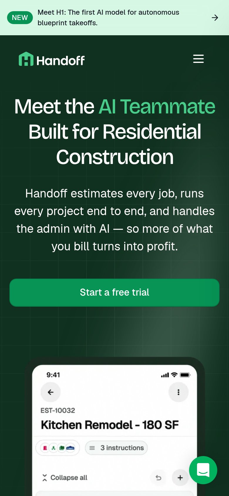
What works
What to improve