
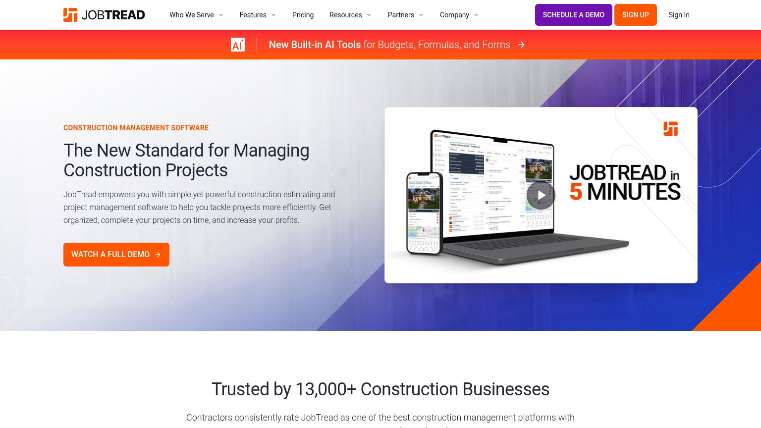
Your landing page’s weakest score is Information hierarchy.
How JobTread ranks
67Growth scoreupdated
category scores
category scoresShowHide
Information hierarchy
64FairDoes the design help or inhibit what the page is trying to say?
 123
- Three header CTAs — "SCHEDULE A DEMO", "SIGN UP", and "Sign In" compete at similar weight with the hero's "WATCH A FULL DEMO", splitting the primary action four ways.
- AI announcement banner — Full-width red banner with its own arrow link sits between nav and hero, pulling first attention to a secondary destination before the headline is read.
- Six-item dropdown nav — Five dropdown menus plus Pricing open dozens of exit paths above the fold, all before the visitor reaches the conversion action.
Mobile web
64FairThe phone experience as a first-class citizen.
 123
- Watch Full Demo CTA — Primary CTA sits far below the first viewport, after the headline, paragraph, and video card — invisible on landing.
- AI tools promo banner — Two-line orange announcement bar eats ~140px of the first mobile viewport before the hero even starts.
- Hero body paragraph — Seven-line paragraph of desktop copy stacks the fold with text and pushes the video and CTA down the page.
Trust
68FairProof that the product is real, competent, and safe to try.
How JobTread compares
Trust read
CTA
70FairCopy, size, verb, cost-feel — does the primary CTA earn the click?
How JobTread compares
Recommended rewrites
Value props
70FairTitle, subtitle, hero — do they sell the product's true value?
JobTread’s headline
The New Standard for Managing Construction Projects
JobTread empowers you with simple yet powerful construction estimating and project management software to help you tackle projects more efficiently. Get organized, complete your projects on time, and increase your profits.
Working
Could improve