
Your landing page’s weakest score is Value props.
How tl;dv ranks
78Growth scoreupdated
category scores
category scoresShowHide
Value props
76FairTitle, subtitle, hero — do they sell the product's true value?
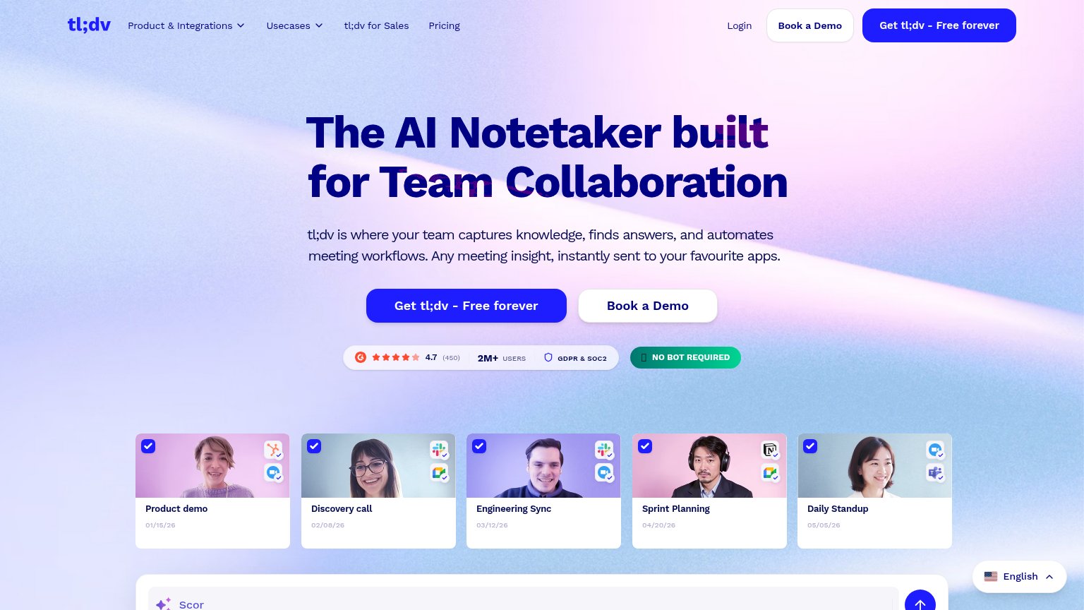
tl;dv’s headline sells
The AI Notetaker built for Team Collaboration
tl;dv is where your team captures knowledge, finds answers, and automates meeting workflows. Any meeting insight, instantly sent to your favourite apps.
Working
- Category + differentiator in one line
- Strong proof: 4.7 G2, 2M+ users, SOC2
- 'No bot required' kills top objection
Could improve
- Triad verbs read generic, low emotion
- 'Favourite apps' vague — name them
- No time-saved or outcome number
Information hierarchy
78FairDoes the design help or inhibit what the page is trying to say?
 1234
- Book a Demo button — White pill styled near-equal weight to the primary CTA — and duplicated in the nav — splits the fold's one action into two.
- Truncated search bar — AI-search input clipped mid-word at 'Scor' by the fold, reading as a broken element rather than a feature.
- Crowded nav row — Two dropdowns plus Sales, Pricing, Login and two CTAs give attention seven exits before the hero argument lands.
- Headline overlapping doodles — Dotted line-art crosses through 'built' and 'Team', muddying the largest words on the page.
CTA
78FairCopy, size, verb, cost-feel — does the primary CTA earn the click?
How tl;dv compares
Recommended rewrites
Trust
78FairProof that the product is real, competent, and safe to try.
How tl;dv compares
Trust read
Mobile web
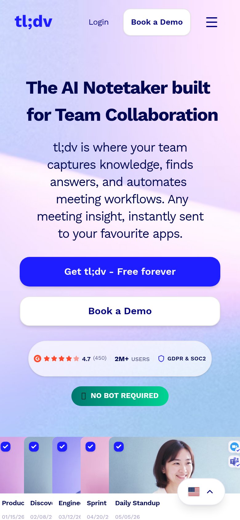
82StrongThe phone experience as a first-class citizen.
What works
What to improve