
Your landing page’s weakest score is Value props.
How Otter.ai ranks
77Growth scoreupdated
category scores
category scoresShowHide
Value props
70FairTitle, subtitle, hero — do they sell the product's true value?
Otter.ai’s headline undersells
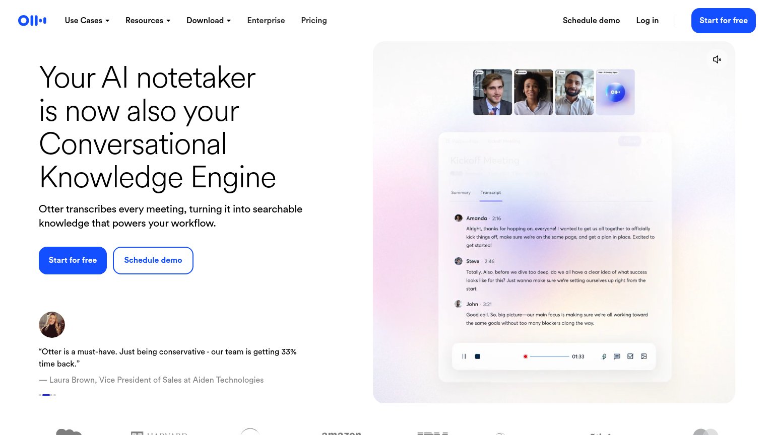
Your AI notetaker is now also your Conversational Knowledge Engine
Otter transcribes every meeting, turning it into searchable knowledge that powers your workflow.
Working
- Subhead names mechanism and outcome plainly
- Hero shows real transcript, not decoration
- Testimonial cites 33% time back
Could improve
- "Conversational Knowledge Engine" is jargon
- Headline assumes prior Otter familiarity
- No numbers or emotion in headline itself
Information hierarchy
76FairDoes the design help or inhibit what the page is trying to say?
 123
- Duplicate CTA pair — "Start for free" appears twice (nav and hero) alongside "Schedule demo" twice, splitting the fold's action weight four ways.
- Nav link row — Six nav items plus "Log in" and "Schedule demo" give attention eight exits before the hero CTA is reached.
- Faded product UI — The washed-out top of the product screenshot (breadcrumb, Share button) is illegible, weakening the demo the visual is supposed to carry.
Trust
76FairProof that the product is real, competent, and safe to try.
How Otter.ai compares
Trust read
Mobile web
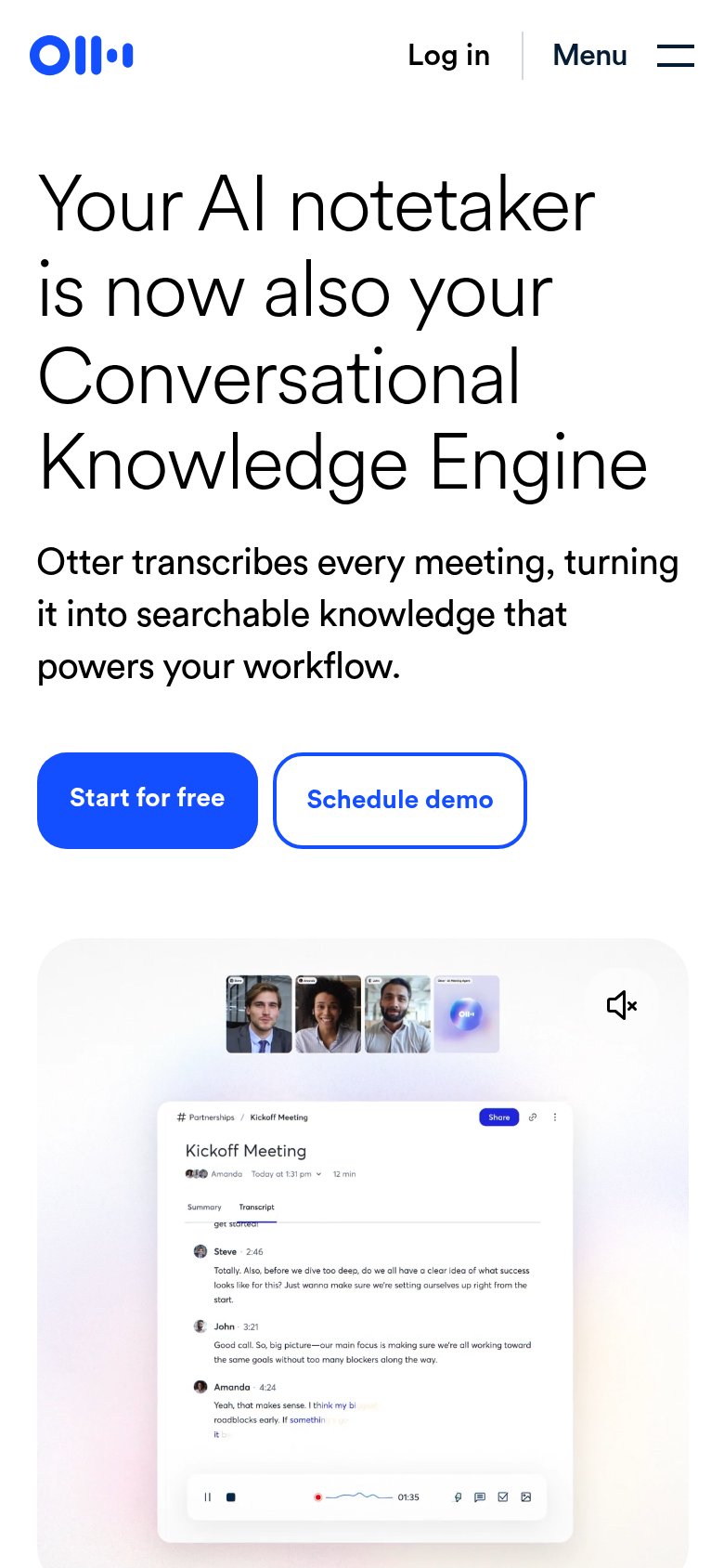
78FairThe phone experience as a first-class citizen.
What works
What to improve
CTA
86StrongCopy, size, verb, cost-feel — does the primary CTA earn the click?
How Otter.ai compares
Recommended rewrites