
Your landing page’s weakest score is CTA.
How Vision Lab ranks
CTA
32PoorCopy, size, verb, cost-feel — does the primary CTA earn the click?


Problems
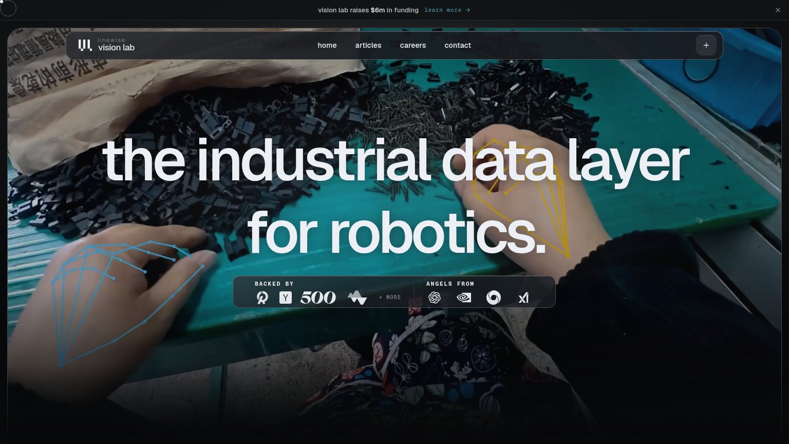
- no CTA in hero at all
- unlabeled '+' icon is only affordance
- banner 'learn more' outshines product
- mobile fold also has no action
Mobile web
48PoorThe phone experience as a first-class citizen.
 123
- Investor proof card — Occupies the prime CTA slot; no action button exists anywhere in the fold.
- Funding announcement bar — Sticky promo strip with no conversion CTA burns the top of the viewport.
- Unlabeled + toggle — Cryptic plus icon is the only nav affordance; visitors can't guess it opens the menu.
Information hierarchy
58FairDoes the design help or inhibit what the page is trying to say?
What works
What to improve
Value props
58FairTitle, subtitle, hero — do they sell the product's true value?
Vision Lab’s headline
the industrial data layer for robotics.
Working
Could improve
Trust
66FairProof that the product is real, competent, and safe to try.
How Vision Lab compares
Trust read