
Your landing page’s weakest score is CTA.
How The Tie (Prediction Markets Data) ranks
- 1.
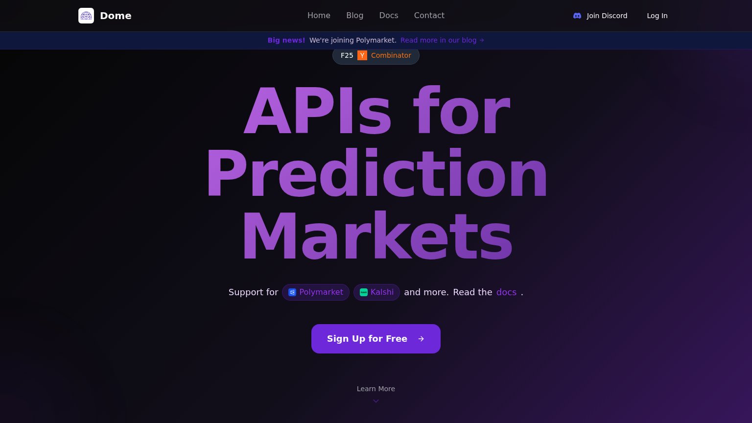
Dome72
- 2.
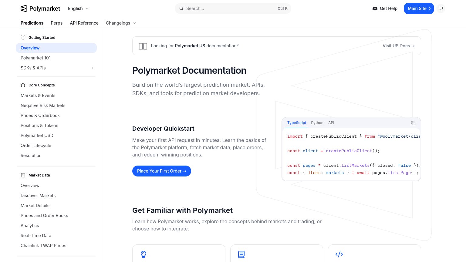
Polymarket CLOB API (Polymarket Developers)68
- 3.
The Tie (Prediction Markets Data)60
- 4.
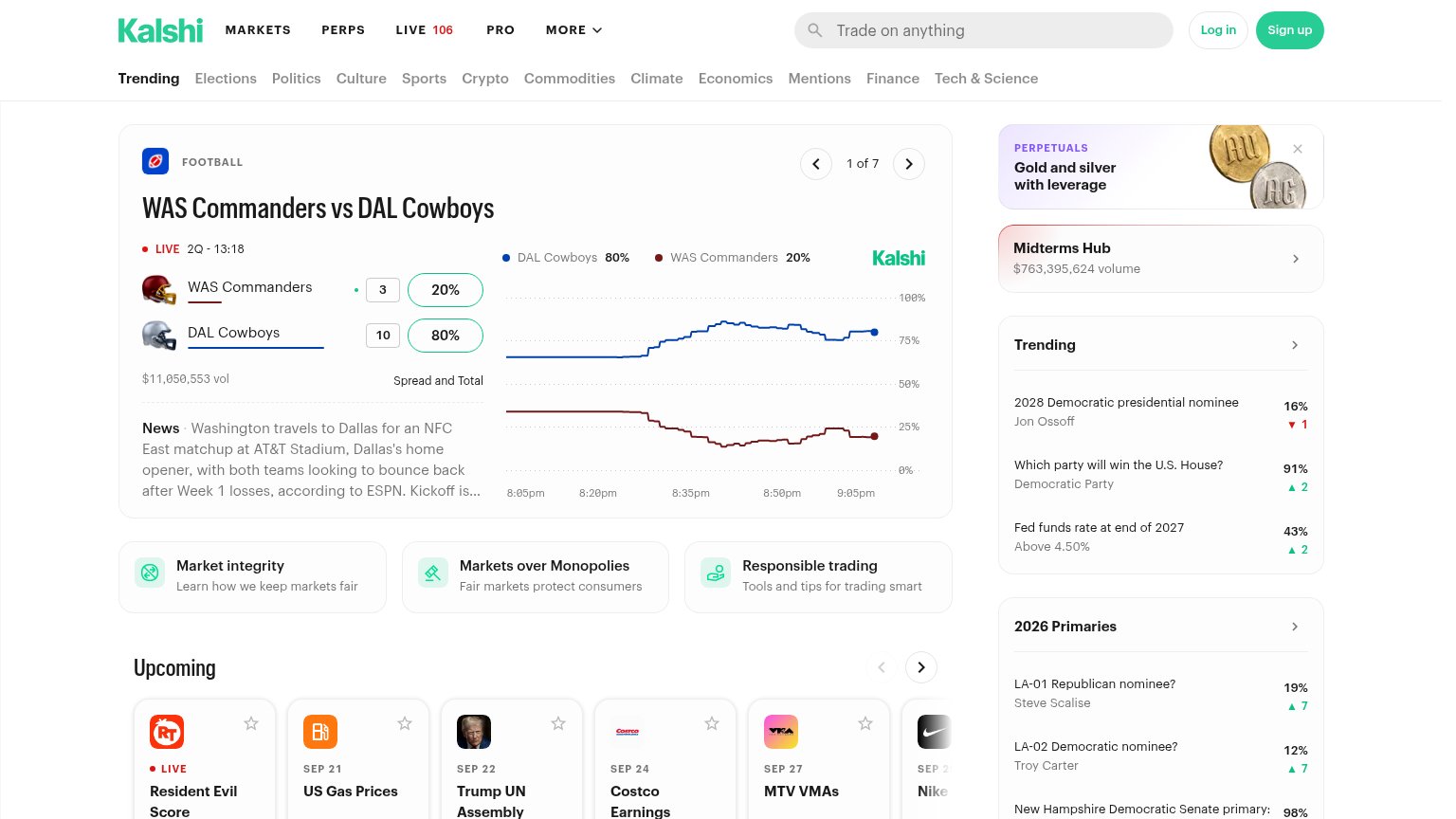
Kalshi API60
- 5.
PredictIt API (via Predictit data)60
60Growth scoreupdated
category scores
category scoresShowHide
CTA
54FairCopy, size, verb, cost-feel — does the primary CTA earn the click?
Problems
- no action verb — reads as a label
- sales-call framing feels costly
- low visual contrast on desktop
- no value promised for the click
Information hierarchy
58FairDoes the design help or inhibit what the page is trying to say?
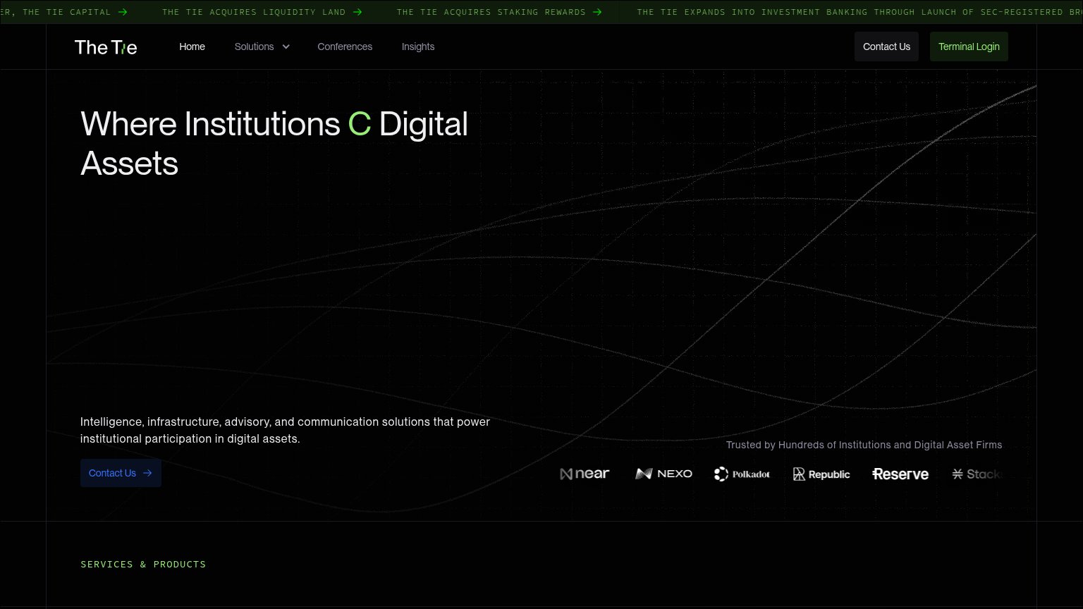
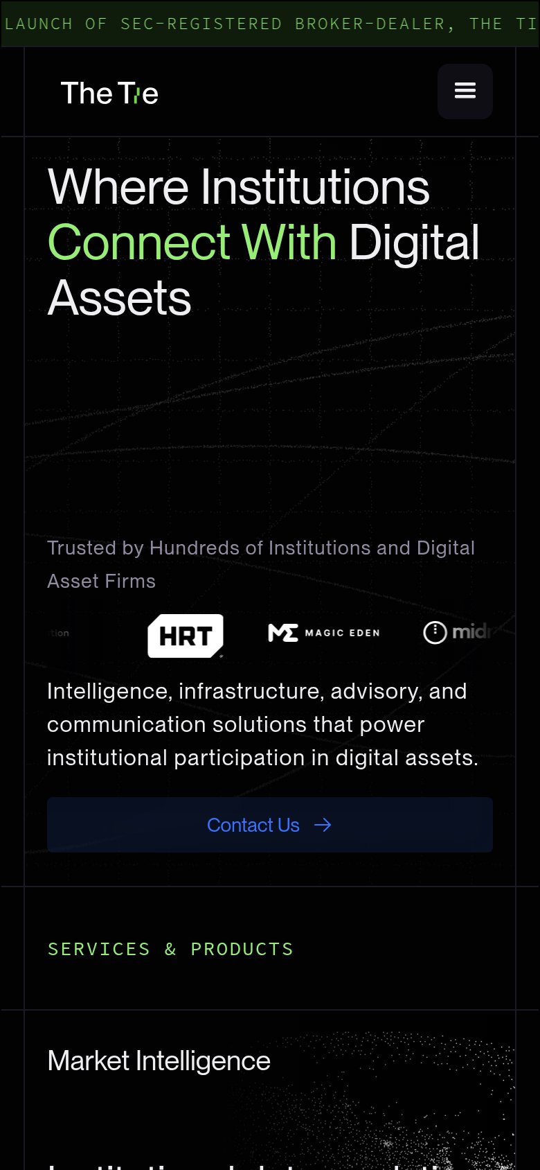
1234- Clipped hero headline — Reads "Where Institutions C Digital Assets" — the animated "Connect With" is missing, so the core promise is broken text.
- Hero Contact Us CTA — Small, dark-blue on black with weak contrast, stranded 450px below the headline outside the scan path.
- News ticker banner — Four scrolling green arrow links above the nav pull attention and add exits before the value prop registers.
- Header Contact Us button — Duplicates the hero CTA at equal weight beside Terminal Login, splitting the single conversion path.
Value props
58FairTitle, subtitle, hero — do they sell the product's true value?
The Tie (Prediction Markets Data)’s headline
Where Institutions Connect With Digital Assets
Intelligence, infrastructure, advisory, and communication solutions that power institutional participation in digital assets.
Working
Could improve
Mobile web
64FairThe phone experience as a first-class citizen.
What works
What to improve
Trust
68FairProof that the product is real, competent, and safe to try.
How The Tie (Prediction Markets Data) compares
Trust read