
Your landing page’s weakest score is Trust.
How Tegore ranks
Trust
48PoorProof that the product is real, competent, and safe to try.
| Trust read | |
|---|---|
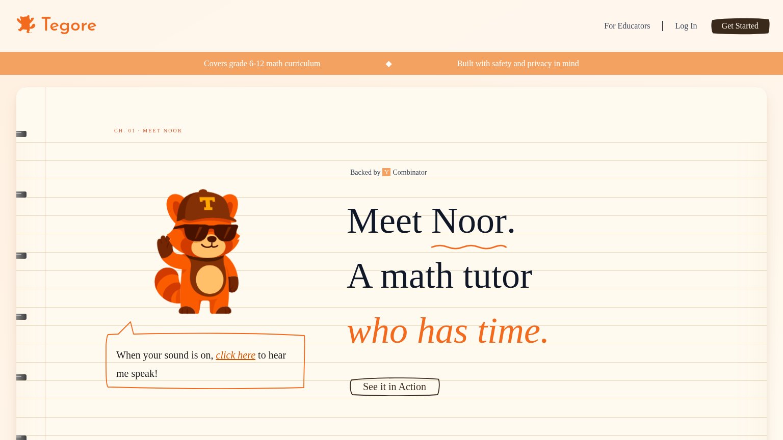
| Tegore | "Backed by Y Combinator" badge above the headline |
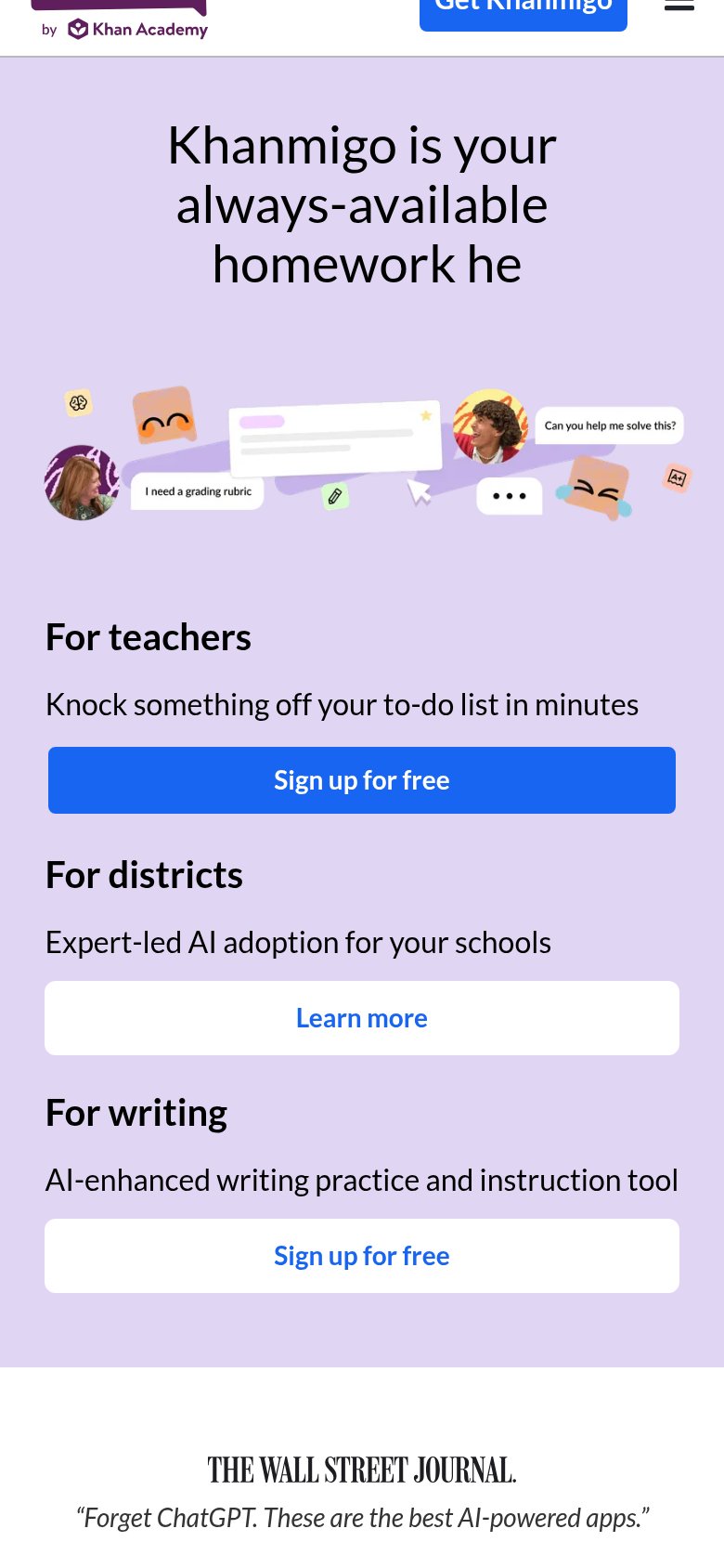
| Wall Street Journal quote: "Forget ChatGPT. These are the best AI-powered apps." | |
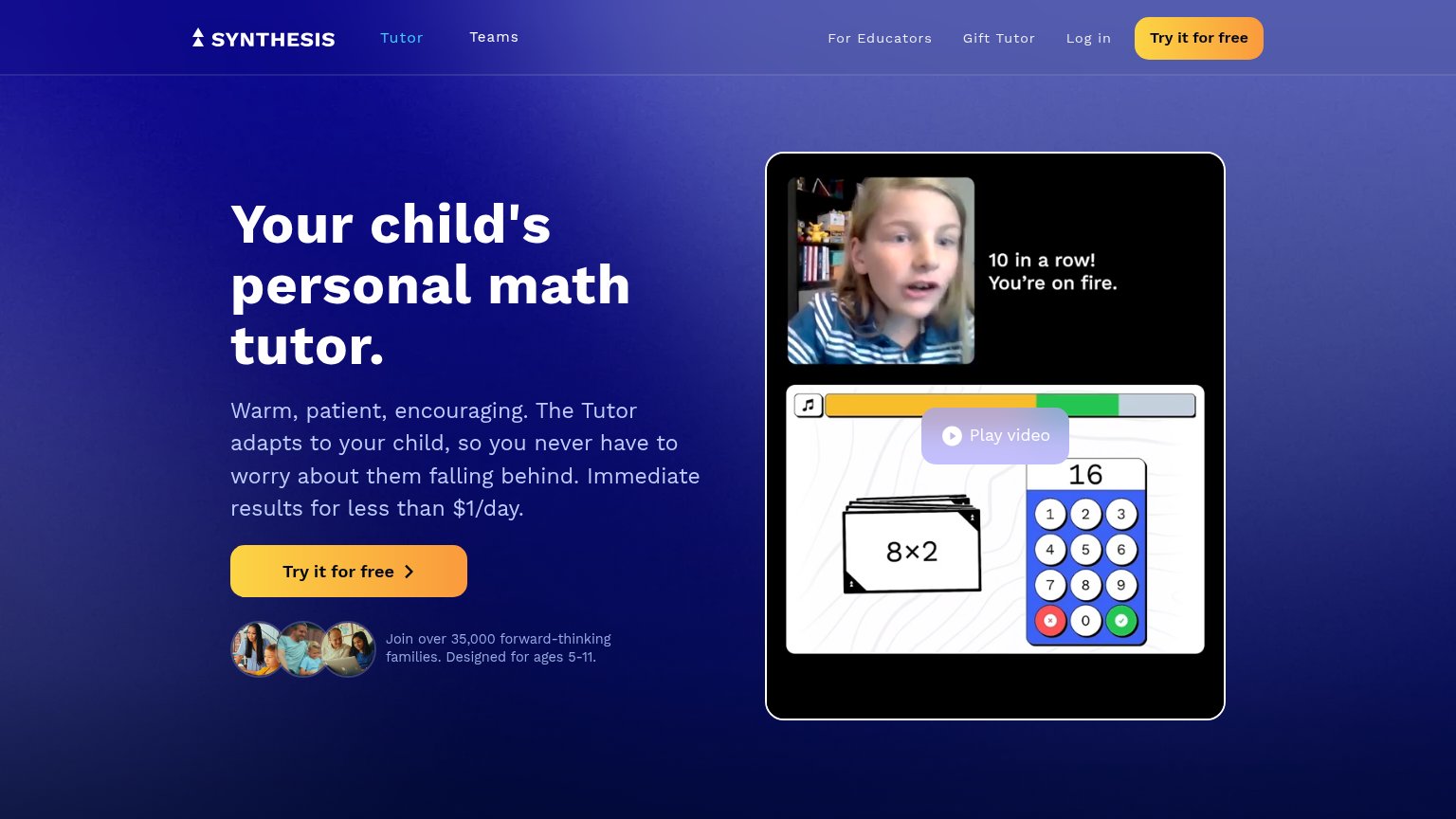
| "Join over 35,000 forward-thinking families. Designed for ages 5-11." beneath the hero CTA | |
| "Watch to learn more about Squirrel Ai's Intelligent Adaptive Learning System" video with product thumbnail | |
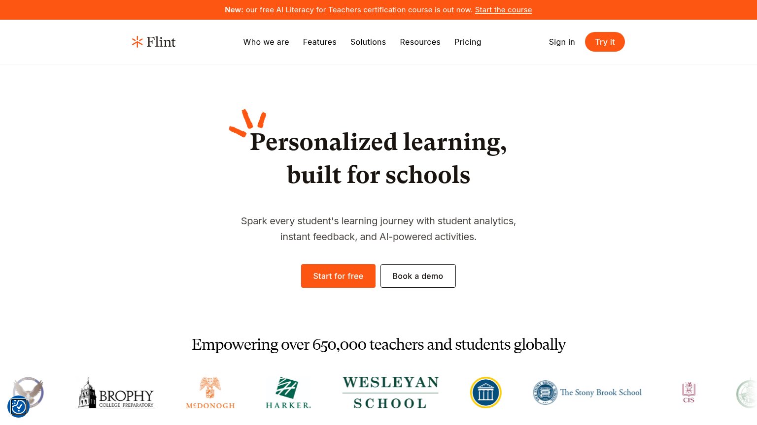
| "Empowering over 650,000 teachers and students globally" above a row of named school logos (Brophy, McDonogh, Harker, We |
CTA
58FairCopy, size, verb, cost-feel — does the primary CTA earn the click?
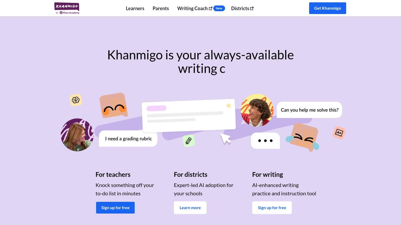
Problems
- hero button smaller than nav button
- outline style, low contrast
- 4 words, over 3-word limit
- hero and nav labels conflict
Value props
62FairTitle, subtitle, hero — do they sell the product's true value?
Tegore’s headline
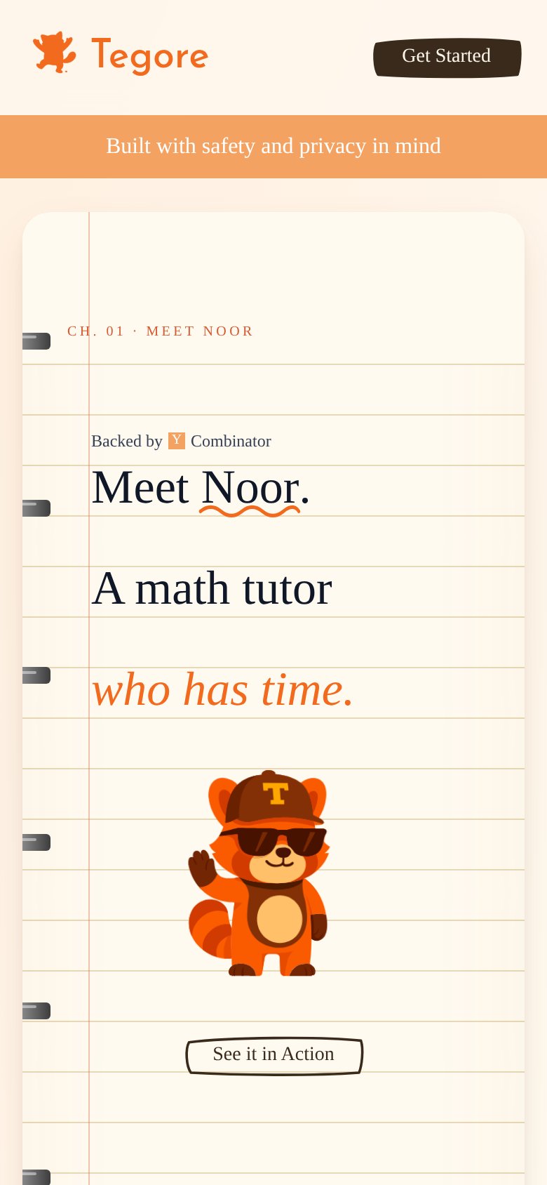
Meet Noor. A math tutor who has time.
Working
Could improve
Mobile web
62FairThe phone experience as a first-class citizen.
What works
What to improve
Information hierarchy
71FairDoes the design help or inhibit what the page is trying to say?
What works
What to improve