
Your landing page’s weakest score is Value props.
How Flint (for schools) — excluded if not math-focused ranks
- 1.
Synthesis Tutor81
- 2.
Flint (for schools) — excluded if not math-focused76
- 3.
Khanmigo (Khan Academy)62
- 4.
Tegore60
- 5.
Squirrel Ai (Learnly)46
76Growth scoreupdated
category scores
category scoresShowHide
Value props
68FairTitle, subtitle, hero — do they sell the product's true value?
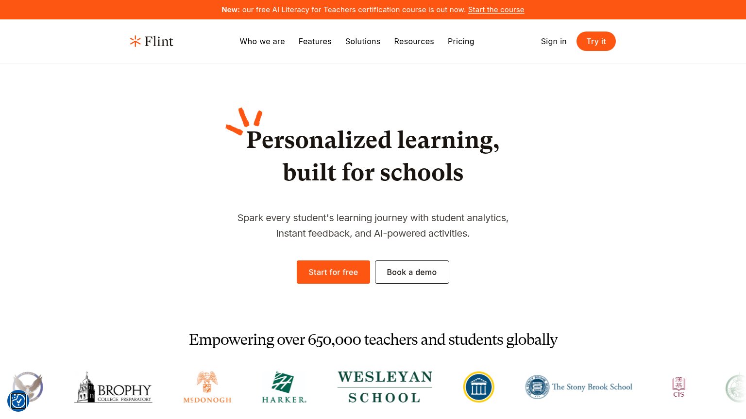
Flint (for schools) — excluded if not math-focused’s headline vague
Personalized learning, built for schools
Spark every student's learning journey with student analytics, instant feedback, and AI-powered activities.
Working
- Names the school buyer directly
- Subhead lists three real capabilities
- 650,000 users + school logos as proof
Could improve
- H1 is a category label, not a claim
- No product shown in the hero
- No emotional or outcome hook
Mobile web
72FairThe phone experience as a first-class citizen.
 1234
- Start for free button — Desktop-proportioned button sits at the fold's edge instead of a full-bleed tap target higher up.
- Oversized hero headline — Serif headline barely scaled down, wrapping into three tall lines that push the CTA to the fold's bottom.
- Two-line promo banner — The AI Literacy announcement eats two lines of the first viewport before the logo even appears.
- Floating consent badge — Blue bubble overlaps page content in the lower-left, adding tap friction near scrolling thumbs.
Trust
76FairProof that the product is real, competent, and safe to try.
How Flint (for schools) — excluded if not math-focused compares
Trust read
Information hierarchy
78FairDoes the design help or inhibit what the page is trying to say?
What works
What to improve
CTA
84StrongCopy, size, verb, cost-feel — does the primary CTA earn the click?
How Flint (for schools) — excluded if not math-focused compares
Recommended rewrites