
Your landing page’s weakest score is Trust.
How tday.com ranks
Trust
58FairProof that the product is real, competent, and safe to try.
| Trust read | |
|---|---|
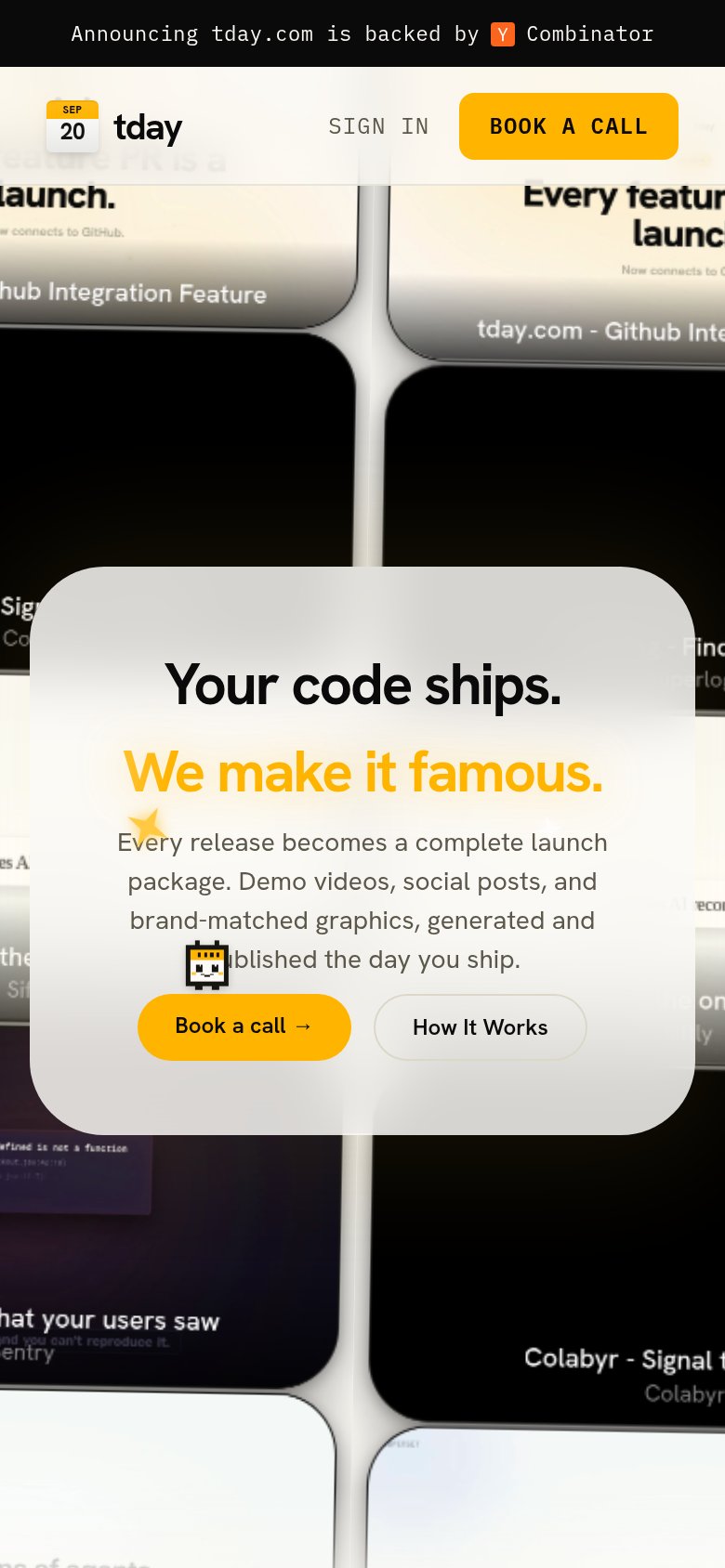
| tday.com | "Announcing tday.com is backed by Y Combinator" banner |
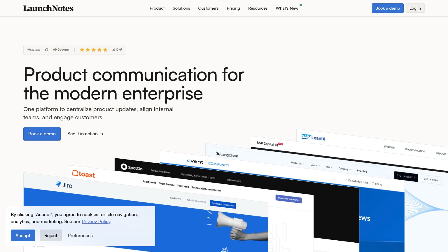
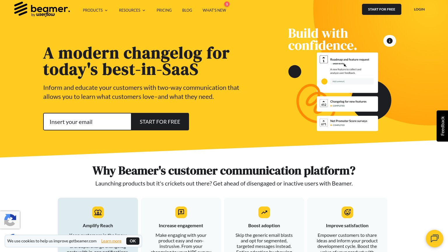
| Capterra / G2 / GetApp badge with "4.9/5" star rating above the hero headline | |
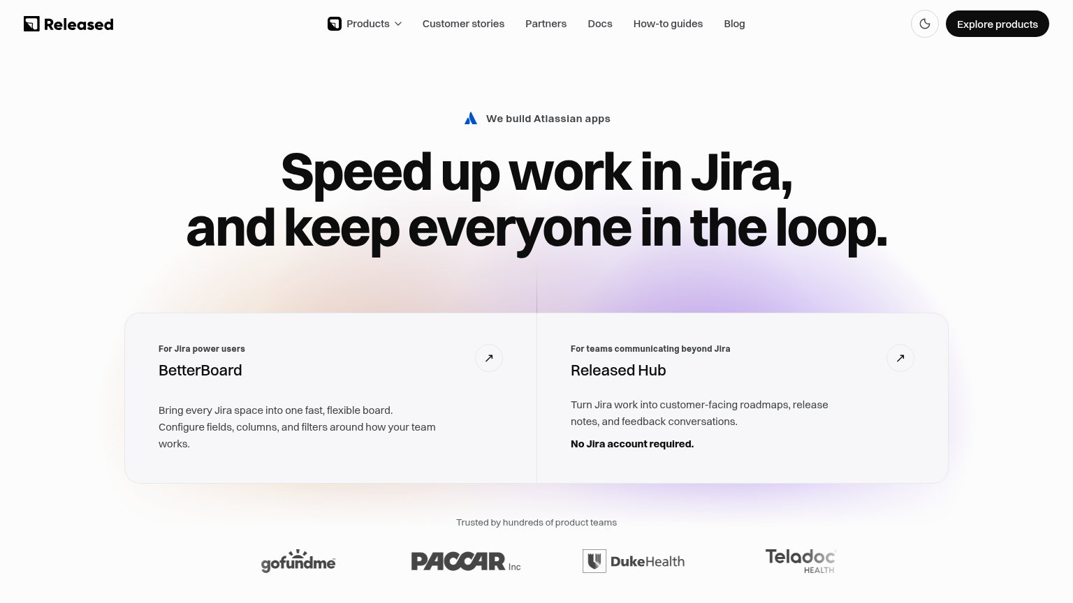
| Logo strip with GoFundMe, PACCAR Inc, Duke Health, and Teladoc Health under "Trusted by hundreds of product teams" | |
| Stylized feature UI cards showing "Roadmap and feature request", "Changelog for new features — COMPLETED", and "Net Prom | |
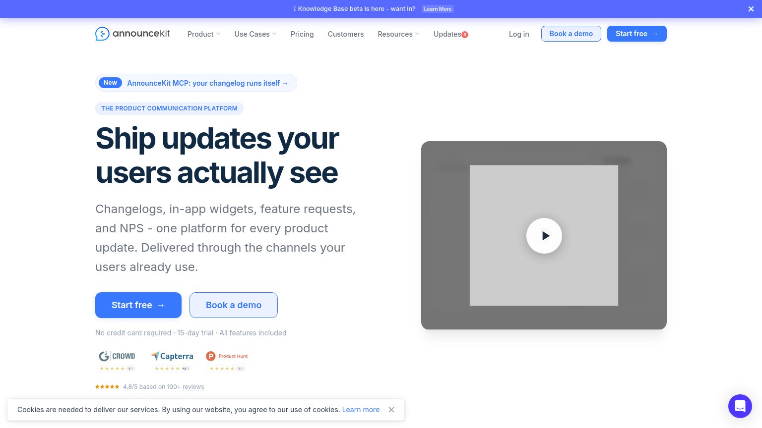
| 4.8/5 based on 100+ reviews with G2 Crowd, Capterra, and Product Hunt rating badges |
CTA
66FairCopy, size, verb, cost-feel — does the primary CTA earn the click?
Problems
- call booking feels costly
- no low-commitment path
- no product-value first click
Mobile web
68FairThe phone experience as a first-class citizen.
What works
What to improve
Information hierarchy
72FairDoes the design help or inhibit what the page is trying to say?
What works
What to improve
Value props
72FairTitle, subtitle, hero — do they sell the product's true value?
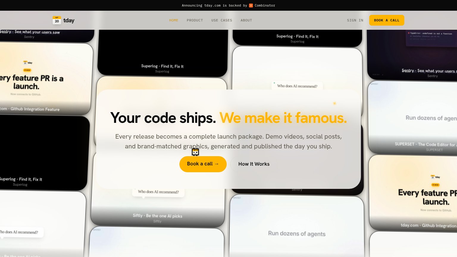
tday.com’s headline
Your code ships. We make it famous.
Every release becomes a complete launch package. Demo videos, social posts, and brand-matched graphics, generated and published the day you ship.
Working
Could improve