
Your landing page’s weakest score is Trust.
How AnnounceKit ranks
- 1.
AnnounceKit76
- 2.
LaunchNotes73
- 3.
tday.com67
- 4.
Beamer66
- 5.
Released64
76Growth scoreupdated
category scores
category scoresShowHide
Trust
68FairProof that the product is real, competent, and safe to try.
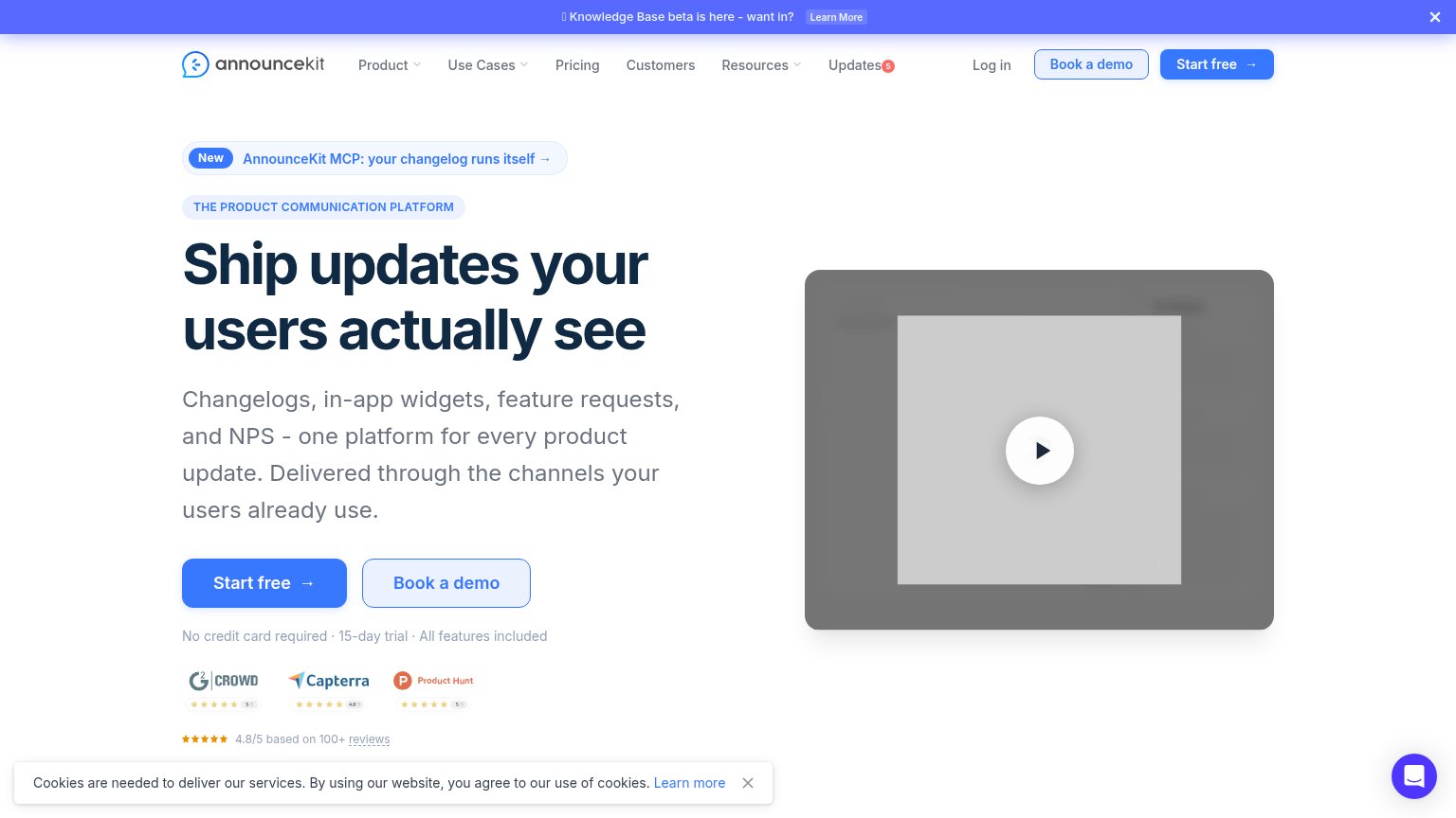
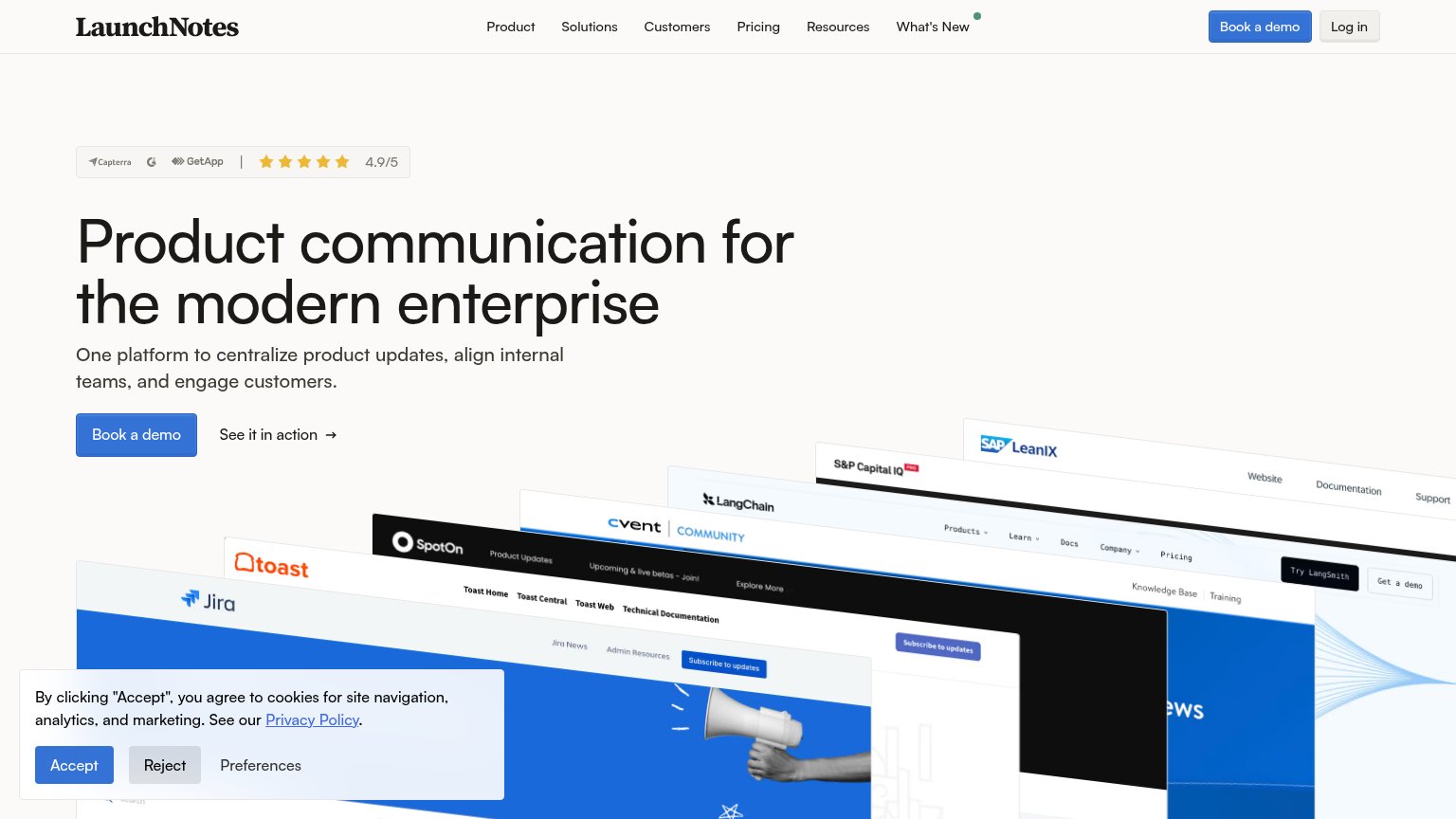
| Trust read | |
|---|---|
| AnnounceKit | 4.8/5 based on 100+ reviews with G2 Crowd, Capterra, and Product Hunt rating badges |
| "Announcing tday.com is backed by Y Combinator" banner | |
| Capterra / G2 / GetApp badge with "4.9/5" star rating above the hero headline | |
| Logo strip with GoFundMe, PACCAR Inc, Duke Health, and Teladoc Health under "Trusted by hundreds of product teams" | |
| Stylized feature UI cards showing "Roadmap and feature request", "Changelog for new features — COMPLETED", and "Net Prom |
Information hierarchy
72FairDoes the design help or inhibit what the page is trying to say?
1234- Gray video placeholder — Hero visual renders as a blank gray frame — the fold's only emotional anchor communicates nothing about the product.
- Duplicate header CTAs — Header repeats "Book a demo" and "Start free" at near-equal weight, splitting attention from the hero's primary button.
- Top announcement banner — "Knowledge Base beta" banner with a Learn More link is the first thing seen and leaks attention before the headline.
- Cookie consent bar — Consent bar with a Learn more link intrudes into the fold and adds one more exit at the moment of action.
Mobile web
72FairThe phone experience as a first-class citizen.
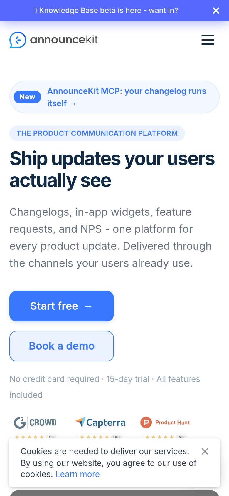
What works
What to improve
Value props
78FairTitle, subtitle, hero — do they sell the product's true value?
AnnounceKit’s headline
Ship updates your users actually see
Changelogs, in-app widgets, feature requests, and NPS - one platform for every product update. Delivered through the channels your users already use.
Working
Could improve
CTA
88StrongCopy, size, verb, cost-feel — does the primary CTA earn the click?
How AnnounceKit compares
Recommended rewrites