
Your landing page’s weakest score is Information hierarchy.
How TaskRabbit ranks
46Growth scoreupdated
category scores
category scoresShowHide
Information hierarchy
38PoorDoes the design help or inhibit what the page is trying to say?
 1234
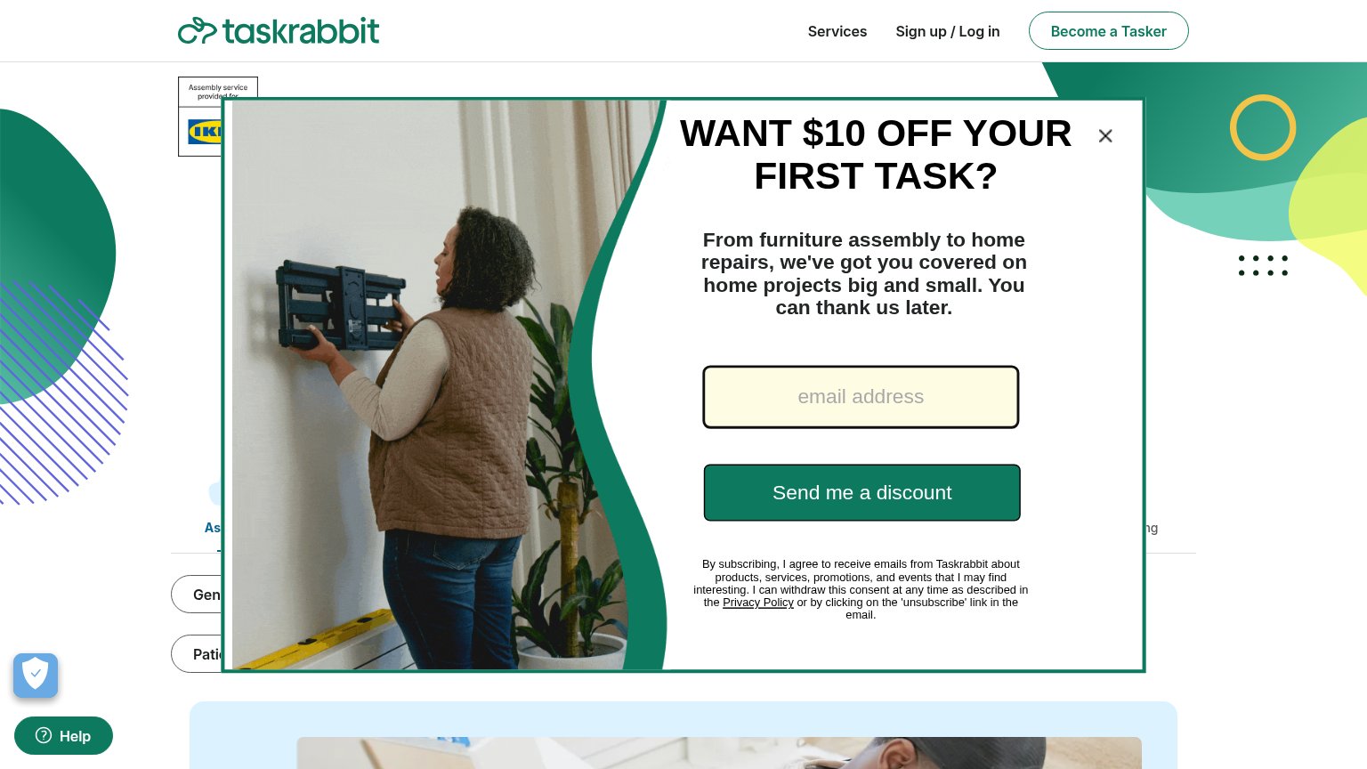
- Discount email modal — Full-fold popup occludes the headline, search bar, and booking path before any value is communicated.
- Send me a discount — The only prominent button on the page pushes email capture instead of the core task-booking action.
- Become a Tasker button — The sole outlined nav button recruits supply-side users, competing with the hidden customer conversion path.
- Occluded headline text — The hero headline and search input are cut off behind the modal, leaving the value prop unreadable.
Value props
42PoorTitle, subtitle, hero — do they sell the product's true value?
TaskRabbit’s headline undersells
WANT $10 OFF YOUR FIRST TASK?
From furniture assembly to home repairs, we've got you covered on home projects big and small. You can thank us later.
Working
- Names real tasks: assembly, home repairs
- $10 incentive is concrete
- IKEA badge lends category proof
Could improve
- Modal hides the actual hero headline
- No numbers on Taskers, reviews, speed
- No emotional relief or outcome named
Mobile web
47PoorThe phone experience as a first-class citizen.
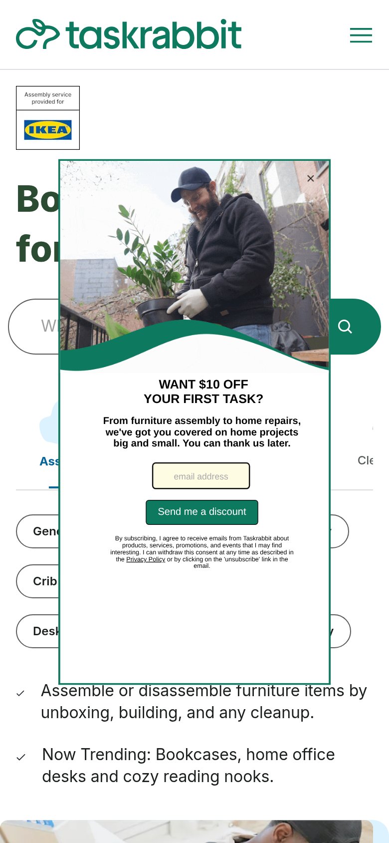
What works
What to improve
Trust
48PoorProof that the product is real, competent, and safe to try.
How TaskRabbit compares
Trust read
CTA
54FairCopy, size, verb, cost-feel — does the primary CTA earn the click?
How TaskRabbit compares
Recommended rewrites