
Your landing page’s weakest score is Trust.
How Airtasker ranks
80Growth scoreupdated
category scores
category scoresShowHide
Trust
74FairProof that the product is real, competent, and safe to try.
| Trust read | |
|---|---|
| Airtasker | Trustpilot 4.0 'Great' (13,330 reviews) badge under the hero CTAs |
| "822,860 Rentable humans" counter on the mobile fold | |
| "Assembly service provided for IKEA" partner badge | |
| No visible trust signal identified. | |
| Customer logo strip featuring Peloton, Apollo, American Freight, Uniqlo, and The Container Store | |
| "Trusted by Industry Leaders Worldwide" section with UNICEF and GIZ logos (mobile capture) |
Information hierarchy
76FairDoes the design help or inhibit what the page is trying to say?
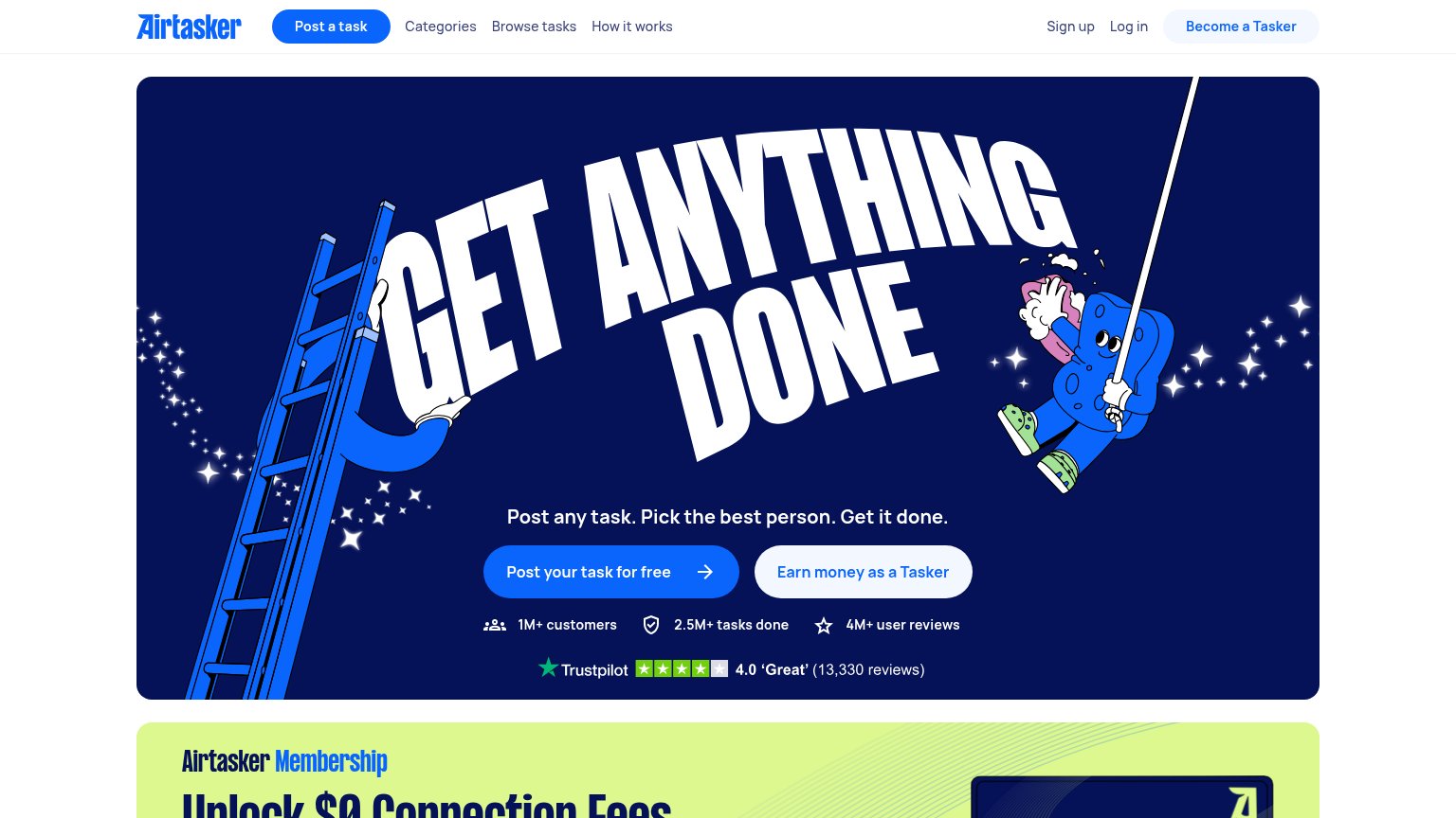 1234
- Earn money CTA — Second CTA sits at near-equal size and weight beside "Post Airtasker's task for free", splitting the fold's one action into two.
- Nav Post a task — A pill-styled "Post a task" button in the nav duplicates the hero CTA, competing for the same click from a second location.
- Become a Tasker pill — Third styled button above the fold pulls buyer traffic toward the supply-side funnel before the headline lands.
- Membership banner peek — The lime "Unlock $0 Connection Fees" banner intrudes into the fold with clipped headline text, adding a third message beat.
Value props
76FairTitle, subtitle, hero — do they sell the product's true value?
Airtasker’s headline
GET ANYTHING DONE
Post any task. Pick the best person. Get it done.
Working
Could improve
CTA
86StrongCopy, size, verb, cost-feel — does the primary CTA earn the click?
How Airtasker compares
Recommended rewrites
Mobile web
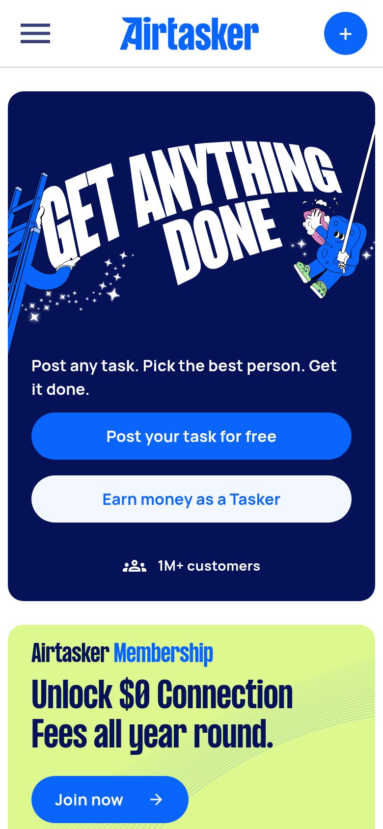
86StrongThe phone experience as a first-class citizen.
What works
What to improve