
Your landing page’s weakest score is Trust.
How TablePlus ranks
- 1.
Beekeeper Studio80
- 2.
TablePlus72
- 3.
Clidey63
- 4.
Adminer62
- 5.
DBeaver54
Trust
58FairProof that the product is real, competent, and safe to try.
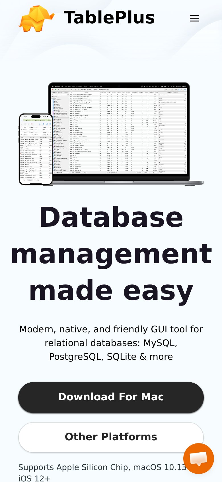
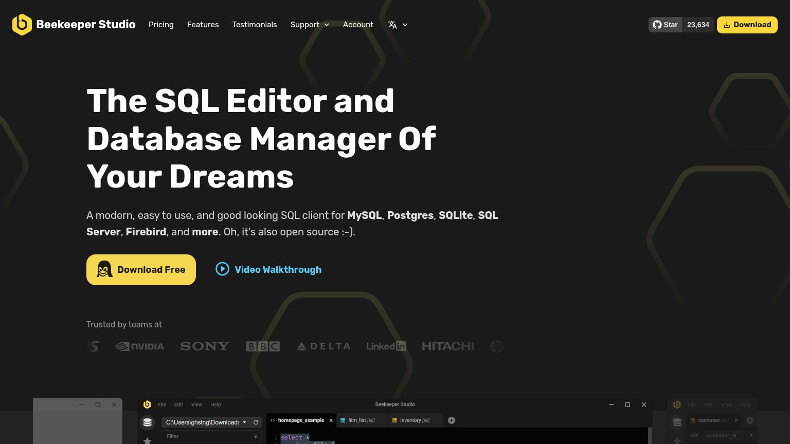
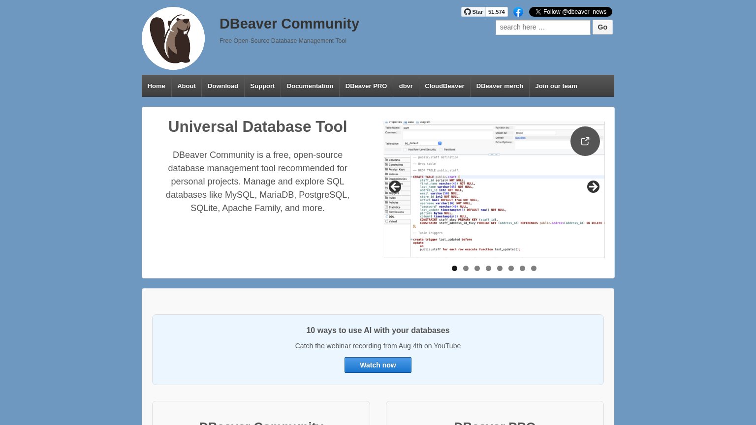
| Trust read | |
|---|---|
| TablePlus | Real product screenshot of the database GUI shown on laptop and phone mockups |
| GitHub link in the navigation signaling open-source code | |
| GitHub star counter showing "Star 51,574" | |
| "Trusted by teams at" logo row with NHS, NVIDIA, Sony, BBC, Delta, LinkedIn, Hitachi, HP | |
| "Screenshots" section showing twelve real product UI captures (login, table structure, export dialogs) |
Mobile web
68FairThe phone experience as a first-class citizen.
123- Product screenshot first — A dense desktop app screenshot leads the mobile fold, pushing the headline and CTA far down the page.
- Download For Mac CTA — The primary CTA sits at the very bottom edge of the first viewport, barely inside the fold after the screenshot and headline stack.
- Chat bubble on CTA — The chat widget overlaps the 'Other Platforms' button and the platform-support text, blocking a tap target.
Value props
72FairTitle, subtitle, hero — do they sell the product's true value?
TablePlus’s headline
Database management made easy
Modern, native, and friendly GUI tool for relational databases: MySQL, PostgreSQL, SQLite & more
Working
Could improve
CTA
80StrongCopy, size, verb, cost-feel — does the primary CTA earn the click?
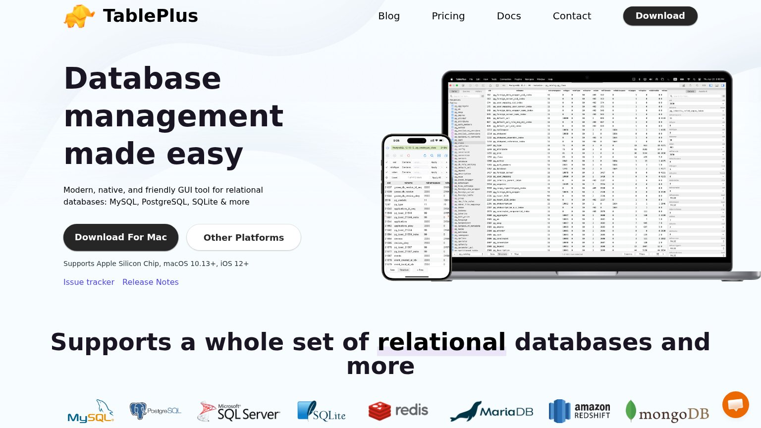
How TablePlus compares
Recommended rewrites
Information hierarchy
82StrongDoes the design help or inhibit what the page is trying to say?
What works
What to improve