
Your landing page’s weakest score is Information hierarchy.
How Beekeeper Studio ranks
- 1.
Beekeeper Studio80
- 2.
TablePlus72
- 3.
Clidey63
- 4.
Adminer62
- 5.
DBeaver54
80Growth scoreupdated
category scores
category scoresShowHide
Information hierarchy
76FairDoes the design help or inhibit what the page is trying to say?
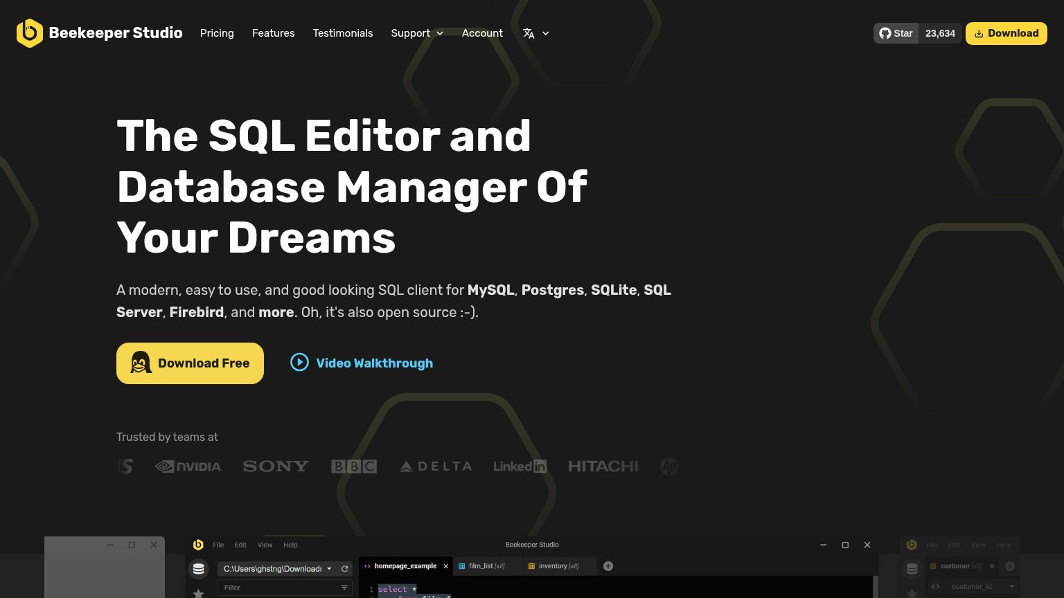 1234
- Header Download button — Duplicates the hero's Download Free at equal yellow weight, splitting the primary action's authority.
- GitHub star widget — An outbound exit sitting beside the header CTA, pulling clicks to GitHub before conversion.
- Seven-item nav row — Pricing, Features, Testimonials, Support, Account and language switcher create ten exit paths above the CTA.
- Video Walkthrough link — Cyan link at the CTA's eye level competes for the same click at near-equal visual pull.
Value props
76FairTitle, subtitle, hero — do they sell the product's true value?
Beekeeper Studio’s headline sells
The SQL Editor and Database Manager Of Your Dreams
A modern, easy to use, and good looking SQL client for MySQL, Postgres, SQLite, SQL Server, Firebird, and more. Oh, it's also open source :-).
Working
- Names category and 5 databases instantly
- Open source stated up front
- Real logos + 23,634 GitHub stars as proof
Could improve
- 'Of Beekeeper Studio's Dreams' names no concrete outcome
- No pain point or emotional contrast
- No number quantifying a benefit
Trust
82StrongProof that the product is real, competent, and safe to try.
How Beekeeper Studio compares
Trust read
Mobile web
82StrongThe phone experience as a first-class citizen.
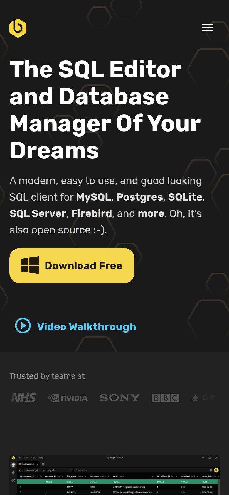
What works
What to improve
CTA
86StrongCopy, size, verb, cost-feel — does the primary CTA earn the click?
How Beekeeper Studio compares
Recommended rewrites