
Your landing page’s weakest score is Trust.
How Supabase Auth ranks
76Growth scoreupdated
category scores
category scoresShowHide
Trust
58FairProof that the product is real, competent, and safe to try.
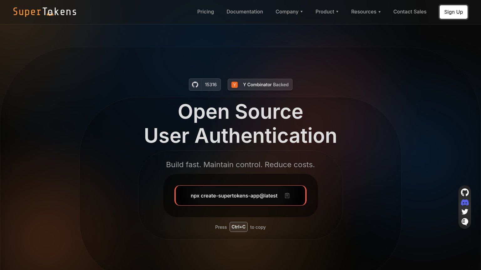
| Trust read | |
|---|---|
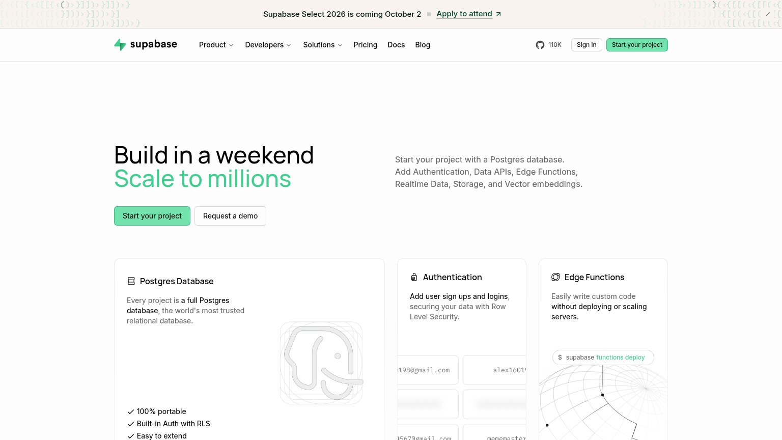
| Supabase Auth | "110K" GitHub star count in the desktop navigation |
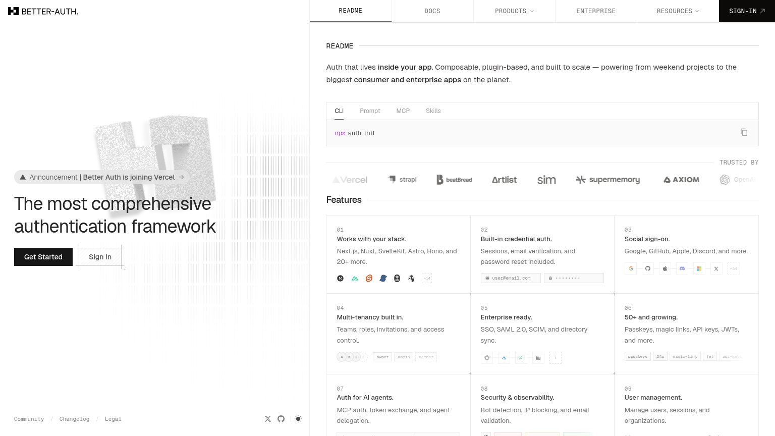
| "TRUSTED BY" logo strip featuring Vercel, strapi, beatBread, Artlist, sim, supermemory, and Axiom | |
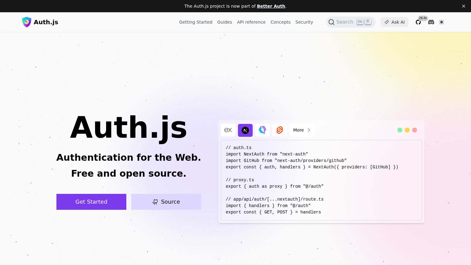
| Code sample panel showing "import NextAuth from \"next-auth\"" with framework tabs, plus the GitHub badge reading "28.4k | |
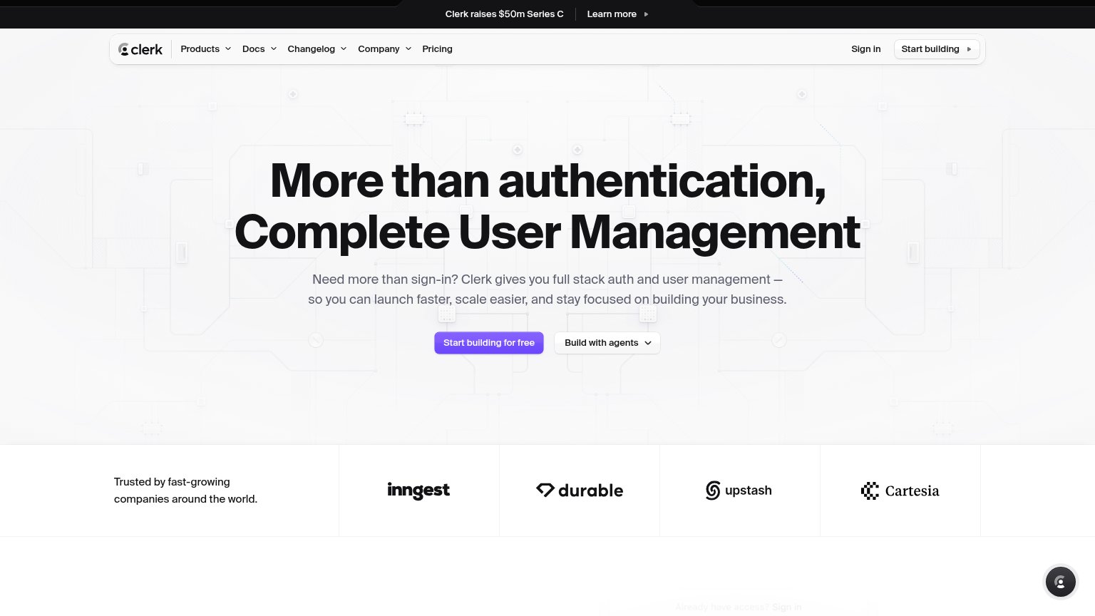
| "Trusted by fast-growing companies around the world" logo strip (Inngest, Durable, Upstash, Cartesia) | |
| github.com/lucia-auth/lucia source link with named maintainer "Pilcrow" | |
| GitHub star count badge showing 15316 |
Information hierarchy
78FairDoes the design help or inhibit what the page is trying to say?
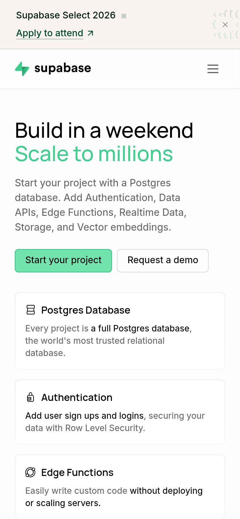
123- Duplicate CTA labels — "Start Supabase Auth's project" appears twice at equal weight (nav and hero), splitting the primary action across two targets.
- Announcement banner — "Apply to attend" event link sits at the very top of the scan path, leaking attention before the headline is read.
- Cropped feature cards — Authentication and Edge Functions cards are cut mid-content at the fold, showing truncated email inputs that read as visual noise.
CTA
78FairCopy, size, verb, cost-feel — does the primary CTA earn the click?
How Supabase Auth compares
Recommended rewrites
Mobile web
80StrongThe phone experience as a first-class citizen.
What works
What to improve
Value props
86StrongTitle, subtitle, hero — do they sell the product's true value?
Supabase Auth’s headline
Build in a weekend Scale to millions
Start your project with a Postgres database. Add Authentication, Data APIs, Edge Functions, Realtime Data, Storage, and Vector embeddings.
Working
Could improve