
Your landing page’s weakest score is Information hierarchy.
How Better Auth ranks
74Growth scoreupdated
category scores
category scoresShowHide
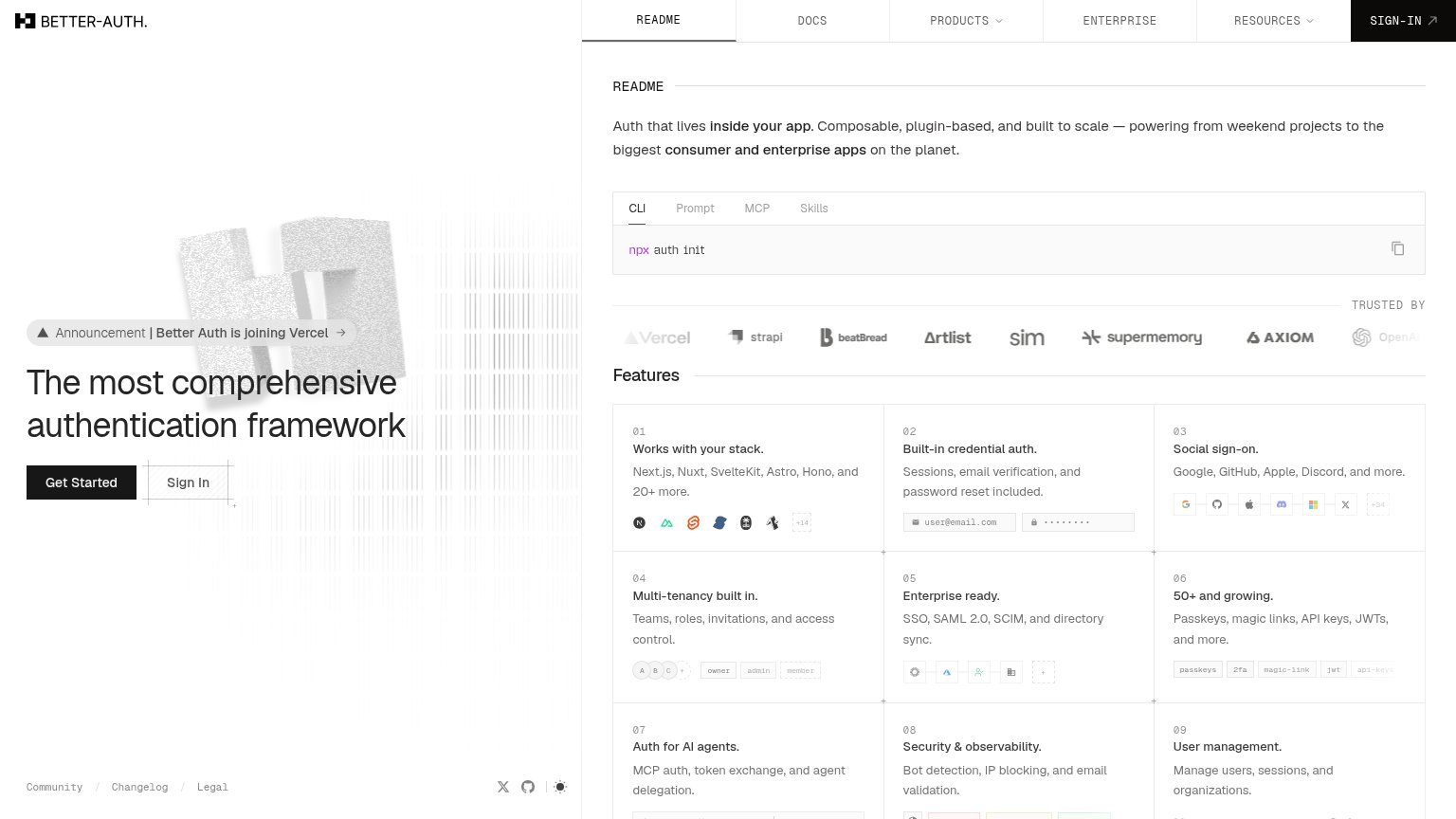
Information hierarchy
66FairDoes the design help or inhibit what the page is trying to say?
 123
- Sign In secondary button — Sits directly beside 'Get Started' at nearly identical size, splitting the primary action's click share.
- Feature grid in fold — Nine same-weight feature cards creep into the first viewport, turning the fold into a feature index.
- Top nav bar — Six nav items plus two dropdowns and a Sign-In button offer eight exits before the hero CTA is read.
Value props
72FairTitle, subtitle, hero — do they sell the product's true value?
Better Auth’s headline sells
The most comprehensive authentication framework
Auth that lives inside your app. Composable, plugin-based, and built to scale — powering from weekend projects to the biggest consumer and enterprise apps on the planet.
Working
- Claims a real differentiator: breadth
- 'Inside Better Auth's app' signals ownership
- CLI snippet proves ease instantly
Could improve
- No emotion — no pain or relief named
- Hero image decorates, not demonstrates
- Numbers (50+, 20+) buried below hero
Trust
72FairProof that the product is real, competent, and safe to try.
How Better Auth compares
Trust read
CTA
76FairCopy, size, verb, cost-feel — does the primary CTA earn the click?
How Better Auth compares
Recommended rewrites
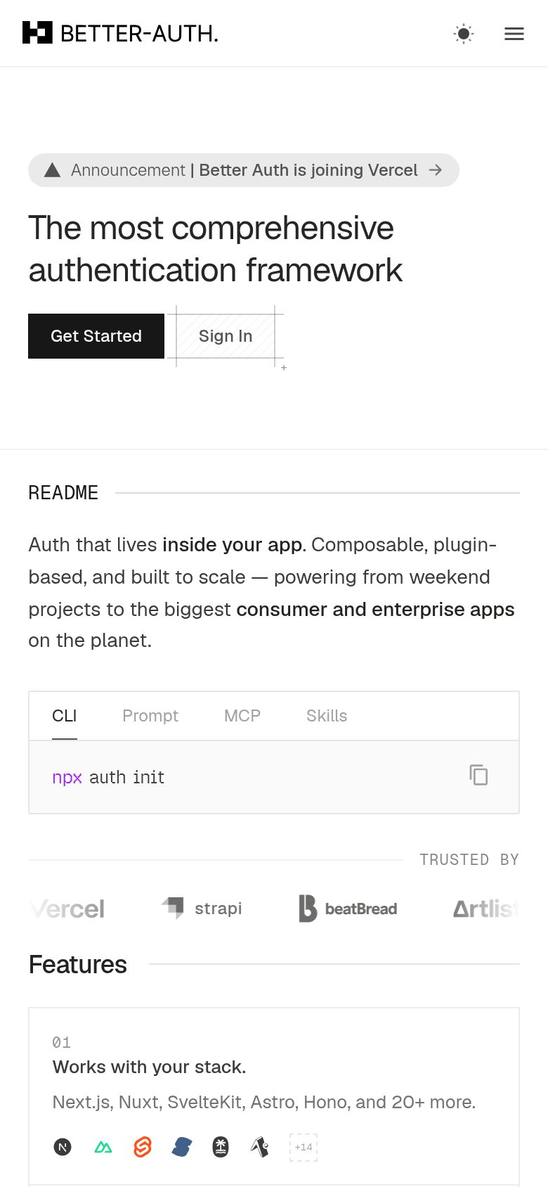
Mobile web
82StrongThe phone experience as a first-class citizen.
What works
What to improve