
Your landing page’s weakest score is Information hierarchy.
How StoryBee ranks
76Growth scoreupdated
category scores
category scoresShowHide
Information hierarchy
72FairDoes the design help or inhibit what the page is trying to say?
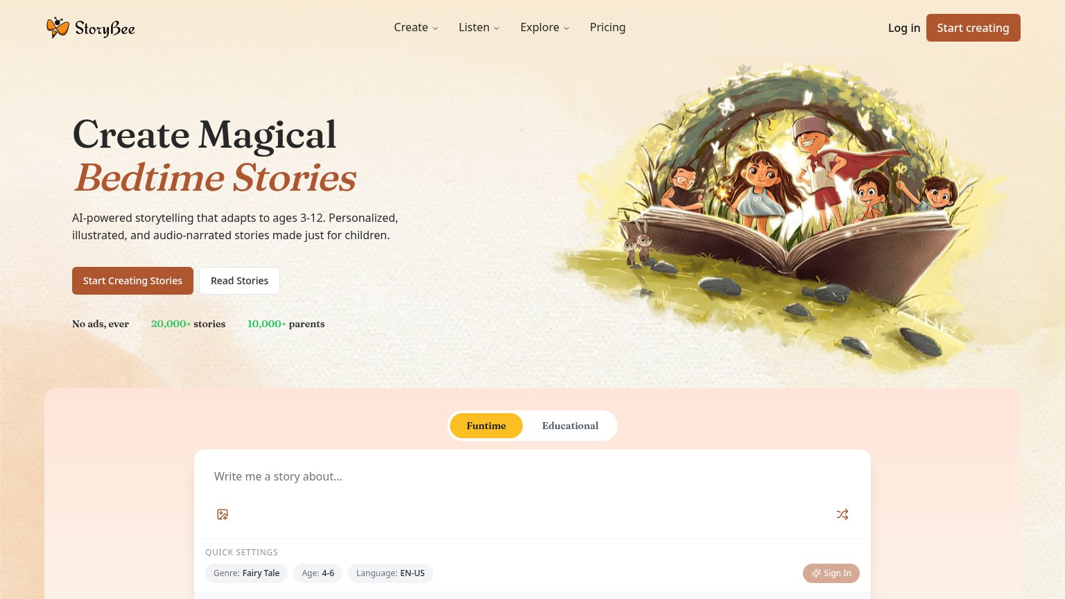 1234
- Duplicate primary CTAs — "Start creating" in the nav and "Start Creating Stories" in the hero split the primary action into two same-styled buttons.
- Story prompt input — A second conversion surface ("Write me a story about...") competes with the hero CTA for the same action, leaving two paths of equal pull in one fold.
- Sign In pill — A third account-entry point inside the prompt card duplicates the nav's Log in and pulls attention away from starting a story.
- Nav dropdown menus — Three dropdowns (Create, Listen, Explore) plus Pricing offer four exit paths before the visitor reaches the hero promise.
Trust
72FairProof that the product is real, competent, and safe to try.
| Trust read | |
|---|---|
| StoryBee | "No ads, ever 20,000+ stories 10,000+ parents" stat strip under the hero CTA |
| No visible trust signal identified. | |
| "100k+" badge with five stars and "Recommended by educators" beside the app store buttons | |
| "Loved & trusted by 80k+ happy members" with a row of member avatar photos | |
| Strip of seven G2 Spring 2025 badges under the hero, including "High Performer", "Users Love Us", "Easiest To Use", and |
CTA
78FairCopy, size, verb, cost-feel — does the primary CTA earn the click?
How StoryBee compares
Recommended rewrites
Mobile web
78FairThe phone experience as a first-class citizen.
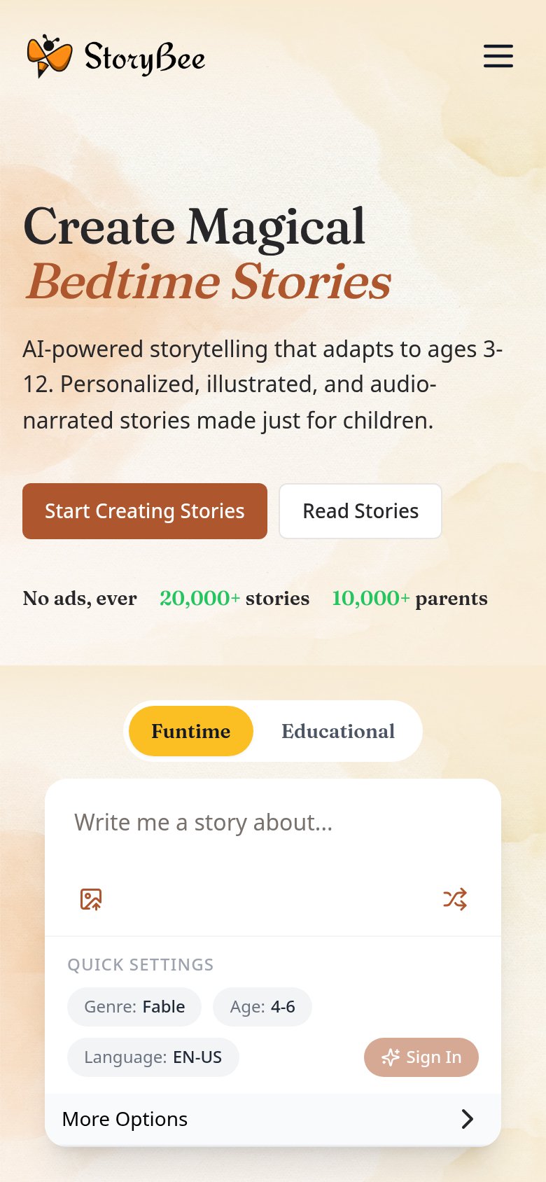
What works
What to improve
Value props
82StrongTitle, subtitle, hero — do they sell the product's true value?
StoryBee’s headline
Create Magical Bedtime Stories
AI-powered storytelling that adapts to ages 3-12. Personalized, illustrated, and audio-narrated stories made just for children.
Working
Could improve