
Your landing page’s weakest score is Trust.
How Bedtimestory.ai ranks
Trust
54FairProof that the product is real, competent, and safe to try.
| Trust read | |
|---|---|
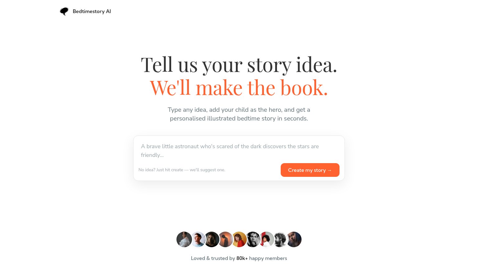
| Bedtimestory.ai | "Loved & trusted by 80k+ happy members" with a row of member avatar photos |
| No visible trust signal identified. | |
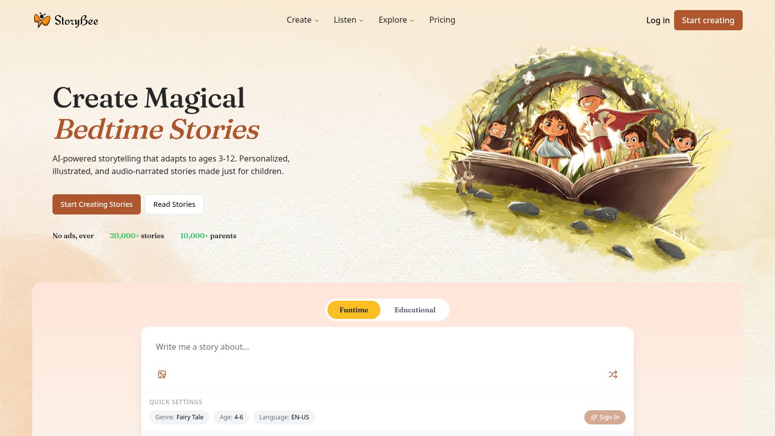
| "No ads, ever 20,000+ stories 10,000+ parents" stat strip under the hero CTA | |
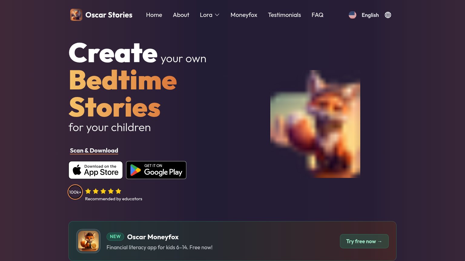
| "100k+" badge with five stars and "Recommended by educators" beside the app store buttons | |
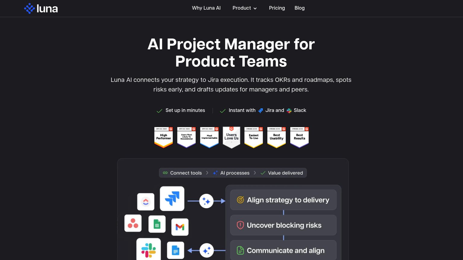
| Strip of seven G2 Spring 2025 badges under the hero, including "High Performer", "Users Love Us", "Easiest To Use", and |
Mobile web
76FairThe phone experience as a first-class citizen.
 123
- Headline wraps four lines — The serif headline scales down too little and wraps into four tall lines, pushing the CTA card deep into the fold.
- Create my story button — The primary CTA is a desktop-proportioned button wrapping onto two lines instead of a full-width thumb target.
- Helper text crowds button — 'No idea? Just hit create' copy is squeezed beside the CTA on the same row, cramping both in the narrow column.
Value props
84StrongTitle, subtitle, hero — do they sell the product's true value?
Bedtimestory.ai’s headline
Tell us your story idea. We'll make the book.
Type any idea, add your child as the hero, and get a personalised illustrated bedtime story in seconds.
Working
Could improve
CTA
86StrongCopy, size, verb, cost-feel — does the primary CTA earn the click?
How Bedtimestory.ai compares
Recommended rewrites
Information hierarchy
88StrongDoes the design help or inhibit what the page is trying to say?
What works
What to improve