
Your landing page’s weakest score is Trust.
How StockTrim ranks
- 1.
Whitespace74
- 2.
Netstock73
- 3.
Streamline72
- 4.
StockTrim67
- 5.
Lokad62
67Growth scoreupdated
category scores
category scoresShowHide
Trust
44PoorProof that the product is real, competent, and safe to try.

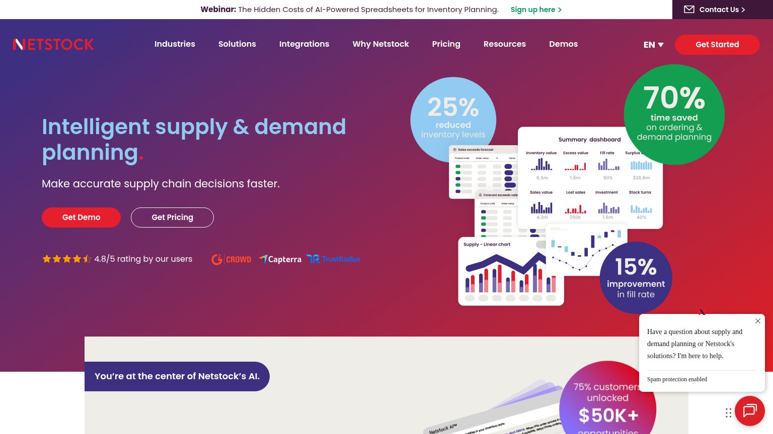

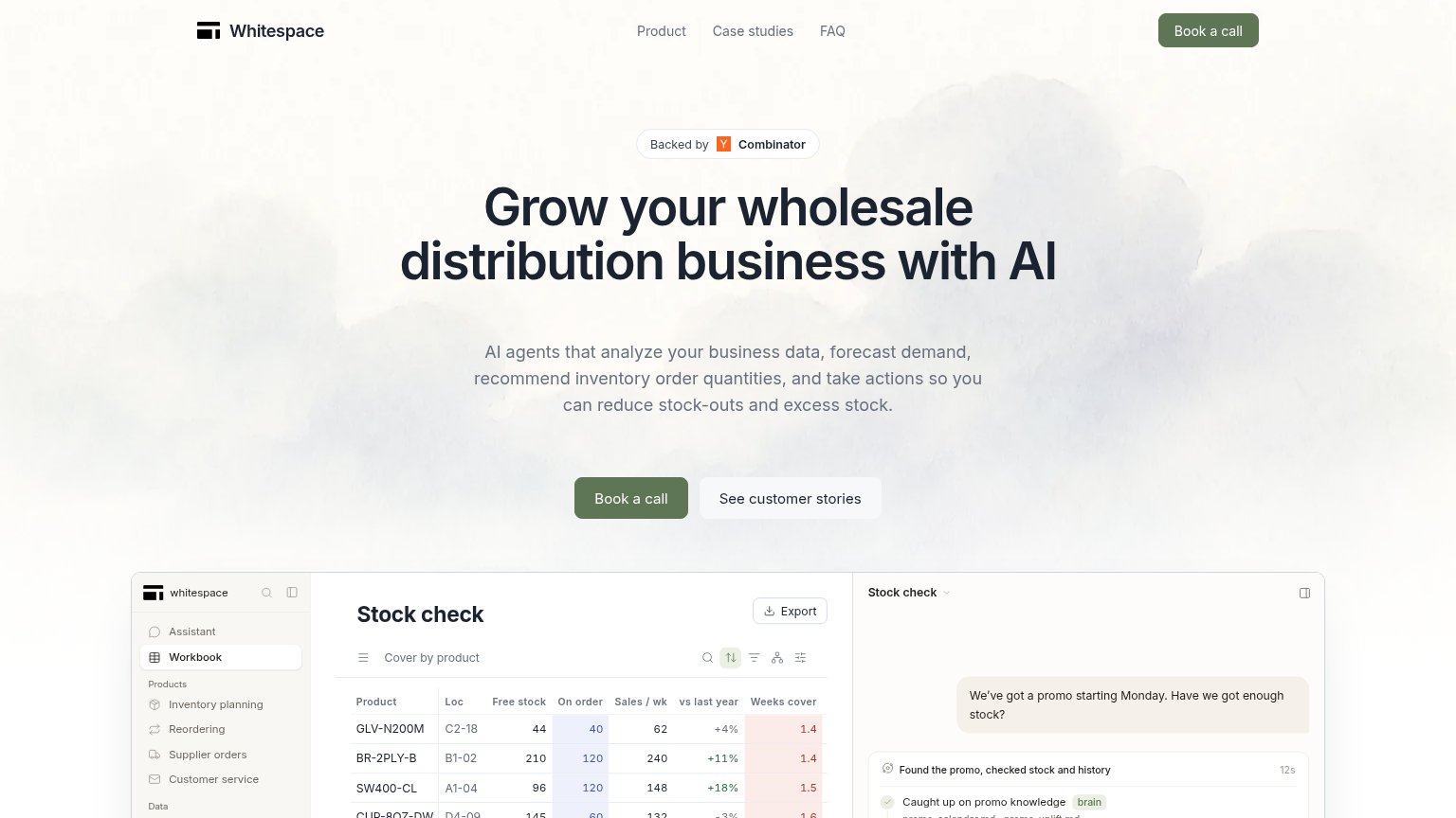

| Trust read | |
|---|---|
| StockTrim | Laptop mockup showing the StockTrim dashboard UI with inventory charts |
| "Backed by Y Combinator" badge above the hero headline | |
| "4.8/5 rating by our users" with G2 Crowd, Capterra, and TrustRadius badges | |
| "Trusted by 2,000+ of the world's most ambitious brands" with logos including Abbott, Circle K, Engie, and Arduino | |
| Real product dashboard screenshots ("Purchase optimization" view with demand charts and a 94.55% fill-rate gauge) |
Information hierarchy
64FairDoes the design help or inhibit what the page is trying to say?
 123
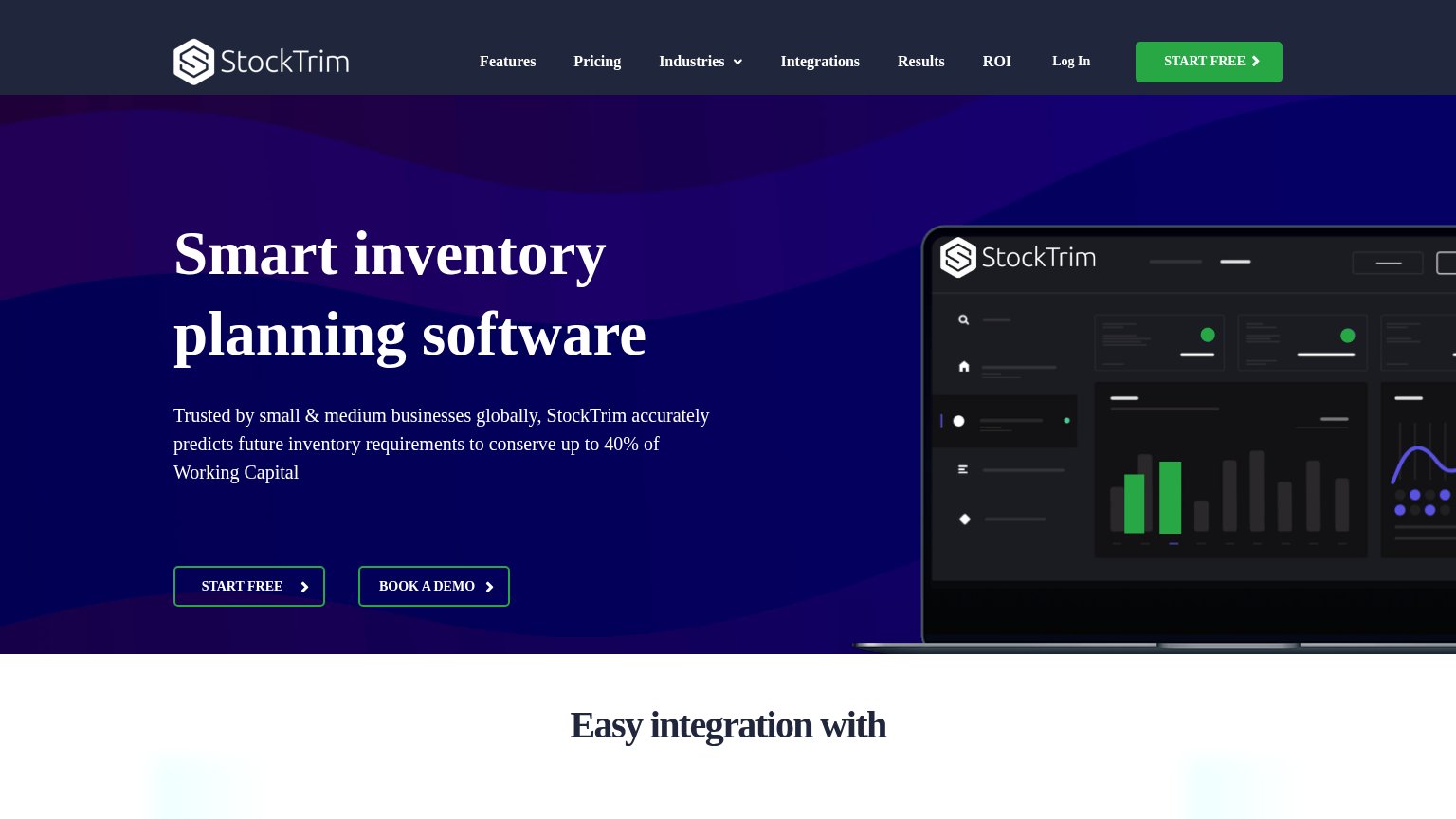
- Hero START FREE button — Outline-only ghost style on dark purple makes the primary action nearly invisible; it duplicates the nav's green START FREE at lower weight.
- BOOK A DEMO button — Styled at identical weight and size to START FREE beside it, splitting the visitor's decision between two equal actions.
- Nav link row — Seven text links plus Log In sit above the hero, giving eight exit paths before the value prop is read.
Value props
68FairTitle, subtitle, hero — do they sell the product's true value?
StockTrim’s headline
Smart inventory planning software
Trusted by small & medium businesses globally, StockTrim accurately predicts future inventory requirements to conserve up to 40% of Working Capital
Working
Could improve
Mobile web
76FairThe phone experience as a first-class citizen.
What works
What to improve
CTA
82StrongCopy, size, verb, cost-feel — does the primary CTA earn the click?
How StockTrim compares
Recommended rewrites