
Your landing page’s weakest score is Information hierarchy.
How Netstock ranks
73Growth scoreupdated
category scores
category scoresShowHide
Information hierarchy
68FairDoes the design help or inhibit what the page is trying to say?
 1234
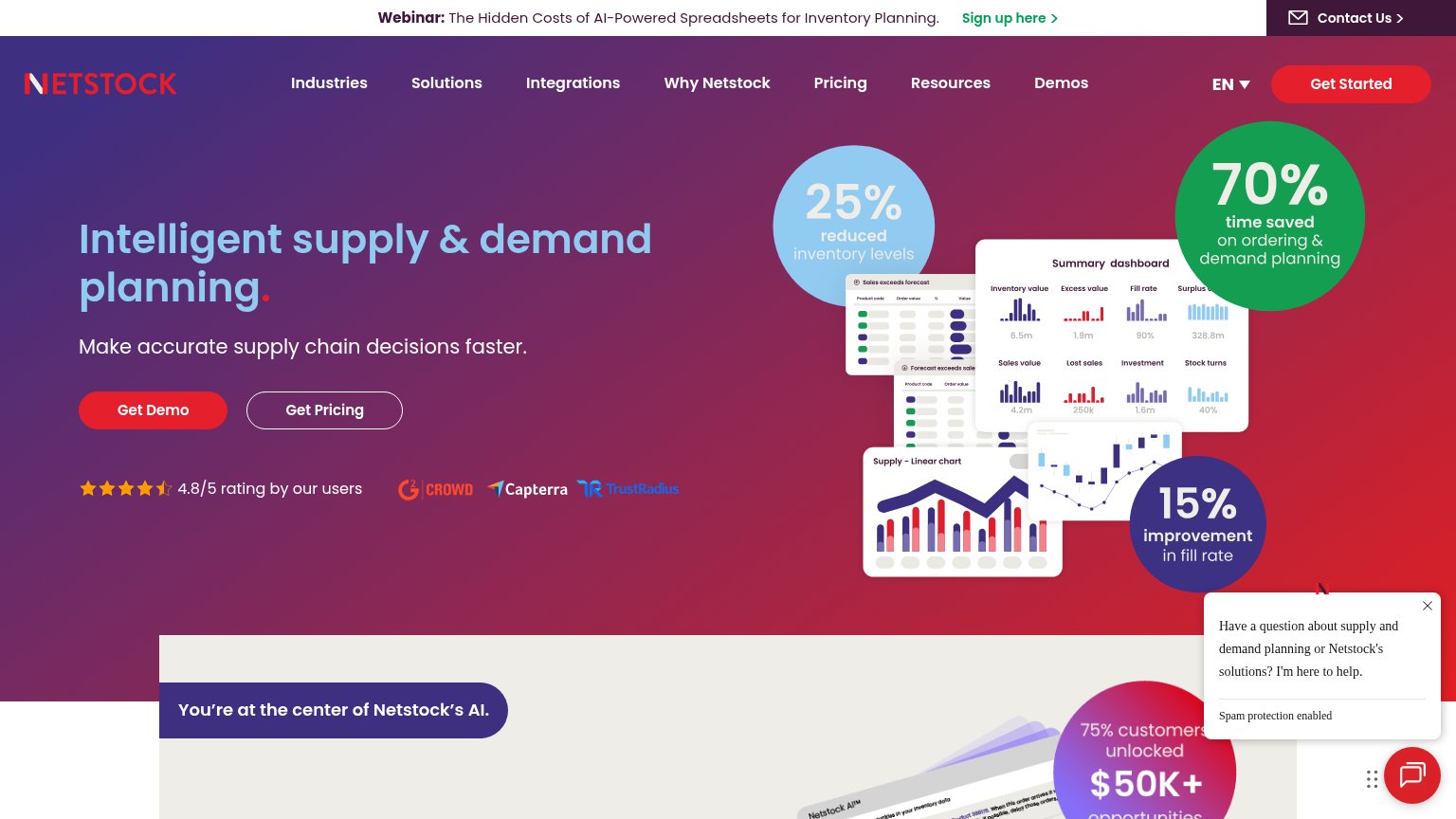
- Auto-open chat popup — Uninvited chat bubble covers the fold's lower-right corner and pulls attention off the stat cards and hero.
- Webinar announcement banner — Top banner with 'Sign up here' plus 'Contact Us' inserts two exits above the nav before the value prop is read.
- Floating stat bubbles — Three same-weight percentage bubbles (25%, 70%, 15%) compete with each other and the headline instead of building one argument.
- Get Pricing button — Outlined secondary CTA sits at the same size beside Get Demo, splitting the click decision.
Value props
72FairTitle, subtitle, hero — do they sell the product's true value?
Netstock’s headline undersells
Intelligent supply & demand planning.
Make accurate supply chain decisions faster.
Working
- Stat bubbles give hard proof (25%, 70%, 15%)
- Hero shows real dashboard, not decoration
- 4.8/5 rating with three review logos
Could improve
- Headline is a category label, not a claim
- Subhead is generic — no numbers or pain
- Emotional payoff (relief, confidence) absent
Trust
72FairProof that the product is real, competent, and safe to try.
How Netstock compares
Trust read
Mobile web
76FairThe phone experience as a first-class citizen.
What works
What to improve
CTA
78FairCopy, size, verb, cost-feel — does the primary CTA earn the click?
How Netstock compares
Recommended rewrites