
Your landing page’s weakest score is Trust.
How Lokad ranks
Trust
54FairProof that the product is real, competent, and safe to try.

| Trust read | |
|---|---|
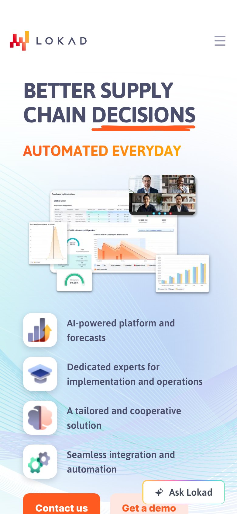
| Lokad | Real product dashboard screenshots ("Purchase optimization" view with demand charts and a 94.55% fill-rate gauge) |
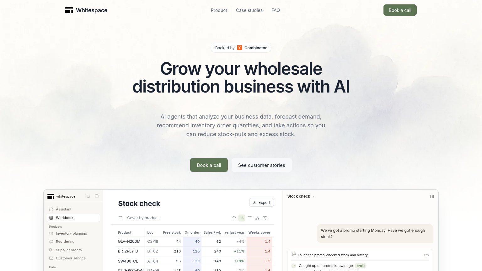
| "Backed by Y Combinator" badge above the hero headline | |
| Laptop mockup showing the StockTrim dashboard UI with inventory charts | |
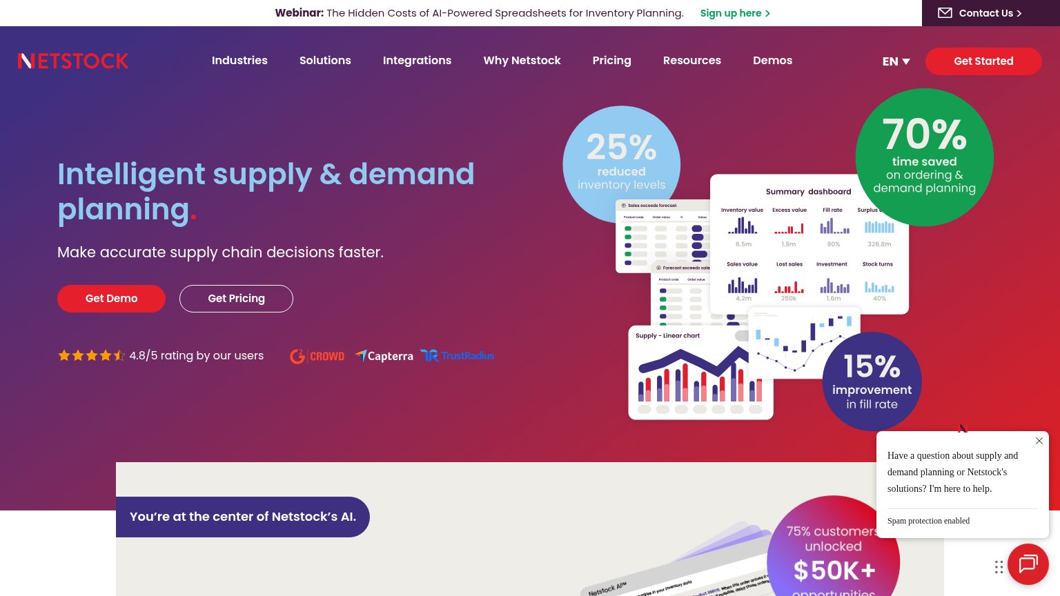
| "4.8/5 rating by our users" with G2 Crowd, Capterra, and TrustRadius badges | |
| "Trusted by 2,000+ of the world's most ambitious brands" with logos including Abbott, Circle K, Engie, and Arduino |
Mobile web
58FairThe phone experience as a first-class citizen.
123- Clipped CTA buttons — Contact us and Get a demo are pushed to the bottom edge and cut off, far below the first viewport.
- Ask Lokad pill — Chat widget sits directly on top of the Get a demo button, blocking the tap target.
- Screenshot collage — Dense desktop dashboard collage consumes a huge mid-page slab and pushes benefits and CTAs down.
CTA
62FairCopy, size, verb, cost-feel — does the primary CTA earn the click?
How Lokad compares
Recommended rewrites
Information hierarchy
68FairDoes the design help or inhibit what the page is trying to say?
What works
What to improve
Value props
68FairTitle, subtitle, hero — do they sell the product's true value?
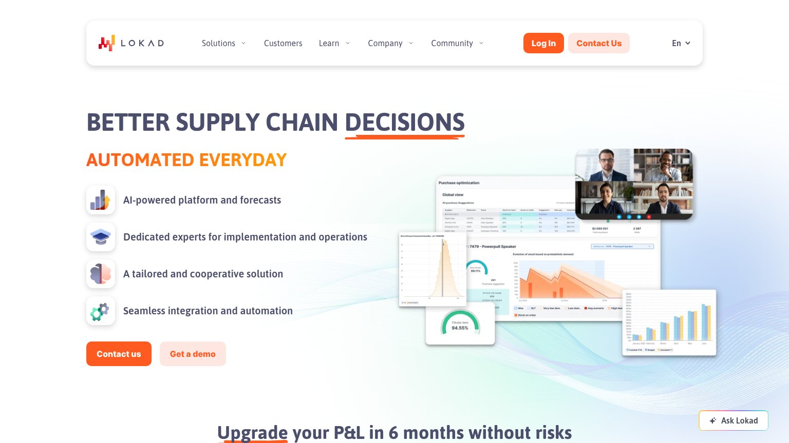
Lokad’s headline
BETTER SUPPLY CHAIN DECISIONS
AUTOMATED EVERYDAY
Working
Could improve