
Your landing page’s weakest score is Information hierarchy.
How STACK ranks
78Growth scoreupdated
category scores
category scoresShowHide
Information hierarchy
68FairDoes the design help or inhibit what the page is trying to say?
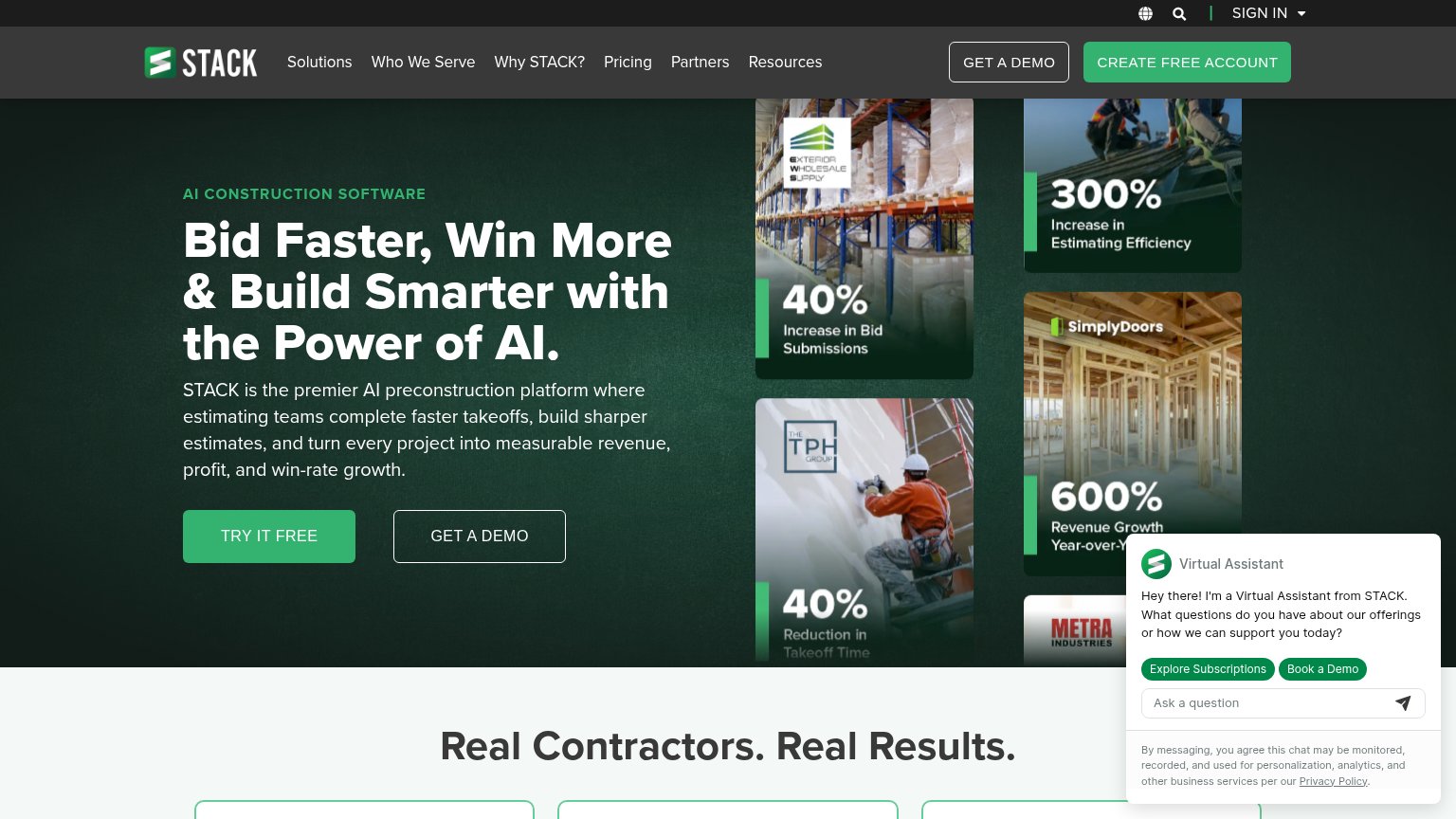 1234
- Auto-expanded chat widget — Opens uninvited over a proof tile, adding two extra buttons that compete with the hero CTA.
- Create Free Account button — Same green fill and weight as the hero's TRY IT FREE, splitting the primary action into two.
- Four stacked proof tiles — Equal-weight 40%/300%/600%/40% cards shout at once instead of one clear headline stat.
- Six-item nav row — Solutions through Resources plus sign-in/search give attention many exits before the hero CTA.
Trust
74FairProof that the product is real, competent, and safe to try.
| Trust read | |
|---|---|
| STACK | Named customer result cards, e.g. SimplyDoors "600% Revenue Growth Year-over-Year" |
| "Backed by Y Combinator" badge above the hero headline | |
| Real Countfire product screenshot showing the takeoff UI counting symbols on an electrical drawing (A 125, AE 55, BE 64, | |
| "Trusted every day by thousands of professional builders." strip above the customer logo row | |
| "Rated 4.6/5 from 80+ reviews" badge beneath the hero CTA |
Mobile web
78FairThe phone experience as a first-class citizen.
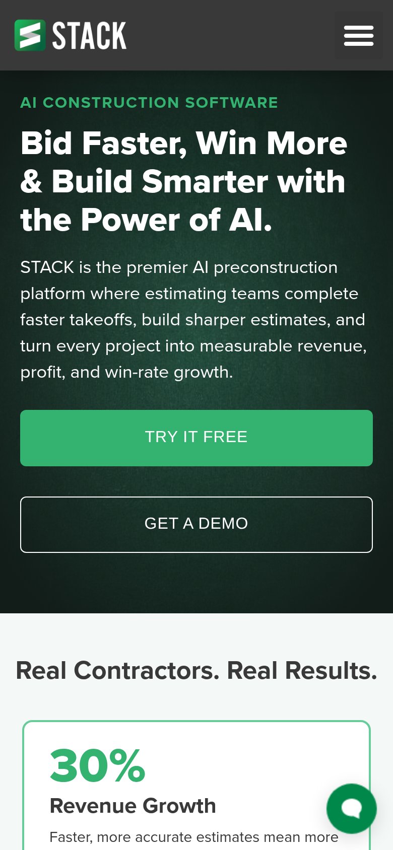
What works
What to improve
Value props
82StrongTitle, subtitle, hero — do they sell the product's true value?
STACK’s headline
Bid Faster, Win More & Build Smarter with the Power of AI.
STACK is the premier AI preconstruction platform where estimating teams complete faster takeoffs, build sharper estimates, and turn every project into measurable revenue, profit, and win-rate growth.
Working
Could improve
CTA
86StrongCopy, size, verb, cost-feel — does the primary CTA earn the click?
How STACK compares
Recommended rewrites