
Your landing page’s weakest score is Trust.
How Sohar Health ranks
- 1.
Asteroid79
- 2.
Infinitus73
- 3.
Sohar Health72
- 4.
Tennr63
Trust
54FairProof that the product is real, competent, and safe to try.

| Trust read | |
|---|---|
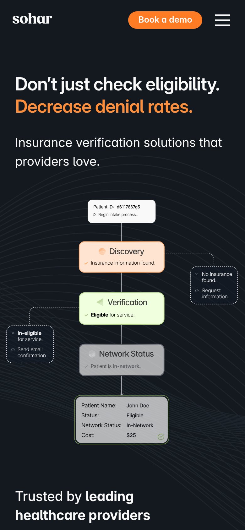
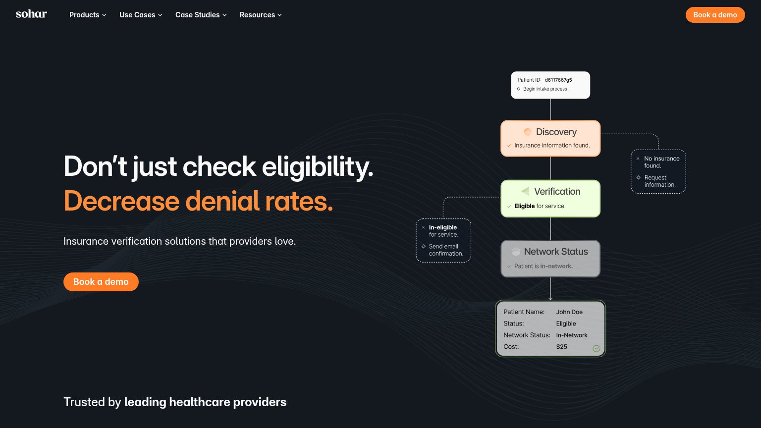
| Sohar Health | Animated eligibility-workflow diagram ending in the result card "Patient Name: John Doe / Status: Eligible / Network Sta |
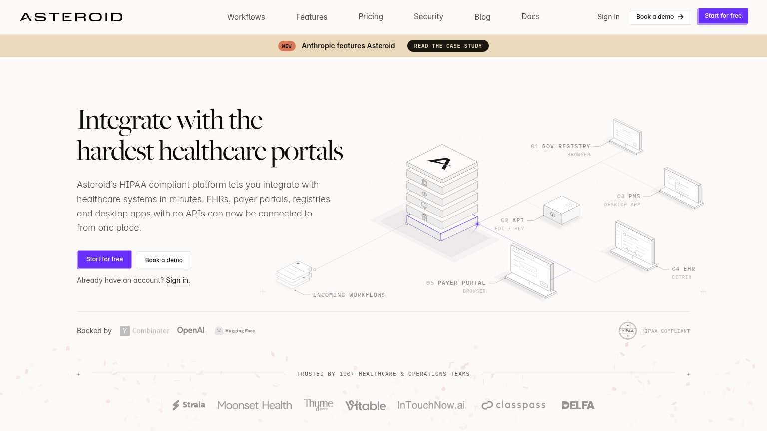
| "TRUSTED BY 100+ HEALTHCARE & OPERATIONS TEAMS" logo strip (Strala, Moonset Health, ClassPass, etc.) | |
| No visible trust signal identified. | |
| ">90% positive ratings from patients" metric strip beneath the hero CTA |
CTA
72FairCopy, size, verb, cost-feel — does the primary CTA earn the click?
Problems
- demo booking feels costly
- no low-intent secondary path
- small vs. oversized headline
Mobile web
72FairThe phone experience as a first-class citizen.
What works
What to improve
Value props
78FairTitle, subtitle, hero — do they sell the product's true value?
Sohar Health’s headline
Don't just check eligibility. Decrease denial rates.
Insurance verification solutions that providers love.
Working
Could improve
Information hierarchy
84StrongDoes the design help or inhibit what the page is trying to say?
What works
What to improve