
Your landing page’s weakest score is Information hierarchy.
How Asteroid ranks
- 1.
Asteroid79
- 2.
Infinitus73
- 3.
Sohar Health72
- 4.
Tennr63
79Growth scoreupdated
category scores
category scoresShowHide
Information hierarchy
78FairDoes the design help or inhibit what the page is trying to say?
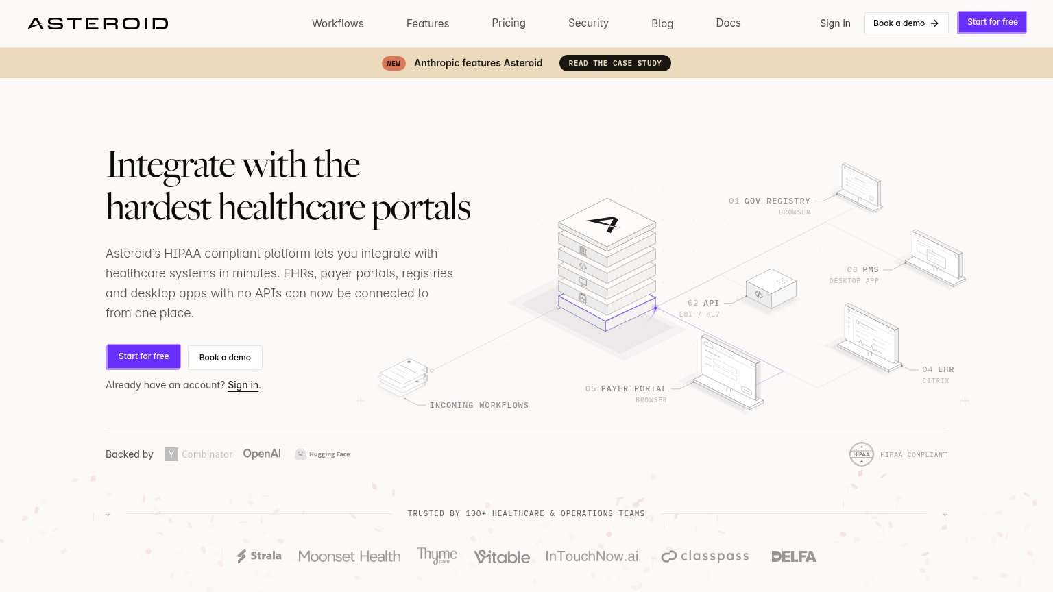 1234
- Case study banner — High-contrast tan strip with 'READ THE CASE STUDY' pulls attention off the hero before the value prop lands.
- Seven-link nav row — Workflows through Docs plus Sign in gives nine exits equal footing before the primary CTA is reached.
- Nav Start for free — Duplicates the hero CTA at equal weight, splitting the single conversion focal point.
- Backed-by investor row — Grey Y Combinator/OpenAI/Hugging Face marks read as faded links, adding a fourth horizontal band competing in the fold.
Value props
78FairTitle, subtitle, hero — do they sell the product's true value?
Asteroid’s headline sells
Integrate with the hardest healthcare portals
Asteroid’s HIPAA compliant platform lets you integrate with healthcare systems in minutes. EHRs, payer portals, registries and desktop apps with no APIs can now be connected to from one place.
Working
- 'Hardest' taps real portal frustration
- Concrete list: EHRs, payer portals, registries
- 'No APIs' and 'in minutes' remove objections
Could improve
- No end outcome (time saved, claims done)
- Only number is 100+ teams, below the CTA
- 'In minutes' is vague — quantify it
Trust
78FairProof that the product is real, competent, and safe to try.
How Asteroid compares
Trust read
Mobile web
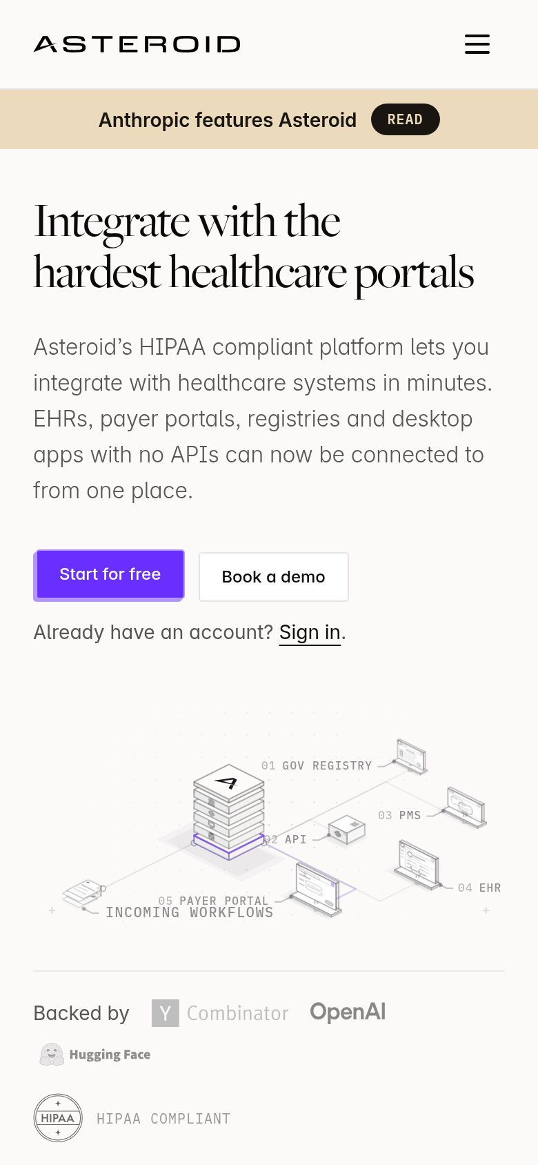
78FairThe phone experience as a first-class citizen.
What works
What to improve
CTA
84StrongCopy, size, verb, cost-feel — does the primary CTA earn the click?
How Asteroid compares
Recommended rewrites