
Your landing page’s weakest score is Information hierarchy.
How Smart Radar System ranks
- 1.
Congruent69
- 2.
Zendar57
- 3.
Provizio57
- 4.
Arbe Robotics52
- 5.
Echodyne51
- 6.
Smart Radar System40
40Growth scoreupdated
category scores
category scoresShowHide
Information hierarchy
38PoorDoes the design help or inhibit what the page is trying to say?
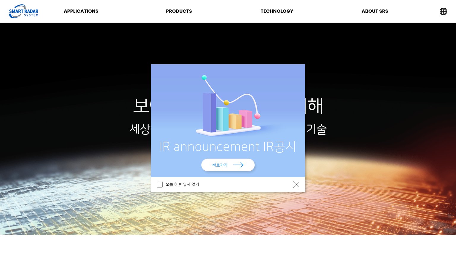 1234
- IR announcement popup — Modal covers the headline on both viewports and hijacks the fold's only clickable action for an investor notice.
- Obscured hero headline — Value proposition '보이지 않는 것을 보기 위해…' is cut in half by the popup and unreadable at a glance.
- 바로가기 popup link — The only visible CTA in the fold leads to IR disclosures, not a product conversion path.
- Top navigation row — Five equal-weight exits (nav links plus globe icon) with no primary CTA to subordinate them to.
Trust
38PoorProof that the product is real, competent, and safe to try.
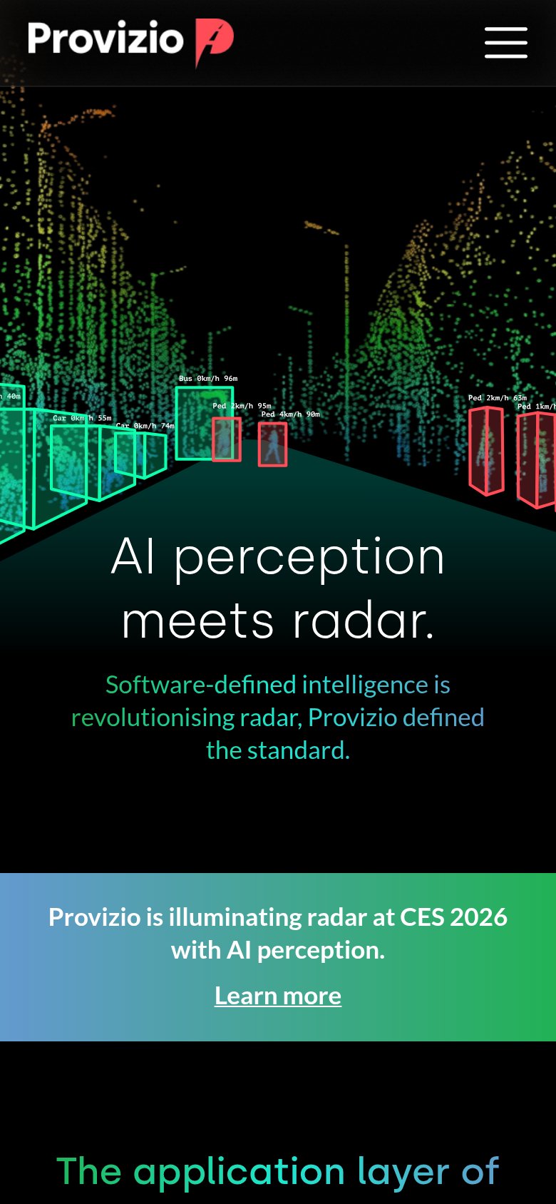
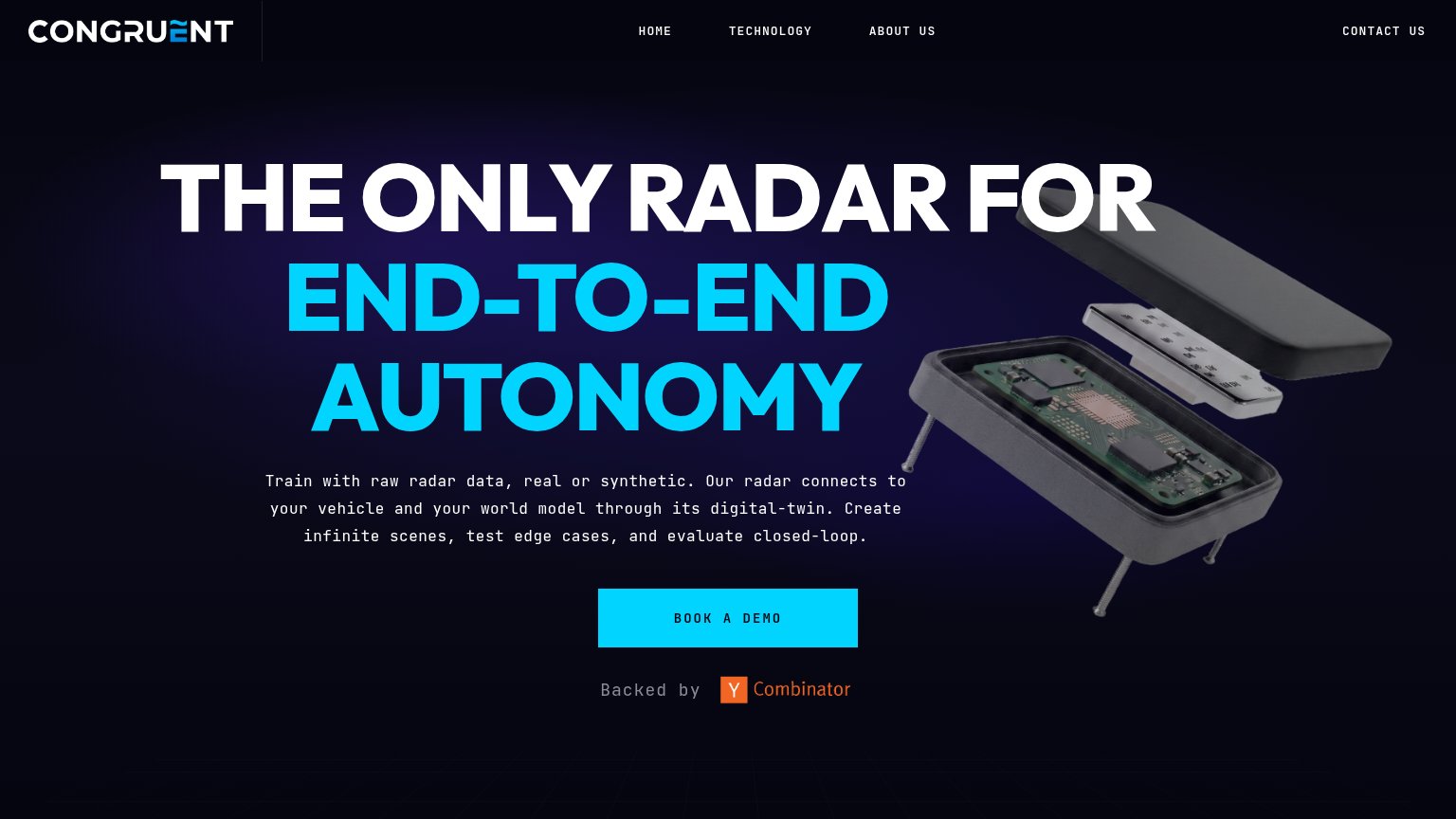
| Trust read | |
|---|---|
| Smart Radar System | "IR announcement IR공시" popup implying a publicly disclosed, real company |
| "Backed by Y Combinator" badge below the Book a Demo CTA | |
| No visible trust signal identified. | |
| No visible trust signal identified. | |
| Radar point-cloud demo visualization with labeled object detections ("Car 0km/h 55m", "Ped 4km/h 90m") | |
| No visible trust signal identified. |
Mobile web
38PoorThe phone experience as a first-class citizen.
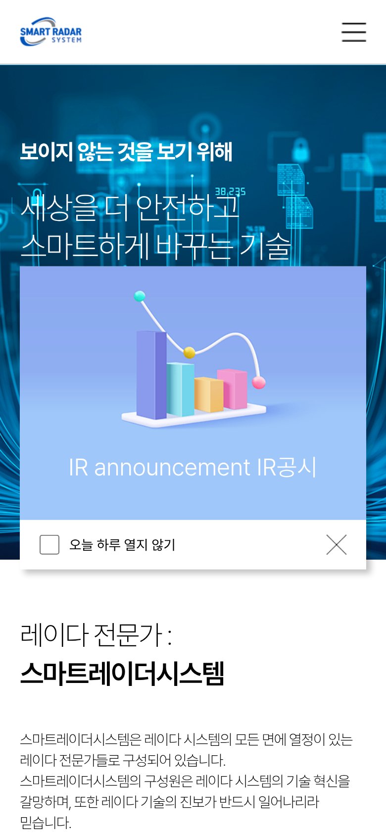
What works
What to improve
CTA
42PoorCopy, size, verb, cost-feel — does the primary CTA earn the click?
How Smart Radar System compares
Recommended rewrites
Value props
42PoorTitle, subtitle, hero — do they sell the product's true value?
Smart Radar System’s headline
보이지 않는 것을 보기 위해
세상을 더 안전하고 스마트하게 바꾸는 기술
Working
Could improve