
Your landing page’s weakest score is Trust.
How Congruent ranks
Trust
52FairProof that the product is real, competent, and safe to try.
| Trust read | |
|---|---|
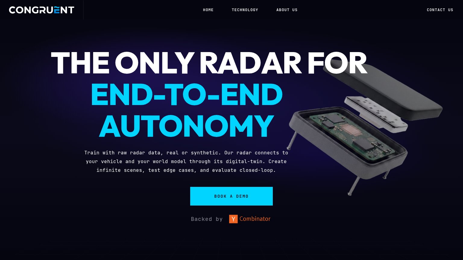
| Congruent | "Backed by Y Combinator" badge below the Book a Demo CTA |
| No visible trust signal identified. | |
| No visible trust signal identified. | |
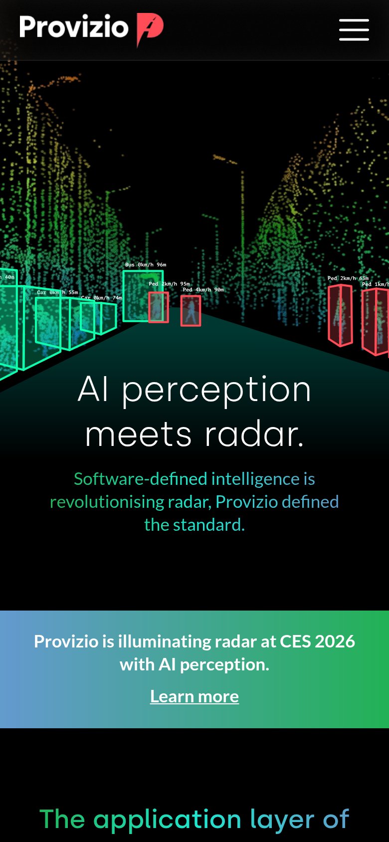
| Radar point-cloud demo visualization with labeled object detections ("Car 0km/h 55m", "Ped 4km/h 90m") | |
| "IR announcement IR공시" popup implying a publicly disclosed, real company | |
| No visible trust signal identified. |
Mobile web
62FairThe phone experience as a first-class citizen.
 1234
- Primary CTA below fold — The 'BOOK A DEMO' button sits far down the page after seven lines of body copy, past the first viewport on most phones.
- Seven-line body paragraph — The description wraps into seven short cramped lines over the product render, delaying the CTA and reading as a wall of text.
- Body copy over render — The paragraph is overlaid directly on the exploded radar image, degrading contrast and making the render illegible.
- Awkward 'Backed by' wrap — The 'Backed by' label breaks into two misaligned lines beside the Y Combinator badge, looking untested on mobile.
Value props
72FairTitle, subtitle, hero — do they sell the product's true value?
Congruent’s headline
THE ONLY RADAR FOR END-TO-END AUTONOMY
Train with raw radar data, real or synthetic. Our radar connects to your vehicle and your world model through its digital-twin. Create infinite scenes, test edge cases, and evaluate closed-loop.
Working
Could improve
CTA
76FairCopy, size, verb, cost-feel — does the primary CTA earn the click?
How Congruent compares
Recommended rewrites
Information hierarchy
84StrongDoes the design help or inhibit what the page is trying to say?
What works
What to improve