
Your landing page’s weakest score is Trust.
How SmarterDx ranks
- 1.
Kaizen75
- 2.
Infinitus73
- 3.
SmarterDx64
- 4.
Tennr63
Trust
40PoorProof that the product is real, competent, and safe to try.

| Trust read | |
|---|---|
| SmarterDx | No visible trust signal identified. |
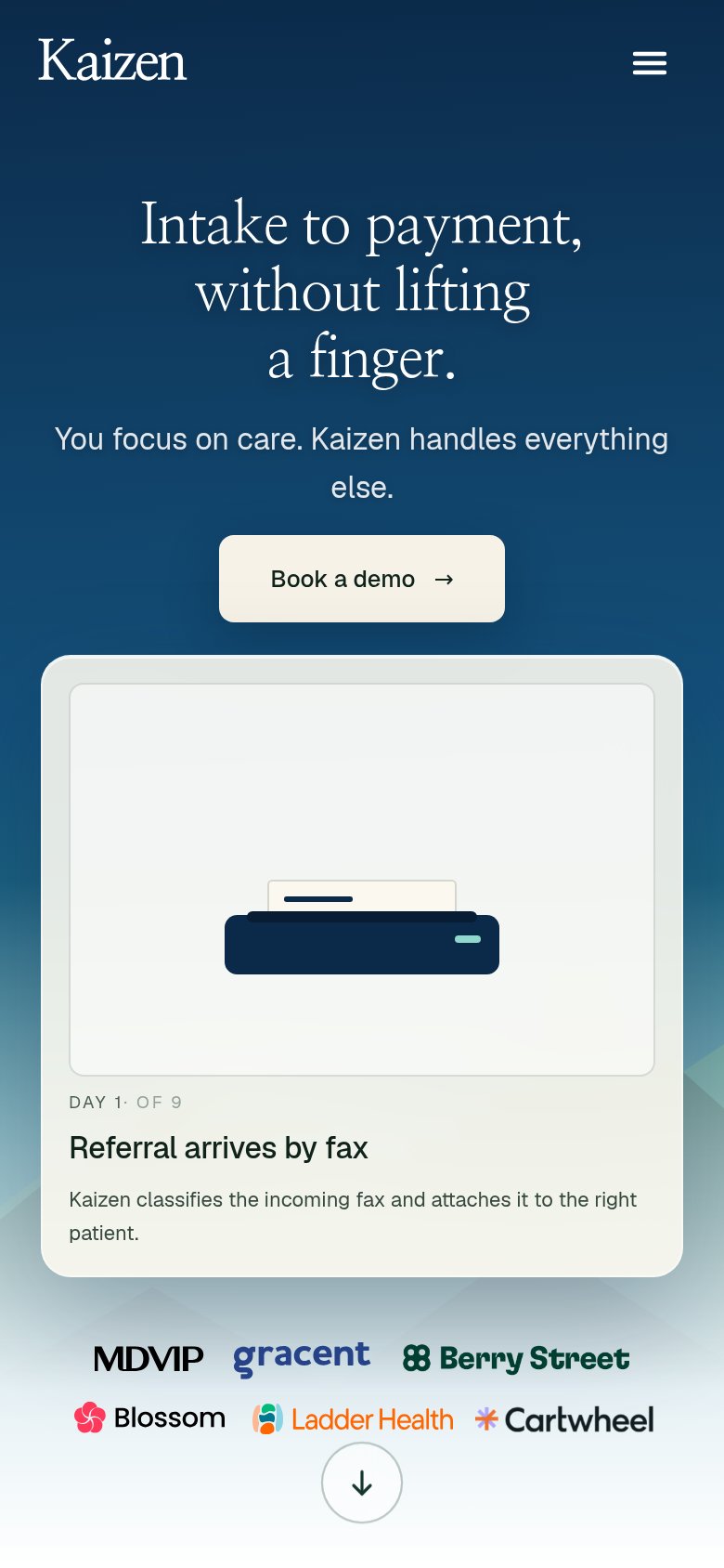
| Customer logo row on mobile: MDVIP, gracent, Berry Street, Blossom, Ladder Health, Cartwheel | |
| No visible trust signal identified. | |
| ">90% positive ratings from patients" metric strip beneath the hero CTA |
Mobile web
58FairThe phone experience as a first-class citizen.
 1234
- Six-line hero headline — Desktop headline barely scaled down; it wraps into six oversized lines eating most of the viewport.
- Two stacked body paragraphs — Desktop-density copy crammed into the phone column pushes the primary CTA to the fold's bottom edge.
- Explore the platform button — Sits at the very bottom of the fold and stays desktop-width instead of near-full-bleed.
- Eyebrow tagline text — Wide-tracked monospace 'THE CLINICALLY INTELLIGENT RCM PLATFORM' wraps awkwardly at phone width.
CTA
70FairCopy, size, verb, cost-feel — does the primary CTA earn the click?
How SmarterDx compares
Recommended rewrites
Value props
72FairTitle, subtitle, hero — do they sell the product's true value?
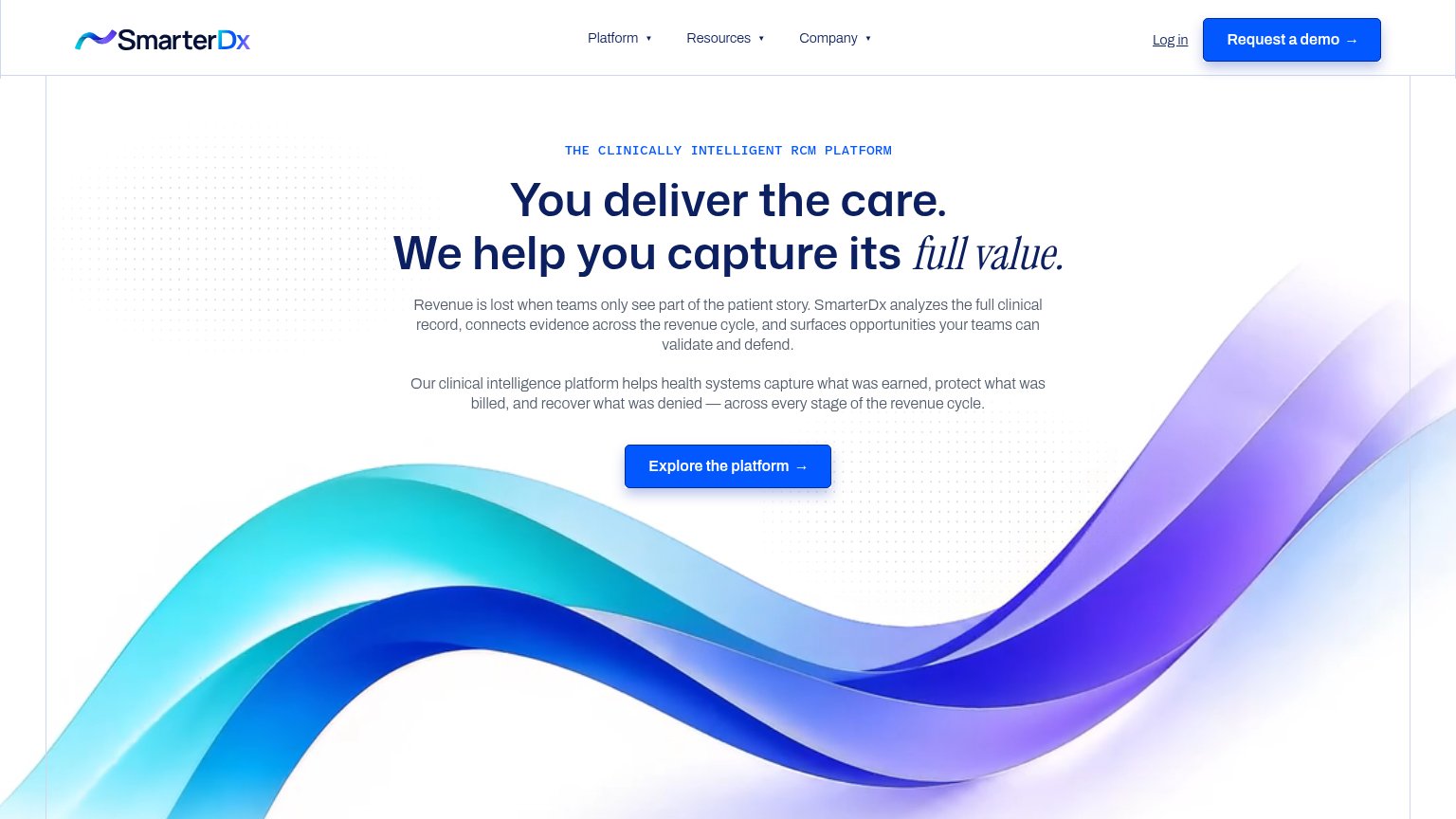
SmarterDx’s headline
You deliver the care. We help you capture its full value.
Revenue is lost when teams only see part of the patient story. SmarterDx analyzes the full clinical record, connects evidence across the revenue cycle, and surfaces opportunities your teams can validate and defend.
Working
Could improve
Information hierarchy
78FairDoes the design help or inhibit what the page is trying to say?
What works
What to improve