
Your landing page’s weakest score is Mobile web.
How Shopmonkey ranks
66Growth scoreupdated
category scores
category scoresShowHide
Mobile web
58FairThe phone experience as a first-class citizen.
 1234
- Request a Demo button — Primary CTA sits two screens below the fold and the chat bubble crowds its right edge.
- Newsletter promo bar — Dead blocker with no conversion CTA that consumes the top of the first viewport.
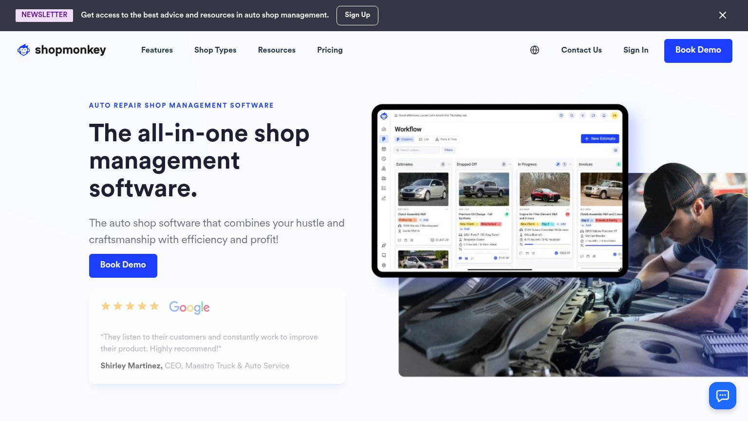
- Hero screenshot collage — Tall image stack pushes the value copy and CTA far below the fold.
- Chat bubble — Floating widget overlaps the primary CTA's tap area at the fold edge.
Value props
62FairTitle, subtitle, hero — do they sell the product's true value?
Shopmonkey’s headline undersells
The all-in-one shop management software.
The auto shop software that combines your hustle and craftsmanship with efficiency and profit!
Working
- Eyebrow nails the exact audience
- Hero image shows real product UI
- 5-star Google review adds proof
Could improve
- Subhead repeats 'software', adds no facts
- No numbers or concrete outcomes
- 'Efficiency and profit' is generic
CTA
64FairCopy, size, verb, cost-feel — does the primary CTA earn the click?
How Shopmonkey compares
Recommended rewrites
Trust
68FairProof that the product is real, competent, and safe to try.
How Shopmonkey compares
Trust read
Information hierarchy
76FairDoes the design help or inhibit what the page is trying to say?
What works
What to improve