
Your landing page’s weakest score is CTA.
How Sendblue ranks
- 1.
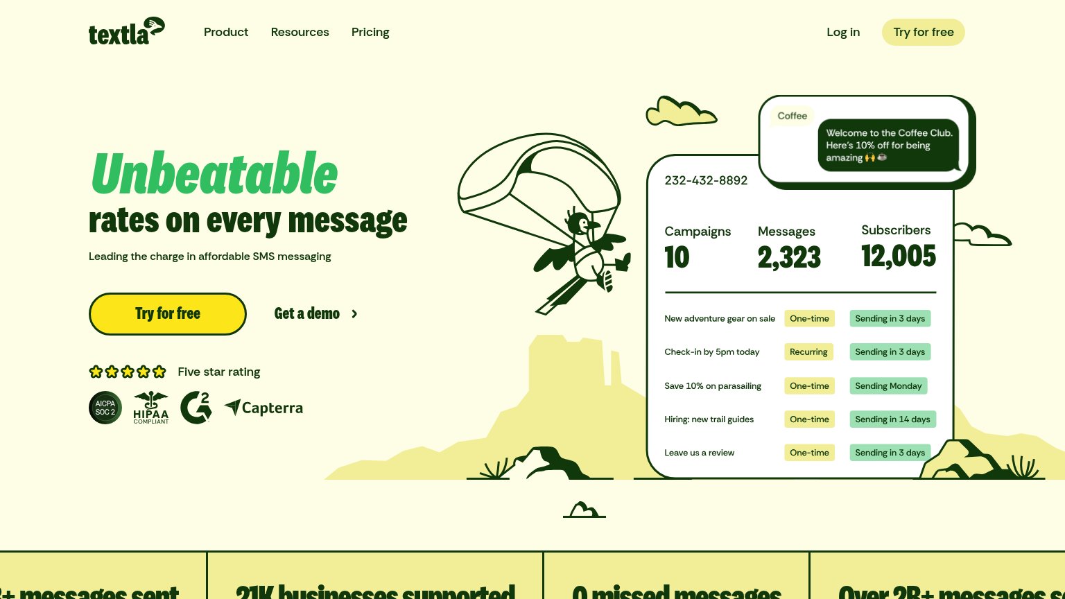
Textla81
- 2.
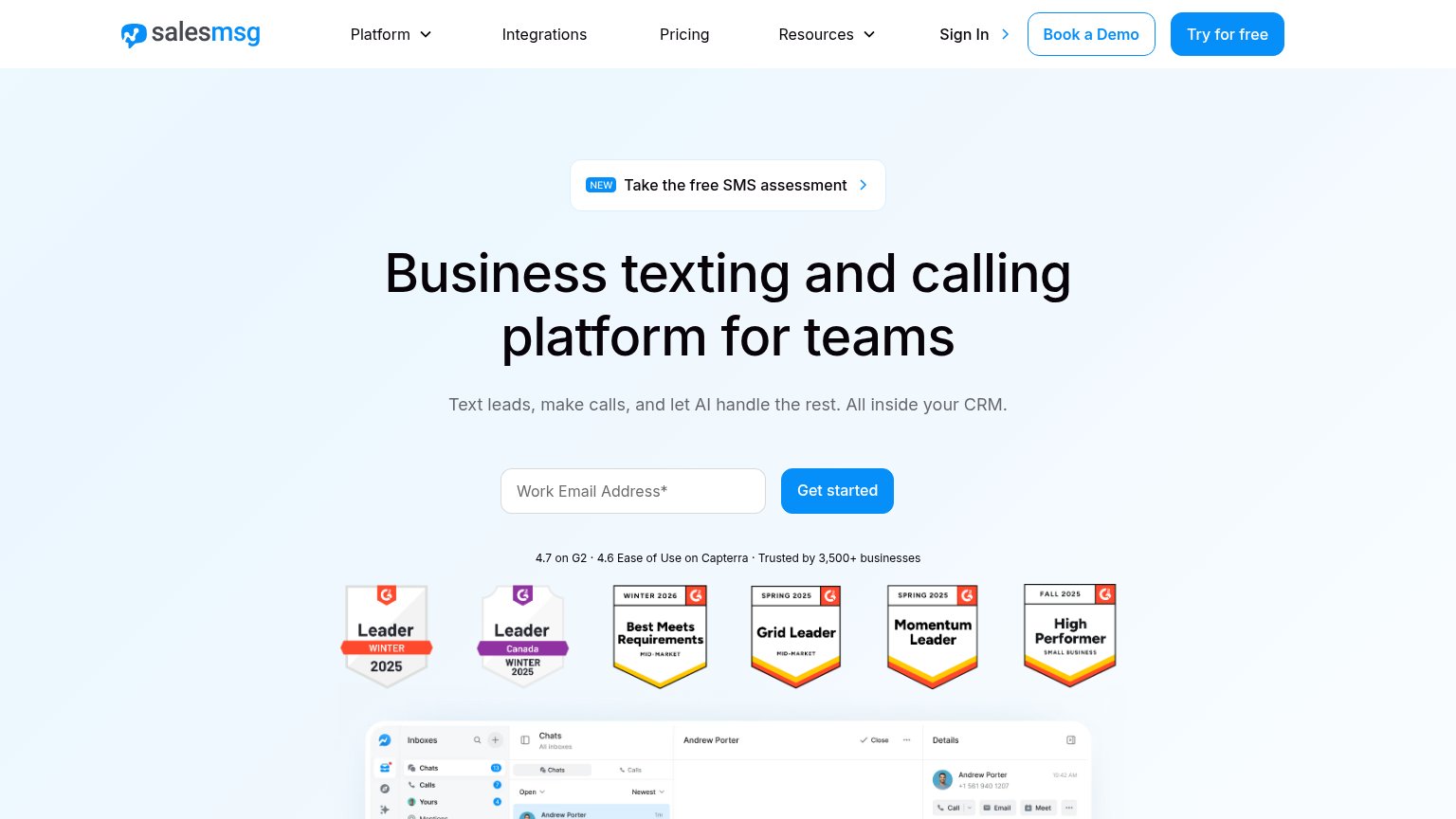
Salesmsg74
- 3.
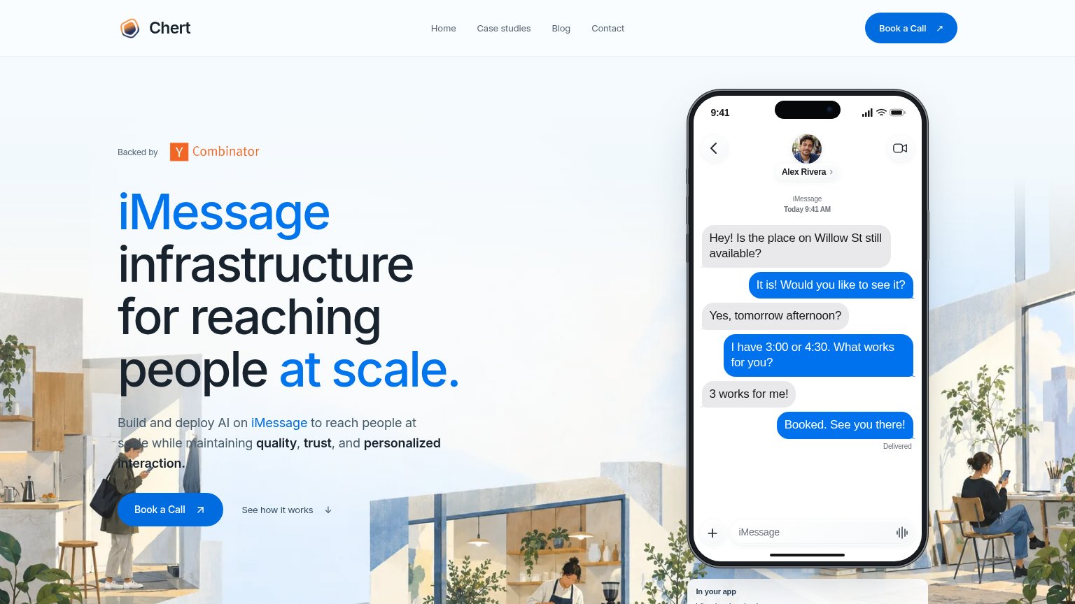
Chert71
- 4.
Sendblue68
- 5.
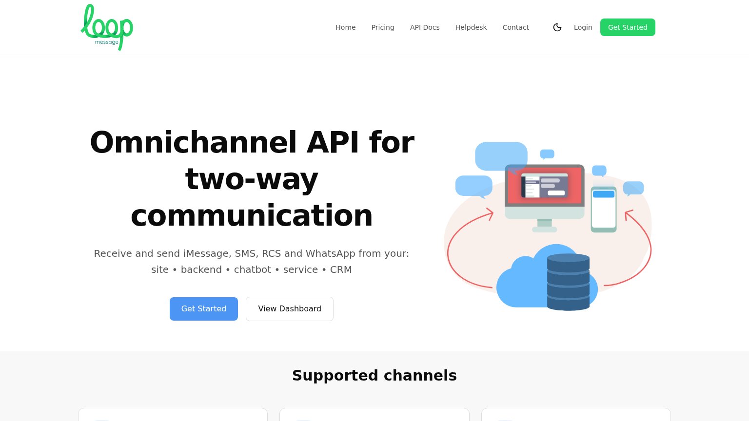
Loop Message66
CTA
58FairCopy, size, verb, cost-feel — does the primary CTA earn the click?
Problems
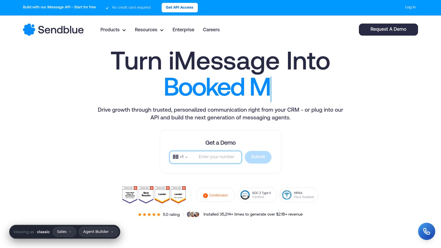
- 'Submit' promises nothing
- asks phone number upfront — costly
- no 'free' despite free banner offer
- three competing CTA labels
Mobile web
66FairThe phone experience as a first-class citizen.
 123
- Get a Demo form — The phone-number field with country picker plus a disabled-looking Submit sits mostly below the first viewport, so the primary action needs a scroll.
- Chat bubble over badges — The floating phone bubble overlaps the HIPAA trust card and crowds the bottom-right tap zone.
- Viewing-as debug bar — A sticky 'Viewing as classic / Sales / Agent Builder' toolbar covers page content and adds a competing tap target.
Information hierarchy
68FairDoes the design help or inhibit what the page is trying to say?
What works
What to improve
Value props
72FairTitle, subtitle, hero — do they sell the product's true value?
Sendblue’s headline
Turn iMessage Into Booked M
Drive growth through trusted, personalized communication right from your CRM - or plug into our API and build the next generation of messaging agents.
Working
Could improve
Trust
78FairProof that the product is real, competent, and safe to try.
How Sendblue compares
Trust read