
Your landing page’s weakest score is Information hierarchy.
How Salesmsg ranks
- 1.
Textla81
- 2.
Salesmsg74
- 3.
Chert71
- 4.
Sendblue68
- 5.
Loop Message66
74Growth scoreupdated
category scores
category scoresShowHide
Information hierarchy
72FairDoes the design help or inhibit what the page is trying to say?
 123
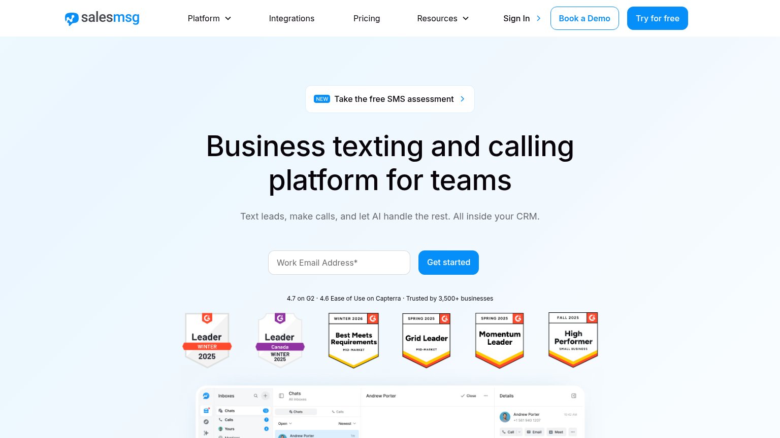
- Try for free button — Same-weight blue button as "Get started" splits the primary action between two competing conversions.
- SMS assessment banner — "NEW" pill banner sits directly above the headline and pulls first attention toward a secondary exit.
- Book a Demo button — Third styled CTA in the header adds a second conversion path before the visitor reads the headline.
CTA
72FairCopy, size, verb, cost-feel — does the primary CTA earn the click?
Problems
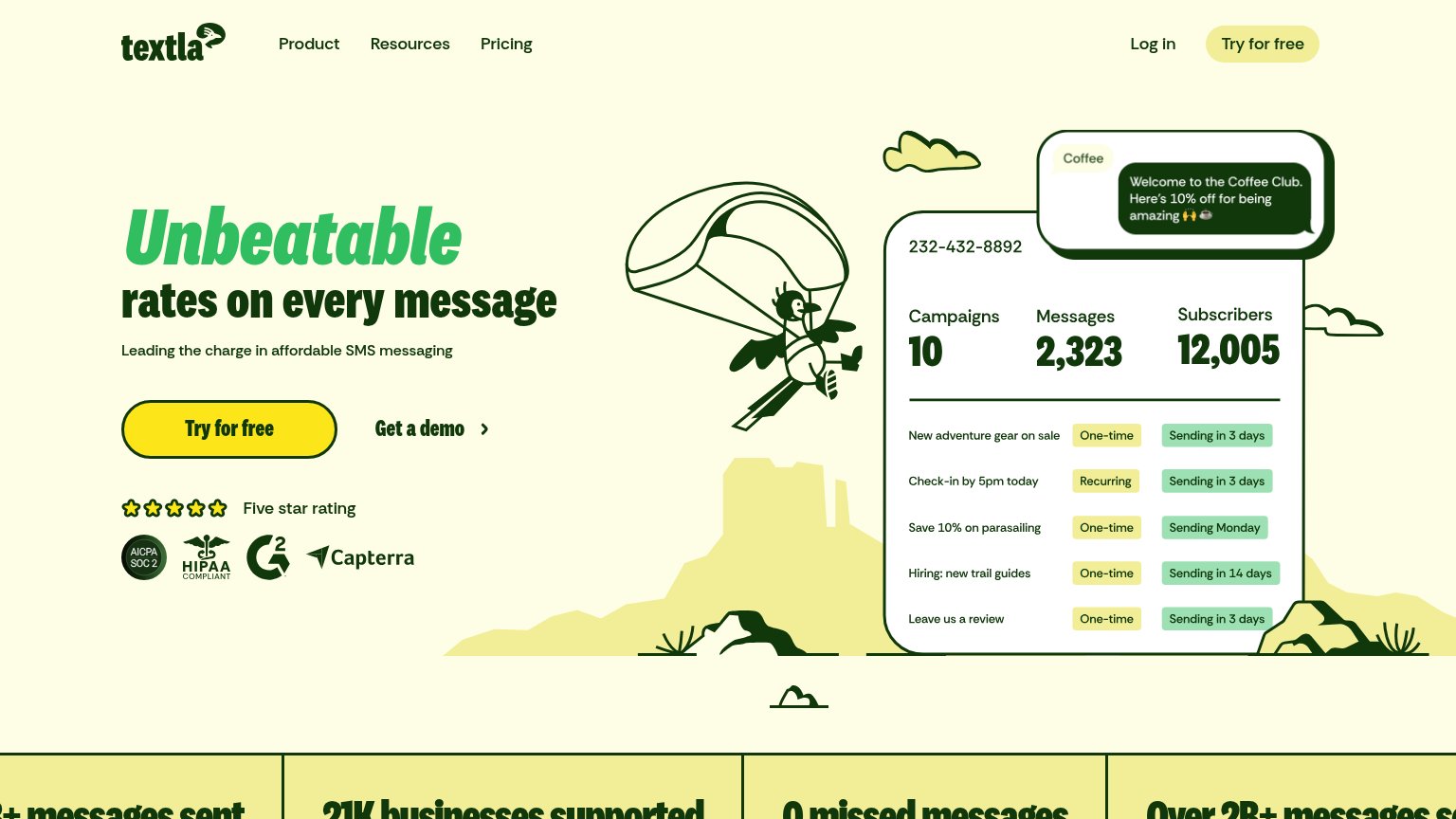
- no 'free' despite 'Try for free' nav
- label differs from nav CTA
- work email required before value
Value props
72FairTitle, subtitle, hero — do they sell the product's true value?
Salesmsg’s headline
Business texting and calling platform for teams
Text leads, make calls, and let AI handle the rest. All inside your CRM.
Working
Could improve
Trust
78FairProof that the product is real, competent, and safe to try.
How Salesmsg compares
Trust read
Mobile web
78FairThe phone experience as a first-class citizen.
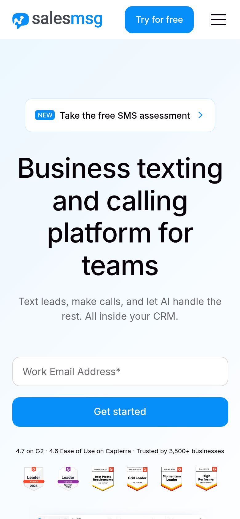
What works
What to improve