
Your landing page’s weakest score is Trust.
How Selfin ranks
Trust
58FairProof that the product is real, competent, and safe to try.

| Trust read | |
|---|---|
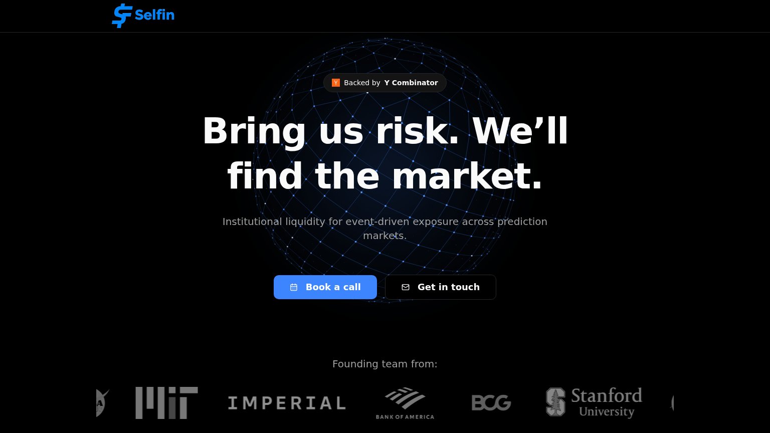
| Selfin | "Backed by Y Combinator" badge above the headline |
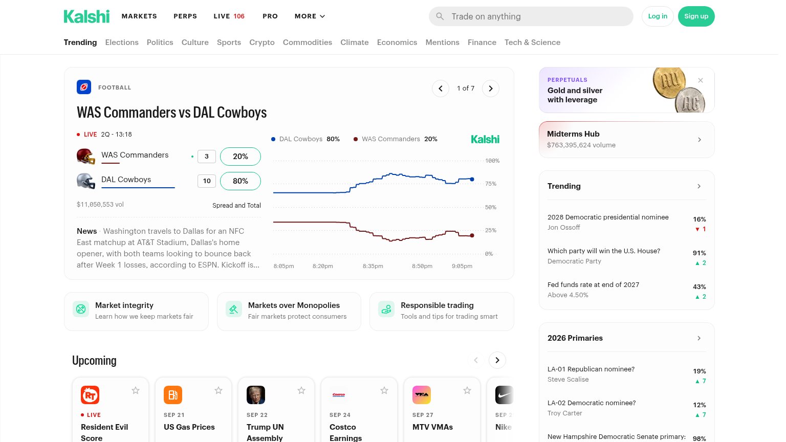
| Live market card showing "$11,050,553 vol" with a real-time price chart for WAS Commanders vs DAL Cowboys | |
| Live market volume figures — "$7M Vol." on the NATO x Russia market and Hot Topics showing "$614K today" traded | |
| No visible trust signal identified. |
Mobile web
58FairThe phone experience as a first-class citizen.
 123
- Book a call CTA — Sits below the first mobile viewport, so visitors see no tappable action on landing.
- Oversized hero headline — Wraps into four tall lines at desktop weight, eating half the screen and pushing the CTA down.
- Get in touch button — Low-contrast dark outline button nearly disappears against the black background.
Value props
68FairTitle, subtitle, hero — do they sell the product's true value?
Selfin’s headline
Bring us risk. We’ll find the market.
Institutional liquidity for event-driven exposure across prediction markets.
Working
Could improve
CTA
70FairCopy, size, verb, cost-feel — does the primary CTA earn the click?
How Selfin compares
Recommended rewrites
Information hierarchy
82StrongDoes the design help or inhibit what the page is trying to say?
What works
What to improve