
Your landing page’s weakest score is Information hierarchy.
How Seeking Alpha ranks
- 1.
Ekpa74
- 2.
The Motley Fool67
- 3.
Seeking Alpha66
- 4.
TipRanks56
- 5.
Zacks Investment Research54
66Growth scoreupdated
category scores
category scoresShowHide
Information hierarchy
58FairDoes the design help or inhibit what the page is trying to say?
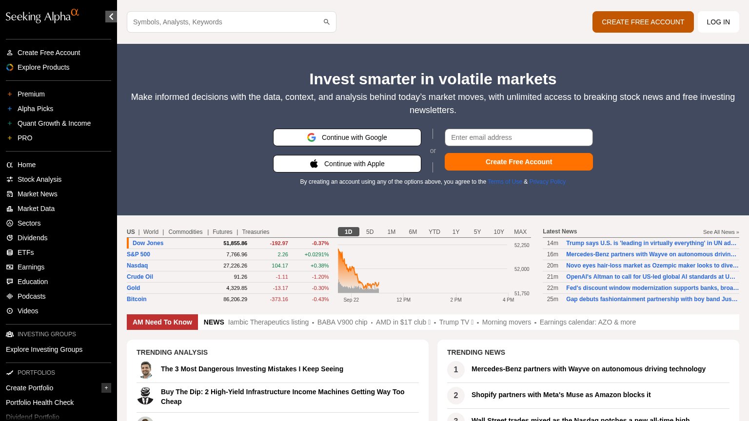 1234
- Left sidebar navigation — Twenty-plus equal-weight links (Premium, Alpha Picks, Market News, Sectors...) leak attention away from account creation before the hero even registers.
- Market data band — Dense tickers, chart, and Latest News headlines sit at the same visual weight as the signup hero, splitting the fold into two competing pages.
- Duplicate signup CTAs — Header 'CREATE FREE ACCOUNT', Google, Apple, and orange 'Create Free Account' present four same-purpose buttons with no single dominant action.
- AM Need To Know strip — Red banner plus five headline links add another exit row directly under the hero's conversion form.
Mobile web
58FairThe phone experience as a first-class citizen.
 1234
- Sign-in overlay interstitial — A ~93% viewport Google sign-in overlay blocked the first tap and had to be dismissed before content was reachable.
- Bottom sticky signup banner — The 'Create Free Account' banner covers roughly a third of the viewport and hides the fifth trending item behind it.
- Double-decker sticky header — Hamburger row plus Home/News/Analysis/Portfolio tab row stack two nav decks, eating the top of the fold.
- Truncated news ticker — 'Iambic Therapeutics list…' clips mid-word with no visible affordance that it scrolls.
Value props
68FairTitle, subtitle, hero — do they sell the product's true value?
Seeking Alpha’s headline
Invest smarter in volatile markets
Make informed decisions with the data, context, and analysis behind today's market moves, with unlimited access to breaking stock news and free investing newsletters.
Working
Could improve
Trust
68FairProof that the product is real, competent, and safe to try.
How Seeking Alpha compares
Trust read
CTA
78FairCopy, size, verb, cost-feel — does the primary CTA earn the click?
How Seeking Alpha compares
Recommended rewrites