
Your landing page’s weakest score is Trust.
How Scalar Field ranks
64Growth scoreupdated
category scores
category scoresShowHide
Trust
46PoorProof that the product is real, competent, and safe to try.

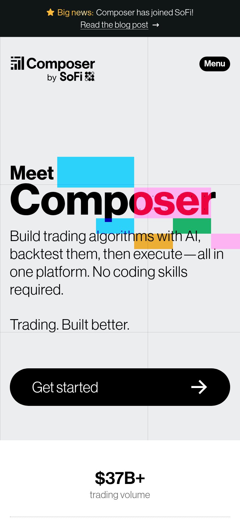
| Trust read | |
|---|---|
| Scalar Field | Interactive prompt console with 'Add Trading Platforms' and 'Add Data Sources' controls showing real product UI |
| "$37B+ trading volume" stat below the mobile CTA | |
| "Proudly featured by" press section heading (mobile capture) | |
| Trending AI Robots (30) (Selected out of 298 Total) |
Information hierarchy
62FairDoes the design help or inhibit what the page is trying to say?
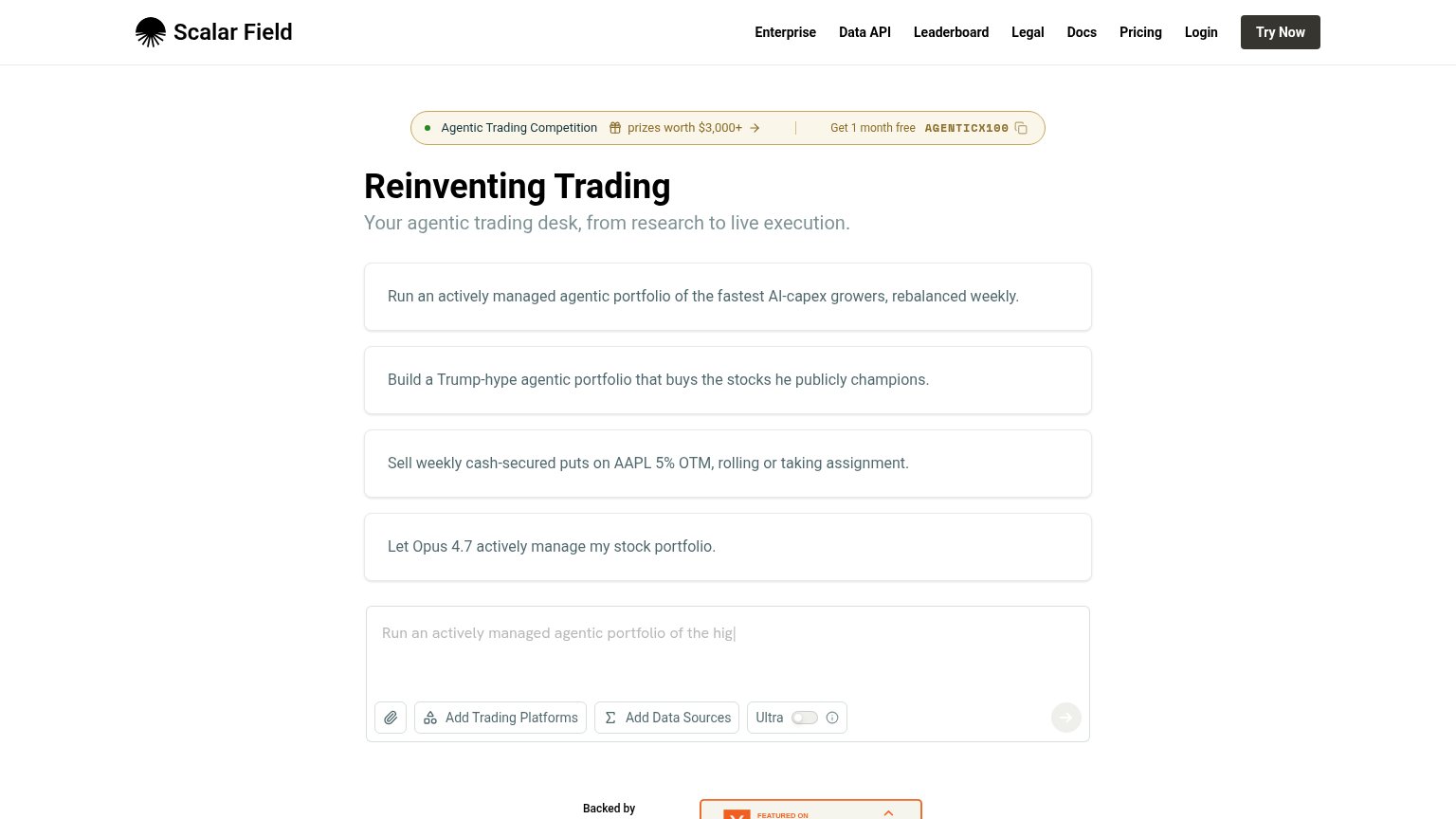 1234
- Competition banner — Sits above the headline and outranks 'Reinventing Trading' with color, an arrow link, and a promo code — three competing actions before the value prop.
- Four example prompt cards — Same size and weight as the input box below them, so the actual conversion surface reads as a fifth identical card instead of the destination.
- Nav link row — Seven text links plus Login sit at equal weight beside 'Try Now', giving eight exits before the primary action.
- Chat input send button — The primary action inside the fold's core surface is a faint grey arrow icon — near-invisible against the white card.
Value props
68FairTitle, subtitle, hero — do they sell the product's true value?
Scalar Field’s headline
Reinventing Trading
Your agentic trading desk, from research to live execution.
Working
Could improve
Mobile web
68FairThe phone experience as a first-class citizen.
What works
What to improve
CTA
78FairCopy, size, verb, cost-feel — does the primary CTA earn the click?
How Scalar Field compares
Recommended rewrites