
Your landing page’s weakest score is Trust.
How Composer ranks
- 1.
Conviction73
- 2.
Composer65
- 3.
Trade Ideas63
- 4.
Tickeron58
65Growth scoreupdated
category scores
category scoresShowHide
Trust
58FairProof that the product is real, competent, and safe to try.
| Trust read | |
|---|---|
| Composer | "$37B+ trading volume" stat below the mobile CTA |
| "Backed by Y Combinator" badge next to brokerage integration logos (Robinhood, Public.com, Alpaca) | |
| Trending AI Robots (30) (Selected out of 298 Total) | |
| Live "Stocks Trending Now" panel showing real ticker data (AAPL 323.08, NFLX 81.29) with timestamp |
Information hierarchy
62FairDoes the design help or inhibit what the page is trying to say?
 1234
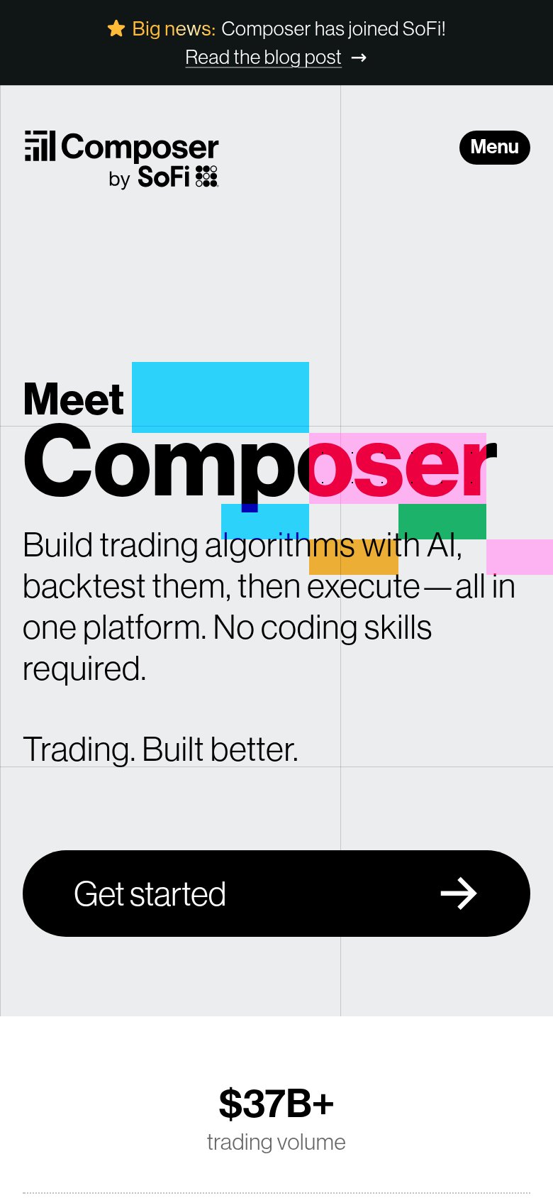
- Cut-off CTA button — The primary 'Get started' button sits below the fold line, leaving only the small nav 'Sign Up' pill as a visible action.
- Pink block overlap — The magenta block sits on top of 'oser', turning the headline's second half into a low-contrast pink-on-pink smear.
- Blog post banner — 'Read the blog post' is the topmost link on the page, routing first attention away from conversion.
- Six-link nav row — Six equal-weight nav links plus Login compete with the lone Sign Up pill before any hero CTA appears.
CTA
62FairCopy, size, verb, cost-feel — does the primary CTA earn the click?
How Composer compares
Recommended rewrites
Value props
64FairTitle, subtitle, hero — do they sell the product's true value?
Composer’s headline
Meet Composer
Build trading algorithms with AI, backtest them, then execute — all in one platform. No coding skills required.
Working
Could improve
Mobile web
78FairThe phone experience as a first-class citizen.
What works
What to improve