
Your landing page’s weakest score is Trust.
How Runna ranks
75Growth scoreupdated
category scores
category scoresShowHide
Trust
66FairProof that the product is real, competent, and safe to try.

| Trust read | |
|---|---|
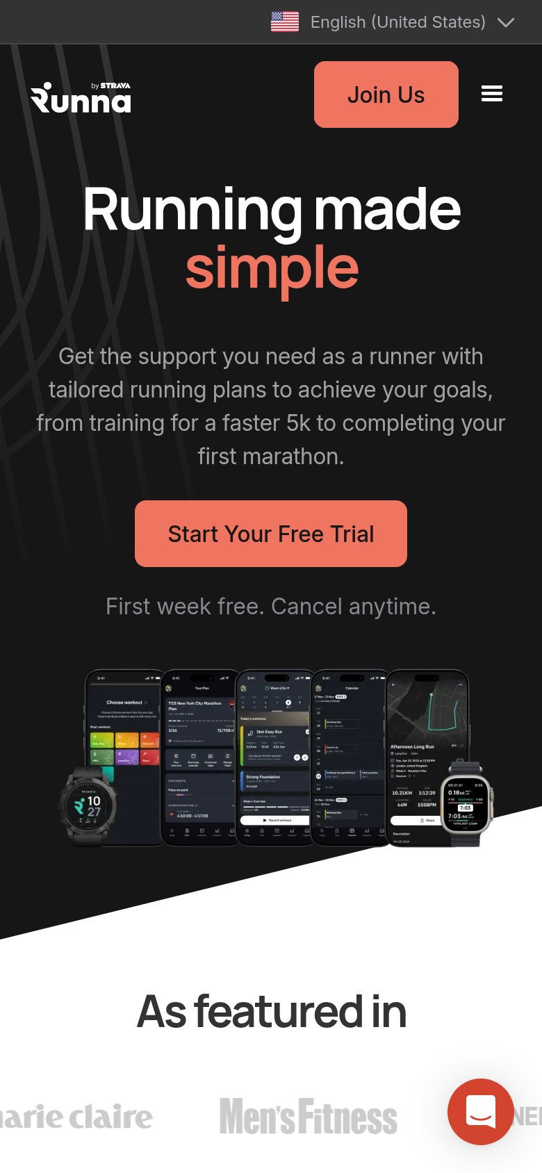
| Runna | Detailed real app screenshots including "TCS New York City Marathon Plan" and GPS route UI |
| Chat demo showing Amby's coaching message: "Morning. Sleep and HRV both look good, so today's a green light for interval | |
| "Harness intelligence from over 100 million kilometres of real-world data" | |
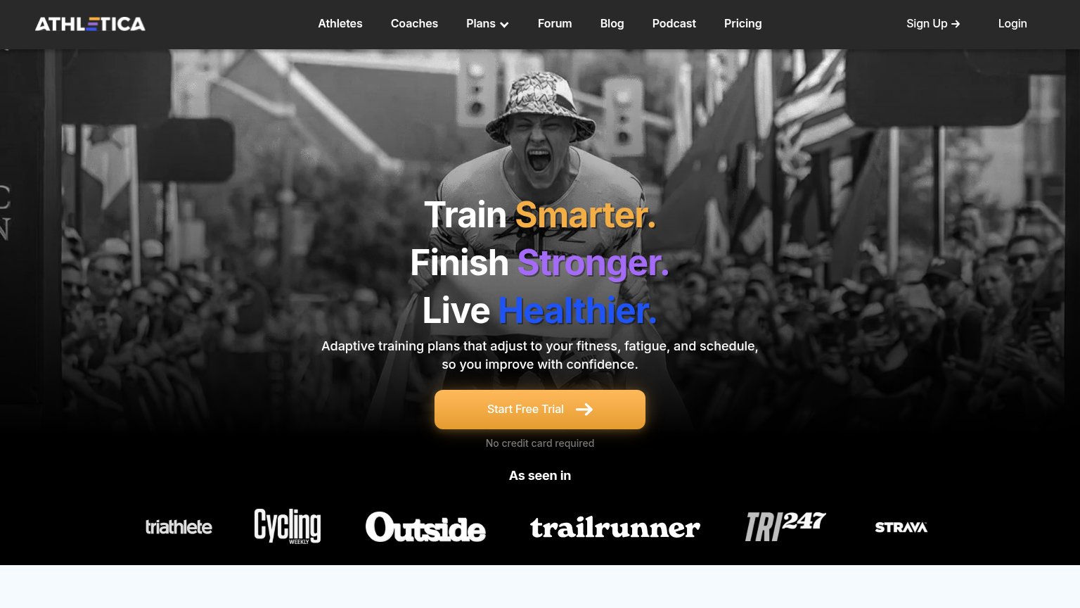
| "As seen in" press logo bar (Triathlete, Cycling Weekly, Outside, Trail Runner, TRI247, Strava) | |
| App UI screenshots showing personalized plan ("Amy, it's time to start training!") with workouts and health metrics (56 | |
| "we have published the science to back it up" claim in the hero subheadline |
Value props
72FairTitle, subtitle, hero — do they sell the product's true value?
Runna’s headline undersells
Running made simple
Get the support you need as a runner with tailored running plans to achieve your goals, from training for a faster 5k to completing your first marathon.
Working
- Subhead names concrete goals: 5k, first marathon
- Hero screens demonstrate real plans and workouts
- 'First week free. Cancel anytime.' de-risks trial
Could improve
- H1 is generic; doesn't say it's a coaching app
- No proof numbers (users, PBs, ratings)
- 'Get the support Runna need' is filler phrasing
Information hierarchy
76FairDoes the design help or inhibit what the page is trying to say?
What works
What to improve
CTA
80StrongCopy, size, verb, cost-feel — does the primary CTA earn the click?
How Runna compares
Recommended rewrites
Mobile web
83StrongThe phone experience as a first-class citizen.
What works
What to improve