
Your landing page’s weakest score is Mobile web.
How Rosalind ranks
60Growth scoreupdated
category scores
category scoresShowHide
Mobile web
48PoorThe phone experience as a first-class citizen.
 1234
- Cut-off primary CTA — "TRY FREE NOW" is clipped at the viewport edge — not tappable without scrolling.
- Three-paragraph hero copy — Desktop-length italic paragraphs fill the entire fold and push the CTA off-screen.
- Orange chat bubble — Floats in the thumb zone directly over where the primary CTA appears.
- Oversized body text — Body copy barely scaled down from desktop, wrapping into ~25 cramped lines.
Information hierarchy
52FairDoes the design help or inhibit what the page is trying to say?
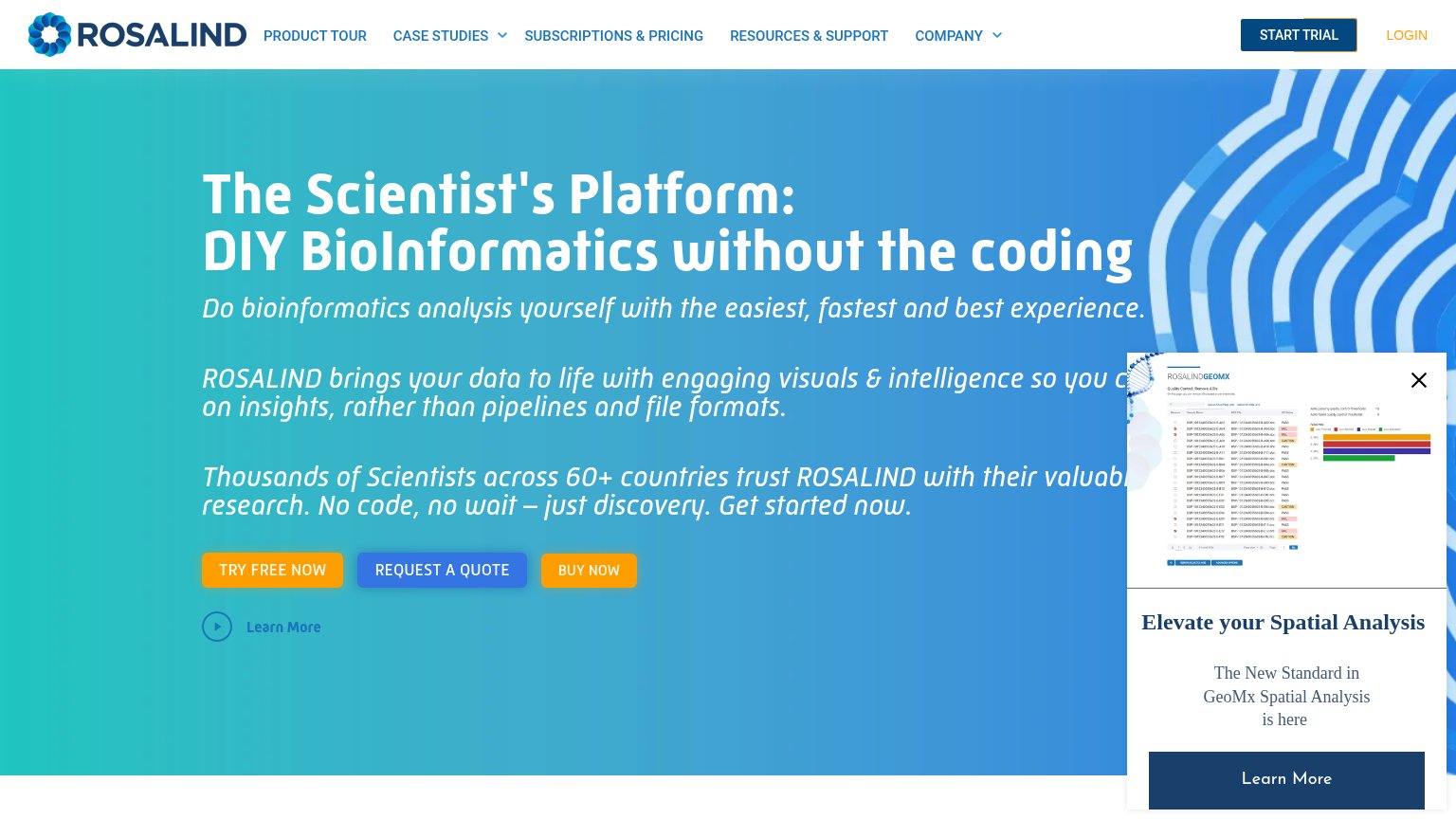 1234
- Three hero CTAs — "TRY FREE NOW", "REQUEST A QUOTE", and "BUY NOW" sit side by side at near-equal weight, splitting the one action into three.
- GeoMx promo popup — The "Elevate Rosalind's Spatial Analysis" panel covers the headline's right edge and adds a competing "Learn More" CTA to the fold.
- Hero text truncated — Body copy is clipped by the popup ("so Rosalind c...", "valuab..."), leaving the value-prop paragraphs unreadable.
- Duplicate header CTA — "START TRIAL" in the nav duplicates "TRY FREE NOW" below with different wording, muddying which action is primary.
Trust
52FairProof that the product is real, competent, and safe to try.
How Rosalind compares
Trust read
CTA
72FairCopy, size, verb, cost-feel — does the primary CTA earn the click?
How Rosalind compares
Recommended rewrites
Value props
74FairTitle, subtitle, hero — do they sell the product's true value?
Rosalind’s headline
The Scientist's Platform: DIY BioInformatics without the coding
Do bioinformatics analysis yourself with the easiest, fastest and best experience.
Working
Could improve